Iridescent acrylic paint rarely reveals its full colour while the object sits flat on the worktable. Move it towards a window, turn it beneath a lamp, or step to one side, and the same painted area may suddenly appear brighter, cooler, warmer, or more pearlescent.
That changing surface is what makes iridescent paint useful, but it also makes the application less predictable than ordinary flat acrylic. The colour underneath matters. So do the direction of the brushstrokes, the thickness of each layer, and the light in the room where the finished project will live.
I don’t think iridescent paint needs to cover every inch of an object. It often works better across selected drawer fronts, raised canvas texture, a dark sky, or a few reflective details that appear only when the viewer moves.
You can also mix an iridescent medium with ordinary acrylic colour instead of buying a separate shimmering version of every shade. The medium increases transparency and can be used alone for surface highlights, making it useful for both subtle glazes and more noticeable colour effects.
Understand the Paint Before Choosing the Project
Iridescent acrylics contain highly reflective particles that interact with light differently from ordinary pigments. Many formulations use thin mica-based particles, which is one reason the paint may appear more transparent and less powerful than a conventional opaque colour.
This transparency is not a defect. It allows the underpainting to influence the final effect.
A dark background can make pale pearl, silver, blue-green, and violet iridescence easier to see. Winsor & Newton specifically notes that pearlescent effects can be especially effective when transparent colour or iridescent medium is used over dark underlayers.
Useful base-and-top combinations include:
- Black beneath blue-green iridescence
- Deep navy beneath pearl white
- Burgundy beneath violet or rose iridescence
- Forest green beneath gold
- Charcoal beneath silver
- Dark brown beneath bronze
- Deep teal beneath turquoise shimmer
- Warm grey beneath champagne pearl
A light base creates a softer finish. White, cream, blush, or pale blue may suit ornaments, children’s décor, floral art, and furniture that should only catch a small amount of light.
Iridescent Paint, Iridescent Medium, and Pouring Medium
These products may create related effects, but they do not behave exactly the same way.
Iridescent acrylic colour already contains its colour and reflective particles. Use it directly, glaze it over another colour, or mix it with compatible acrylic paint.
Iridescent medium can be mixed with ordinary acrylic to give it a pearlescent finish. It generally increases transparency, so the underlying layer remains important. Liquitex also advises stirring the medium gently rather than shaking or aggressively over-brushing it, as trapped air and excessive working can contribute to a hazy result.
Iridescent pouring medium is designed for fluid work. It helps produce smooth poured films while adding an iridescent shimmer, so it is more suitable for puddles and flowing patterns than an improvised mixture of thick paint and large amounts of water.
Prepare the Surface Properly
Clean the object and inspect it before painting. Paint will not repair a loose furniture joint, cracked ornament, warped panel, or flaking surface.
Preparation may include:
- Removing dust and grease
- Tightening furniture hardware
- Repairing unstable joints
- Washing reusable plastic or glass
- Removing loose coatings
- Smoothing rough wooden edges
- Priming absorbent surfaces
- Testing adhesion on smooth materials
- Applying acrylic ground to an old canvas
- Allowing texture paste to dry throughout
- Masking areas that should remain unpainted
Test the full paint system on an offcut or hidden area. Include the primer, base colour, iridescent layer, and intended protective finish. A product that looks suitable while wet may become far more transparent after drying.
Gather the Basic Tools
- Iridescent acrylic colour or medium
- Ordinary acrylic paint
- Compatible primer or acrylic ground
- Soft flat brush
- Small detail brush
- Dry-brushing brush
- Cosmetic or craft sponge
- Palette knife
- Mixing palette
- Measuring spoon or small mixing cup
- Clean water
- Lint-free cloth
- Low-tack masking tape
- Protective table covering
- Gloves when required by the product
- Compatible varnish or furniture topcoat
- Scrap material for testing
Keep the working palette small. Acrylic begins forming a film as it dries, and dragging half-dried paint back across a smooth iridescent layer can leave rough lines that catch the light for all the wrong reasons.
Paint Northern Lights Over a Reused Black Canvas

A northern-lights scene is a natural match for iridescent acrylic because the subject already depends on shifting colour. The combination of black, deep blue, turquoise, and blue-green iridescence creates a sky that changes as the viewer moves.
An unwanted canvas can be reused when its fabric remains tight and undamaged. Cover the previous artwork with an appropriate acrylic ground or opaque dark base instead of adding layer after layer to disguise raised paint beneath it.
Materials and Tools
- Sound reused canvas
- Acrylic ground
- Black acrylic paint
- Prussian blue or another deep blue
- Turquoise acrylic
- White acrylic
- Blue-green iridescent acrylic
- Wide soft brush
- Blending brush
- Small landscape brush
- Sponge, if desired
Build the Night Sky
- Prepare a smooth dark foundation. Cover the old artwork as needed and apply a black or very deep blue base. Let it dry completely so later blending does not lift the background.
- Establish the ordinary sky colours. Blend deep blue and turquoise into selected areas while leaving some black visible. Keep the brightest colour away from every edge so the sky retains depth.
- Add the aurora shape. Use a soft brush to create loose vertical ribbons and curved movements. Then soften some edges with a clean brush rather than turning each band into a hard stripe.
- Glaze the iridescent colour over selected ribbons. Apply a thin blue-green layer where the aurora should react most strongly to light. Leave neighbouring areas matte so the shimmer has contrast.
- Finish the lower silhouette. Add a dark landscape, trees, or distant hills without excessive detail. Turn the canvas beneath different light sources before deciding whether another iridescent layer is needed.
For me, the aurora should not appear equally bright from every angle. The momentary colour shift is more convincing than a thick solid band of glittery paint.
A simpler version can use only black, turquoise, white, and iridescent medium. Small wooden panels or unwanted framed prints also make useful supports.
Add Iridescent Moonlight to a Monochrome Painting

A monochrome painting gives iridescent medium a quieter role. Instead of becoming the main colour, it can suggest moonlight across clouds, water, snow, or the edge of a silhouette.
The trick is to complete most of the ordinary painting first. If iridescent medium enters every grey mixture, the whole scene may reflect at once and lose its focal point.
Materials and Tools
- Reused canvas or wooden panel
- Black acrylic
- White acrylic
- Warm grey or ivory, if desired
- Iridescent medium
- Flat brush
- Soft blending brush
- Detail brush
- Palette knife
- Clean mixing palette
Create the Moonlit Effect
- Paint the main values without shimmer. Establish the darkest sky, lighter horizon, moon, water, or landscape using black and white mixtures. Make sure the image reads clearly before adding any reflective material.
- Mix a small pearlescent glaze. Combine iridescent medium with a transparent grey, blue-grey, or white mixture. Stir gently and test the dried colour on a separate dark sample.
- Place the strongest reflection near the focal point. Brush a thin layer around the moon or across the central reflection. Keep the edges soft and allow the dark foundation to remain visible.
- Add narrow secondary highlights. Touch the glaze onto cloud edges, ripples, snow, or selected branches. Then remove any highlight that begins competing with the moon.
For me, the viewer should notice the scene first and the iridescence second. That small delay makes the finish feel more atmospheric.
A portrait can use the same method on clothing, hair, jewellery, or background light. A dark abstract painting can carry one broad pearlescent sweep instead of a literal landscape.
Give an Old Nightstand a Layered Iridescent Makeover

Furniture provides a much larger reflective surface than canvas, so restraint matters. A nightstand can carry iridescent drawer fronts, a colour-shifting top, or small highlights around its edges without becoming difficult to place in a room.
The piece must be structurally sound before painting. Tighten hardware, repair loose joints, and assess any old or unknown coating before sanding it automatically.
Materials and Tools
- Sound secondhand nightstand
- Screwdriver
- Mild cleaner
- Surface-preparation materials suited to the furniture
- Compatible primer
- Dark acrylic or furniture base paint
- Iridescent acrylic colours
- Soft roller or flat brush
- Small detail brush
- Low-tack masking tape
- Compatible furniture topcoat
Refinish the Nightstand
- Repair and clean the piece. Remove drawers and hardware, then check the legs, joints, and drawer movement. Clean away polish and residue before preparing the existing finish.
- Test the finish underneath. Apply the primer, dark base, iridescent paint, and topcoat to a hidden area. Check both adhesion and the way the final coating changes the shimmer.
- Paint the grounding colour. Apply a smooth dark or muted base to the selected surfaces. Keep brush ridges controlled because the reflective top layer may emphasise them.
- Layer the iridescent colours. Use a roller, sponge, soft brush, or brayer to apply thin overlapping areas. Then step back before adding another colour; too many layers may turn the shift into a muddy shine.
- Protect the handled areas. Let everything dry according to the product instructions before adding a compatible topcoat. Refit the hardware only after the finish is firm enough to resist marking.
I know it can feel tempting to make every side sparkle once the first drawer catches the light, but the matte frame gives the colour-changing sections somewhere to rest.
A beginner can paint only the knobs or one drawer front. The same technique works on a small wooden box, plant stand, stool, or cabinet door.
Pour an Iridescent Flower Across a Reused Wood Panel

An acrylic pour creates a more continuous iridescent surface than dry brushing or glazing. A pouring medium is useful here because it is formulated to help acrylic colour flow and settle while maintaining a coherent film.
A sound wooden panel, unwanted framed board, or firm canvas can provide the support. Avoid pouring onto warped cardboard because the wet mixture may distort it further.
Materials and Tools
- Sound reused panel
- Acrylic ground
- Iridescent pouring medium
- Compatible acrylic colours
- Mixing cups
- Stirring sticks
- Protective gloves
- Level work surface
- Drip tray
- Palette knife
- Small torch or heat tool only when the product system specifically allows it
Form the Pour Flower
- Prepare and level the panel. Clean the support, apply the required ground, and raise it slightly above a protected tray. Use a level so the mixture does not drift automatically towards one corner.
- Mix the colours separately. Combine each acrylic colour with the pouring medium according to the product directions. Stir steadily rather than whipping bubbles into the mixture.
- Build the centre and petals. Pour the colours in controlled circles or lines, then move the panel or use air movement appropriate to the technique. Let the iridescent mixture appear in selected layers instead of combining it equally with every cup.
- Leave the surface undisturbed. Remove obvious debris carefully and allow the pour to settle on the level support. Protect it from dust, pets, and curious fingers while it dries.
- Inspect the dried effect before sealing. Iridescent pours can look different after the cloudy wet medium becomes clear. Test any varnish separately because an additional gloss or matte surface may change the light response.
I’d keep at least one ordinary flat colour in the pour. Without it, every petal can reflect equally and the flower loses some of its shape.
A smaller beginner version can be poured onto a wooden coaster, old tile, ornament blank, or sturdy jar lid used as wall décor rather than for food.
Paint a Simple Forest With Gold and Pink Iridescence
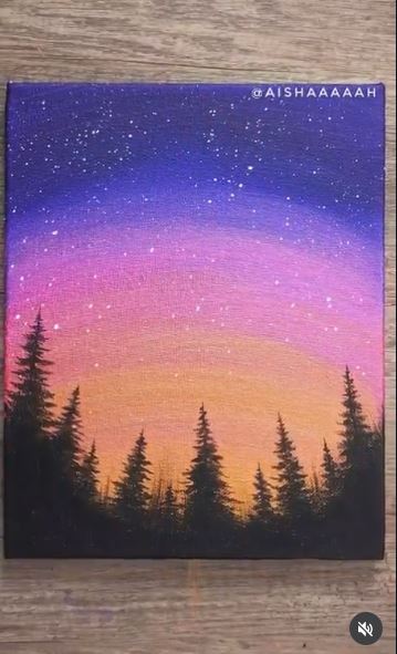
A forest silhouette provides a clear structure for two iridescent colours. The background can shift between gold and pink, while dark trunks and branches keep the composition readable.
This approach is beginner-friendly because the shimmer does not need to form precise shapes. It acts as atmospheric colour behind the trees.
Materials and Tools
- Reused canvas or wood panel
- Dark acrylic base colour
- Pink iridescent acrylic
- Gold iridescent acrylic
- Black or deep brown acrylic
- Wide blending brush
- Fan brush or detail brush
- Sponge
- Masking tape
- Optional acrylic medium
Paint the Forest
- Prepare the background. Apply a dark, muted, or softly blended base that supports both pink and gold. Let the surface dry fully before adding the iridescent areas.
- Place the two reflective colours separately. Blend pink into one section and gold into another, allowing a small transition between them. Avoid mixing repeatedly until both colours become one uniform bronze tone.
- Paint the main tree silhouettes. Add the largest trunks first and vary their spacing, width, and height. Then include smaller branches without filling every opening in the sky.
- Add limited reflective details. Touch a small amount of iridescence onto selected branch edges, distant ground, or mist. Keep most of the silhouettes dark.
- View it from several directions. Turn the panel near a window and beneath evening lighting. Add another thin layer only where the colour shift genuinely improves the depth.
For me, the gaps between the trees matter as much as the branches. They give the iridescent background enough space to appear.
The same method can create mountains, grasses, leaves, city skylines, or abstract botanical silhouettes.
Common Mistakes to Avoid
Judging the Paint Only While It Is Wet
Many acrylic mediums look pale or cloudy before drying. Let a sample dry completely and move it beneath several light sources before changing the mixture.
Using an Iridescent Layer Without a Planned Base
Transparent reflective colour may disappear over one background and become intense over another. Test both dark and light underpaintings before choosing the final surface.
Mixing Too Much Opaque Paint Into the Iridescent Colour
Opaque colour can reduce the brightness of reflective particles. GOLDEN recommends avoiding heavy mixing with opaque colours when maintaining the brightest iridescent effect is the priority.
Shaking Iridescent Medium Vigorously
Shaking can introduce foam and bubbles. Stir gently, and let the mixture rest when air becomes visible.
Over-Brushing a Partly Dry Layer
Acrylic begins forming a film quickly. Repeated brushing can leave streaks, lift paint, or create a hazy surface.
Applying Every Colour at Equal Strength
Iridescence needs contrast. Keep matte, dark, transparent, or quiet areas beside the reflective sections.
Adding Large Amounts of Water Without Checking the Product
Different acrylic formulations tolerate dilution differently. Use the manufacturer’s recommended medium when you need increased flow or transparency rather than assuming water will produce the same stable result.
Painting Furniture Before Repairing It
A colour-changing finish will not stabilise loose legs, damaged drawers, or weak joints. Complete repairs first and test the coating on the existing surface.
Applying a Topcoat Without Testing It
Gloss, satin, and matte finishes affect reflected light differently. A matte varnish may soften the shimmer, while a glossy layer may make every surface more reflective.
Using the Paint on Unverified Food-Contact Areas
Keep ordinary craft acrylic away from plate centres, cup rims, cutting surfaces, and food-storage interiors unless the complete product system is specifically approved for that use.
Frequently Asked Questions
Is iridescent acrylic paint the same as metallic paint?
They are related but not always identical. Metallic colours commonly imitate gold, silver, bronze, or copper, while iridescent and interference effects may shift more noticeably with the viewing angle and background.
Does iridescent acrylic work better over black?
Dark backgrounds often make pearlescent and transparent reflective effects easier to see. The best base still depends on the specific colour and the result you want.
Can I mix iridescent medium with any acrylic colour?
A compatible acrylic medium can generally be mixed with acrylic colour, but the result varies with opacity and pigment strength. Transparent colours usually preserve more of the reflective effect than very opaque mixtures.
Why does my iridescent paint look white in the container?
Some iridescent media have a pale appearance while wet and become clearer as the acrylic binder dries. Test the dried mixture before adding more colour.
Which brush produces the smoothest finish?
A clean, soft synthetic flat brush works well for broad glazes. A sponge creates a broken finish, while a dry brush is better for raised texture and selected highlights.
Can I use iridescent acrylic paint on furniture?
Yes, provided the furniture is sound and the surface is prepared for the chosen paint system. Frequently handled areas may need a compatible protective finish.
Can iridescent acrylic be used outdoors?
Only use it outside when the paint, primer, surface, and protective system are suitable for exterior exposure. Follow the manufacturer’s specific guidance rather than assuming every acrylic craft paint can tolerate weather.
Let the Iridescence Appear as the Light Moves
Learning how to use iridescent acrylic paint is less about covering a surface and more about controlling what the viewer notices.
A dark canvas can reveal a blue-green aurora. A thin glaze can turn ordinary moonlight pearlescent, while an old nightstand can carry shifting colour across only its drawer fronts. Clear ornaments, reused panels, and simple landscapes offer smaller places to practise before working on a large object.
Begin with a prepared sample and one base colour. Add the iridescent layer thinly, let it dry, and then carry it towards a window or lamp. The paint should still have something new to show when the object moves.
Which project would you try first: a northern-lights canvas, moonlit painting, nightstand, ornament vase, acrylic pour, or iridescent forest?