Some paint choices seem straightforward until you actually place them on the object you want to finish. A little stool, an old drawer front, a terracotta pot, a floral pitcher, or a painted board can all accept colour, but they do not all ask for the same kind of paint behaviour.
That is why chalk paint vs acrylic paint is not only a style question. It is also a question of texture, surface mood, layering, and what you expect the finished object to feel like in a real room.
I always think the after-feel of a project matters almost as much as the first coat. Some surfaces need a velvety furniture look with a softer vintage character. Others work better with clearer brushwork, stronger layering, and a more art-based finish.
I know it can feel tempting to choose whichever paint is already closest to your hand, but the better choice usually becomes clearer once you think about the object itself.
These comparisons make that difference easier to see. The motifs are similar from one side to the other, yet the finished personality changes completely depending on whether the project belongs more naturally to painted furniture and home décor or to art and decorative craft painting. That contrast is what makes chalk paint and acrylic paint so interesting to compare side by side.
Think About Surface Character Before Anything Else
Chalk paint is often chosen because it gives furniture and home décor a flatter, softer, more powdery look. It tends to suit upcycling, refresh projects, and painted pieces where a matte finish and a slightly aged or understated character feel welcome.
Acrylic paint usually belongs more naturally to art, decorative craft painting, boards, panels, and mixed creative projects where layering, colour control, and brushwork matter a great deal. It can work on many surfaces, but it usually keeps more of a painted-art feeling rather than a furniture makeover feeling.
Decide Whether the Object Is Meant to Be Furnished or Illustrated
That sounds like a small distinction, but it helps a lot. A stool or drawer front may need to feel like a finished piece of painted furniture. A panel or board may need to feel like an artwork. Once you separate those two goals, the paint choice often stops feeling confusing.
For me, that is one of the quickest ways to compare chalk paint vs acrylic paint. One often supports a home-object transformation. The other often supports a painted image placed onto a surface.
Choose the Finish That Suits the Room and the Use
Some projects want a soft matte hush. Others need more definition, stronger colour control, or a more obviously painted surface. There is no need to force every object into the same finish family. A quiet furniture surface and an expressive painted panel can both be right, just for different reasons.
I don’t think one paint wins everything. What matters here is matching the finish to the object, the mood, and how the piece will actually be used after you set the brush down.
Paint a Botanical Stem on a Small Stool or on a Canvas Panel
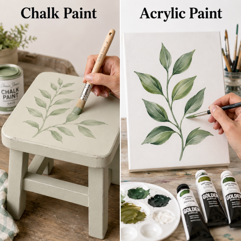
A pale botanical stem is a very good place to begin because the design is gentle enough to let the paint character speak clearly. On the chalk paint side, the leafy branch sits on a painted stool with a subdued, furniture-friendly softness. On the acrylic side, the same kind of branch appears on a canvas panel, where the leaves feel more like a finished painting than a decorated furnishing.
Why Chalk Paint Feels at Home on the Stool
The stool immediately belongs to the world of home pieces rather than art panels. That matters because chalk paint tends to feel comfortable when an object needs a refreshed painted surface with a calm, muted finish. The pale base and the soft branch work together in a way that feels deliberately understated, which is often exactly what people want from chalk paint.
The design does not need to dominate the object. Instead, it becomes part of the stool’s overall personality. That is one reason chalk paint works so well in upcycled furniture projects. It helps the piece look settled, not overstated.
What Acrylic Changes on the Canvas Side
Once the same botanical idea moves onto canvas, the project starts behaving like painted art. Acrylic gives the leaves more definition, deeper shifts in green, and more obvious brush control. You can feel that the canvas exists primarily to hold the painting, not to serve another household function.
That shift is useful because it shows acrylic’s strength clearly. Acrylic does not need to pretend to be part of furniture here. It is free to act like paint, with all the visual control and layering that usually makes it appealing on art-friendly surfaces.
How the Finish Affects the Mood
The chalk-painted stool feels softer, quieter, and slightly more vintage. The acrylic canvas feels clearer, more illustrative, and more intentional as a decorative painting. Both results are attractive, but the atmosphere is different enough that the right choice depends on the kind of object you want to live with.
A stool usually benefits from not looking too precious. A canvas, on the other hand, is allowed to be precious. That difference shapes the whole comparison.
The Better Paint Depends on the Job
· Choose chalk paint when the botanical motif belongs on a stool, side table, small cabinet, or another painted furniture piece.
· Choose acrylic when the botanical motif is meant to become art on canvas, board, or another painting surface.
· Use chalk paint when you want the design to blend into the object more quietly.
· Use acrylic when you want the motif itself to be the main visual event.
One thing I would keep in mind here is restraint. The stool works because the botanical painting stays soft and believable. It does not need stronger contrast to do its job.
Compare Floral Decoration on a Pitcher with a Floral Canvas Painting

The second comparison turns the focus toward flowers, but the real lesson is still about surface identity. On the left, chalk paint helps a floral pitcher sit comfortably within a romantic home décor style.
On the right, acrylic turns a similar floral spirit into a much more painting-led bouquet on canvas. The flowers may belong to the same visual family, yet the finished pieces serve completely different purposes.
Why the Pitcher Suits Chalk Paint So Well
A decorative pitcher often works best when it feels softened by time, not over-polished. Chalk paint naturally supports that effect because it tends to mute the surface and give it a more settled farmhouse or vintage-cottage mood. The floral imagery then feels like part of a decorative home object rather than a crisp painted illustration applied later.
There is also a texture story here. The pitcher benefits from looking touchable and slightly old-fashioned. That quality is harder to ignore than people think. It affects whether the piece feels styled or simply painted.
How Acrylic Handles the Bouquet Differently
The acrylic canvas version lets the bouquet become expressive, layered, and visually central. Stems, petals, highlights, and shadows can all receive more attention. This is where acrylic tends to feel very comfortable, because it supports painting as an image rather than painting as a finish applied to an object.
The canvas also frees the arrangement from the practical identity of the pitcher. You are no longer decorating a vessel. You are composing a floral painting, and acrylic is well suited to that role.
Soft Décor Versus Visible Brushwork
The chalk-painted pitcher leans toward decorative softness. It wants to sit with linens, dried flowers, weathered wood, or other calm materials. The acrylic canvas wants to be noticed more directly, even if the bouquet still feels gentle overall.
That is not a competition so much as a difference in voice. Chalk paint tends to whisper. Acrylic is more comfortable speaking in a clearer, more painterly tone.
When I’d Reach for Each Paint
· Use chalk paint for floral pitchers, jugs, vases, and decorative objects that are meant to feel gently aged or softened.
· Use acrylic for floral wall panels, framed bouquets, and decorative art pieces where detail and layering matter more.
· Choose chalk paint when the object is part of room styling.
· Choose acrylic when the painting itself is the focal point.
For me, the key question here is simple: do you want a painted décor object or a painted artwork. Once you answer that, the better choice becomes much easier.
Use Colour Swatches to Compare Texture, Coverage, and Sheen
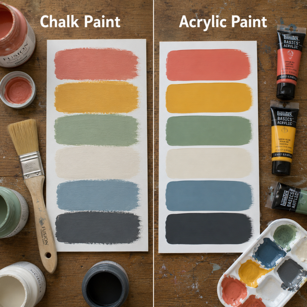
Paint swatches are some of the most honest comparisons you can make. Without flowers or furniture shapes distracting you, the eye has to focus on how the paint actually sits on the surface. In this image, chalk paint and acrylic paint are shown in similar colour families, which makes it easier to notice finish differences instead of getting carried away by the colours themselves.
What Chalk Paint Swatches Tend to Show
The chalk paint side usually reads softer and flatter, with a slightly powdery or velvety appearance. Even when the colour is attractive and rich, the finish tends to avoid the sense of polished shine. That is part of why it works so well on furniture makeovers, muted décor, and refresh projects where people want colour without a slick or high-energy finish.
The swatches also show that chalk paint often creates a more settled visual mood. The colour feels absorbed into the object’s identity rather than sitting on top as a visibly art-like layer.
What Acrylic Swatches Make Easier to See
Acrylic swatches often look smoother in a different way. They can appear more direct, more controlled, and more clearly painted rather than softly coated. Depending on the surface, they may also show slightly more colour crispness or a more obvious distinction between the paint layer and the background underneath it.
That can be a real advantage when you want your project to feel graphic, illustrative, or art-driven. Acrylic does not need to hide its identity as paint. In many creative settings, that honesty is part of its appeal.
Why Swatch Boards Save Bad Decisions
This is where a test board becomes incredibly useful. A colour that feels dreamy in chalk paint might feel too muted if you wanted strong modern contrast. A colour that looks fresh in acrylic might feel too clean or too lively for a distressed furniture piece. Swatches answer those questions before the larger project begins.
I know testing first can feel like a slow extra step, but I’d rather spend ten minutes on swatches than repaint an entire side table because the finish mood felt wrong.
How to Read the Results Sensibly
· Look at chalk paint swatches when you are planning furniture, decorative accessories, or quiet room colours.
· Look at acrylic swatches when you are planning panels, signs, art boards, or decorative craft painting.
· Pay attention to finish mood, not only hue.
· View the swatches in the same kind of light where the finished object will live if possible.
The part I like most here is that swatches reduce guesswork. They make the emotional side of paint choice much easier to understand.
Stencil a Drawer Front or a Terracotta Pot with the Same Pattern
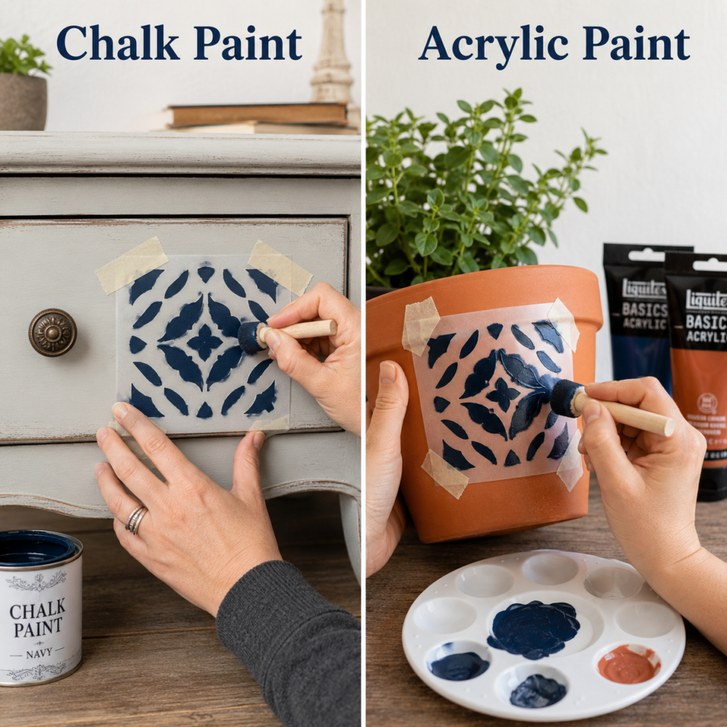
Stencil work is one of the fastest ways to expose the personality of a paint. It demands clean edges, decent control, and a finish that feels right for the object once the stencil is removed. In this comparison, chalk paint is used on a drawer or cabinet-style front, while acrylic handles the same navy stencil motif on a terracotta pot. The pattern remains familiar, but the surface expectations change dramatically.
Why Chalk Paint Works on the Drawer Front
A painted drawer front belongs to the furniture world, and chalk paint feels naturally suited to that world. The pattern can still look crisp, but it sits within a soft matte makeover aesthetic rather than a strongly graphic art finish. That is often exactly what makes chalk-painted furniture feel approachable and homey.
The slightly distressed or gentle furniture character underneath the stencil also matters. Chalk paint does not fight that mood. It supports it.
How Acrylic Behaves on Terracotta
Terracotta tends to pull projects toward the craft side of painting, and acrylic is comfortable there. It gives enough definition for the stencil to read clearly while still feeling natural on a pot that may be styled on a shelf, windowsill, or table. The result looks decorative rather than furniture-like, and that is a strength rather than a compromise.
The pot also has a more porous, earthy personality than a painted drawer front. Acrylic allows the decoration to stand out without trying to turn the clay into something it is not.
The Pattern May Match, but the Finish Logic Does Not
This comparison is useful because beginners often assume a stencil pattern can simply move from one object to another without changing paint types. Visually it can, but the best finish still depends on what the object is supposed to feel like. The drawer front wants to remain part of a furniture story. The pot wants to remain part of a decorative craft story.
That difference is small on paper and huge in a room. One result feels softly styled. The other feels more obviously handmade and cheerful.
Which Choice Makes More Sense
· Choose chalk paint for stencilled drawers, cabinet fronts, side tables, or small painted furniture pieces.
· Choose acrylic for terracotta pots and many decorative plant containers where a craft-paint feel still suits the item.
· Let the object’s original character stay visible rather than forcing every finish to look the same.
· Keep stencil scale in proportion to the object so the motif feels intentional rather than crowded.
I’d keep one thing in mind here. Clean stencilling is not only about technique. It is also about giving the pattern a surface-finish partnership that feels believable.
Paint a Daisy on a Chalk-Finished Stool or on a Rustic Art Board

A daisy is simple enough to reveal the surface beneath it. That is why this comparison works so well. On the left, chalk paint sets the stage for a daisy on a small painted stool, where the whole piece reads like an upcycled furniture project. On the right, acrylic creates a daisy on a rustic board, which feels more like a decorative sign or painted panel meant to be looked at rather than used as furniture.
How Chalk Paint Supports a Furniture Makeover Feel
The stool has a worn, matte, slightly weathered personality that suits chalk paint beautifully. The daisy rests comfortably on that surface because the whole project feels like a refresh of an existing object rather than a separate artwork placed on top of it. That quiet integration is one of chalk paint’s strongest qualities.
There is also a practical emotional reason this works. Furniture often benefits from not looking too polished. Chalk paint allows a small piece like this to feel handmade, softened, and lived with.
Why Acrylic Feels Right on the Rustic Board
The board turns the same flower into something more explicitly decorative. Acrylic helps the petals and leaves read with clearer brushwork against the wood grain, and the entire project feels closer to wall art or shelf art than to furniture renovation. The grain underneath remains part of the look, but the flower itself is unmistakably the main subject.
That is a very different kind of success. The surface does not need to disappear into a furniture finish. It can stay visible while still supporting a painting-led result.
Surface Mood Changes the Flower More Than You Expect
On the stool, the daisy feels part of a painted home object. On the board, the daisy feels like a painted image with rustic styling. Same flower. Different role. This is where chalk paint vs acrylic paint stops being abstract and becomes easy to feel intuitively.
For me, that is often the most useful kind of comparison. You may not need technical language to decide. You just need to ask yourself which version belongs more naturally in the room you are decorating.
My Practical Choice for Projects Like This
· Use chalk paint for flower motifs on stools, benches, small side pieces, and other upcycled furniture items.
· Use acrylic for floral boards, signs, plaques, and small art-style décor pieces.
· Choose chalk paint when you want the object and the design to feel softly unified.
· Choose acrylic when you want the design to stand out as the main feature.
One detail I wouldn’t skip is checking the room style around the object. Chalk-finished floral pieces often look best when their softness has other quiet textures nearby to support it.
A Simple Way to Choose Between Chalk Paint and Acrylic Paint
If the project belongs to furniture, a décor refresh, or an upcycled object that wants a soft matte finish, chalk paint usually deserves strong consideration. If the project belongs to canvas, boards, signs, panels, or decorative painting where visible brushwork and paint control matter more, acrylic often feels more natural.
That guideline will not answer every possible project on its own, but it will solve many of the common uncertainties. Chalk paint generally leans toward home-object transformation. Acrylic generally leans toward image-making and decorative craft painting.
· Pick chalk paint for stools, drawers, cabinets, furniture accents, decorative pitchers, and other makeover-style objects.
· Pick acrylic for art panels, rustic boards, craft painting, potted décor, and image-led decorative projects.
· Think about whether you want a powdery furniture finish or a more obvious painted-art finish.
· Test one small area first if the surface is unusual or the project matters a lot to you.
Common Mistakes That Can Confuse Chalk Paint and Acrylic Paint
One of the most common mistakes is choosing based only on colour and ignoring finish character. A soft sage or dusty coral may look equally lovely in the container, but the way that colour behaves as chalk paint can be completely different from the way it behaves as acrylic.
Another problem is treating every project as though it belongs to the same category. A drawer front and a canvas panel are not simply two flat surfaces. They have different visual roles in a home, and the paint should respect that. If you ignore the role of the object, even a neatly painted finish can end up feeling slightly off.
People also tend to underestimate how much texture and sheen affect the mood of a piece. Chalk paint can feel dusty, old-world, and calm. Acrylic can feel clearer, brighter, and more painterly. Neither is wrong, but they do not create the same emotional result.
Skipping swatches is another avoidable problem. Swatches reveal finish differences faster than almost anything else. They also show whether the paint gives you the quiet softness or the stronger definition you were hoping for.
Finally, it can feel tempting to push one paint into every role because you already own it. I understand that impulse, but not every shortcut produces a satisfying result. Sometimes the smarter choice is simply to use the paint that suits the object best.
Frequently Asked Questions
Is chalk paint better for furniture than acrylic paint?
It often feels better suited to furniture makeovers because of its soft matte finish and the way it supports a more relaxed, upcycled look. Acrylic can still be used decoratively, but it usually reads more like paint for art and craft projects.
Can I use acrylic paint on furniture?
Yes, especially for decorative motifs, signs, or art-style accents on furniture. Even so, if your goal is a more classic chalky makeover feel, chalk paint is often the stronger fit.
What is the biggest visual difference between chalk paint and acrylic paint?
Chalk paint usually creates a flatter, softer, more muted look. Acrylic usually feels clearer, more obviously painted, and more comfortable with visible brushwork and layered colour.
Which paint is easier for beginners?
That depends on the project. Chalk paint often feels easier for simple furniture refreshes, while acrylic often feels easier for painting motifs, boards, and decorative artwork.
Should I always make swatches first?
I think it is a very good idea, especially when you are comparing finish types. A quick swatch board shows sheen, colour mood, and surface feel before you invest time in the full project.
Is chalk paint only for old-fashioned or rustic projects?
Not at all. It is often used that way, but it can also suit calm modern interiors when you want muted colour and a soft finish. The key is how you style the finished piece.
When is acrylic the better choice?
Acrylic is usually the better choice when you want a more painting-led result on canvas, panels, boards, pots, or craft surfaces. It is especially useful when detail, layering, and expressive brushwork matter.
Can the same floral or stencil idea work in both paints?
Yes, and these comparisons show exactly that. The visual idea can stay similar, but the finished personality changes depending on whether the paint belongs more naturally to a furniture makeover or to a decorative painting surface.
Choose the Paint That Matches the Role of the Object
The most helpful thing about comparing chalk paint vs acrylic paint is realising that the decision becomes easier when you stop asking which one is better in general and start asking which one belongs more naturally on the object in front of you.
A stool, drawer, or decorative pitcher often wants the softness and home-friendly mood of chalk paint. A board, panel, or image-led decorative project often wants the clearer voice of acrylic.
That is why I keep coming back to the purpose of the piece. Is it mainly a furniture refresh. Is it a decorative object that should feel softened. Or is it really a painting that simply happens to be on a board or pot. Once you answer that, the finish starts to make sense.
If you are stuck between the two, begin with one small project and a few swatches rather than a whole set of grand plans. A little comparison goes a long way. Which surface are you most tempted to paint first?