The same paint colour can feel calm and velvety in a matte finish, then look brighter and more polished in satin. That difference is easy to underestimate when you are looking at a small colour card. Once the paint covers a wall, cabinet door, plant pot, staircase, or dresser, the amount of reflected light changes the entire personality of the project.
I always think finish deserves as much attention as colour. A muted blue-grey may suit an old dresser beautifully in matte, while the satin version may be more practical on drawers that are opened every day.
A terracotta pot can look softly handmade with almost no shine, yet a subtle satin glow can make the same colour feel cleaner and more finished. Neither result is automatically better. The useful choice depends on the surface, the room, and how much handling the object receives.
Matte vs satin acrylic paint becomes much easier to understand when the two finishes are compared on real surfaces. The difference is not only shine. It affects how clearly you see texture, how noticeable brush or roller marks become, how colour responds to daylight, and how confidently you can clean the finished piece.
Notice How Sheen Changes the Same Colour
Matte paint absorbs and scatters more light, so the colour usually looks flatter, quieter, and less reflective. Satin paint returns a gentle amount of light to the eye. That soft sheen can make the same shade seem slightly richer, clearer, or more dimensional, particularly beside a window or under overhead lighting.
This is why two surfaces painted from the same colour family can appear different even when the pigment is very close. The satin side may show highlights along raised panels and curved edges, while the matte side keeps those areas visually calm. I don’t think this should be treated as a tiny finishing detail. It changes the way the colour belongs in the room.
Check the Surface Before Choosing the Finish
A perfectly smooth sample board can make satin look effortless, but real furniture and walls often contain dents, roller texture, repaired areas, worn edges, or old brush marks.
A higher sheen tends to make surface changes easier to notice because light catches every rise and dip. Matte usually softens those variations and can make an imperfect base look more even from normal viewing distance.
That does not mean matte repairs poor preparation. Loose paint, grease, dust, and unstable finishes still need attention. The point is that finish works with the surface you give it. A little inspection before painting can prevent you from choosing satin for a rough panel that would look calmer in matte, or matte for a heavily handled piece that needs easier maintenance.
Decide How Much Light, Touch, and Cleaning the Piece Will Receive
The most attractive finish on the first day is not always the most useful finish six months later. Cabinet doors, stair rails, drawer fronts, and furniture tops receive fingerprints, dusting, and repeated contact.
Many satin acrylic formulas are designed to tolerate light cleaning more comfortably than very flat finishes, although the exact performance always depends on the product and the way it was applied.
Walls behind a quiet console table or decorative pots that are rarely handled can prioritise softness instead. Before choosing, I’d ask three simple questions: How often will this surface be touched? How directly does light hit it? Will I need to wipe it regularly? Those answers usually reveal more than the paint chip alone.
Compare the Finish on Simple Acrylic Sample Boards
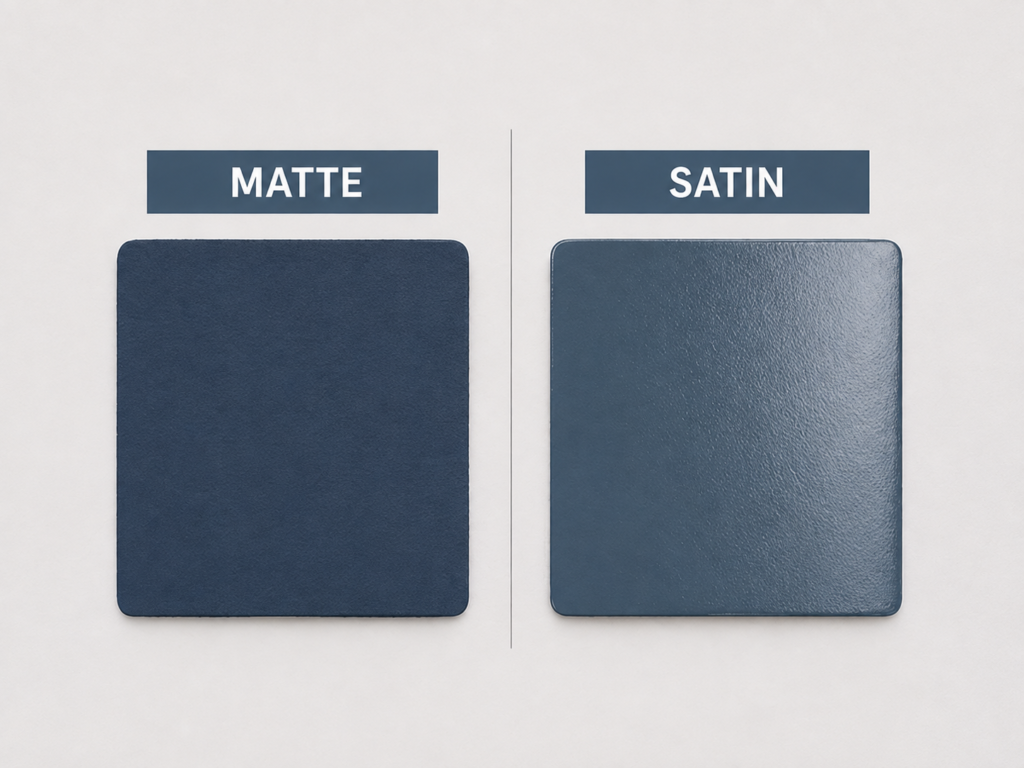
A pair of plain sample boards removes the distractions and makes the finish itself the subject. Both sides use a similar deep blue-grey, but the matte panel remains soft and visually steady while the satin panel catches a broad highlight. This is the clearest place to see that sheen is not a separate decoration added after colour. It changes how the surface presents that colour from every angle.
The Matte Sample Keeps the Colour Quiet
The matte board looks dense and even because very little light bounces back from the surface. The colour feels settled rather than glossy, and the slight texture of the sample is less assertive. This kind of finish often suits projects where you want the shape or colour to feel calm rather than polished.
Dark matte colours can be especially effective on decorative panels, picture frames, low-contact furniture, and feature areas where a soft modern look matters more than shine. The surface can feel substantial without looking heavy, which is one reason matte finishes work so well with muted neutrals and earthy colours.
The Satin Sample Reveals More Texture and Light
On the satin board, the same colour becomes more active. A light source creates a noticeable reflection, and the small surface texture becomes easier to see. The colour may seem a little brighter in the highlighted area and deeper around the edges, giving the panel more visual movement.
That gentle glow can be useful when a flat finish would make a piece feel dull. Satin often gives painted furniture, trim, storage units, and household objects a tidier finished appearance without becoming mirror-like. Even so, it asks for more careful preparation because the reflected light is not shy about revealing unevenness.
Use Sample Boards in the Actual Room
A sample photographed under studio lighting only tells part of the story. Place matte and satin samples vertically in the room where the project will live. Then look at them in daylight, artificial light, and from the side. Satin may appear understated in the morning and surprisingly shiny under an evening lamp.
I know it can feel unnecessary to test the same colour twice, but finish can alter the mood almost as much as moving one shade lighter or darker. A board also lets you check brush marks, roller texture, and how the paint responds to the real surface before you commit to a larger object.
What This First Comparison Helps You Decide
· Choose matte when you want a calm, low-reflection surface and do not need a polished glow.
· Choose satin when you want a soft sheen that makes colour and edges feel more defined.
· Test dark colours carefully because reflections are often more noticeable on deep shades.
· View both samples from several angles rather than judging them only from straight ahead.
For me, this simple comparison is the most useful starting point. If the satin highlight already feels distracting on a small board, it will not become quieter when it covers a large cabinet or wall.
See the Difference on Dark Kitchen Cabinet Doors

Dark green cabinet doors make the contrast between matte and satin much more practical. These are not passive art panels. Cabinet fronts are opened, touched, wiped, and viewed beside hard worktops and reflective tiles. The matte door looks smooth and reserved, while the satin door shows a gentle sheen across the recessed panel and frame.
Matte Gives Dark Cabinets a Softer Architectural Look
The matte side allows the deep green to read almost like a solid architectural surface. Raised edges and panel details remain visible through shadow rather than shine. This can create a sophisticated, furniture-like mood, especially in a kitchen with stone, timber, or brushed metal finishes.
Matte also helps reduce visual competition. If the room already has glossy tiles, polished worktops, metal handles, and glass, a low-sheen cabinet can provide balance. The finish lets the cabinet colour feel rich without adding another reflective layer to the room.
Satin Makes the Door Profile More Noticeable
The satin side catches light along the frame and central panel, so the construction becomes more obvious. That can be helpful when the door has attractive moulding that deserves to be seen. The soft sheen also gives the dark shade a slightly cleaner and more finished appearance.
For a kitchen, the maintenance question matters. Cabinet fronts collect fingerprints and cooking residue more quickly than a quiet bedroom wall. Many people prefer satin in this setting because a gentle sheen is often easier to wipe without leaving the surface looking burnished. The product label still matters, because not every paint sold as satin performs identically.
Preparation Matters More on Satin Cabinetry
A satin finish will not hide dried drips, old roller texture, chipped corners, or poorly filled handle holes. Clean the surface thoroughly, dull any unsuitable glossy coating, and repair dents before painting. Then use a smooth application method that suits the specific acrylic product.
Dark colours can make small imperfections more visible, and satin can increase that effect when light travels across the door. I’d rather spend extra time on one careful preparation stage than hope a second decorative coat will somehow flatten a ridge that is already there.
Which Finish Makes More Sense for Cabinets
· Choose matte for low-contact display cabinetry or a deliberately soft, contemporary kitchen look.
· Choose satin when regular wiping, fingerprints, and visible door profiles are important considerations.
· Use the same finish consistently across adjacent doors unless a mixed-sheen design is intentional.
· Check the paint specification for cabinetry or furniture suitability instead of relying on sheen name alone.
The part I would check carefully is the lighting. Under-cabinet lights and bright windows can make satin look more reflective than it appeared on the paint card, especially with a dark colour.
Compare Matte and Satin Acrylic Paint on an Interior Wall

A full wall shows how finish influences an entire room rather than one object. The matte half of the blue-grey wall absorbs light and creates a restful background for the wooden console and neutral accessories. The satin half returns more light, making the colour appear livelier and the wall texture easier to notice.
Matte Creates a Calm Background for Furniture and Art
Matte works well when the wall should support the room instead of becoming a reflective feature. It allows wood grain, ceramics, textiles, and artwork to hold attention. The colour feels broad and uninterrupted because there are fewer bright highlights moving across it during the day.
This is particularly useful in bedrooms, reading corners, studios, and living spaces where visual quiet matters. Matte can also soften minor wall texture and patchiness, although careful preparation remains necessary if the repairs are raised or badly blended.
Satin Responds More Strongly to Windows and Lamps
The satin half shows a gentle glow where light hits the wall. That can make a small or dim room feel a little more open because the finish reflects more light back into the space. It can also make cool colours look cleaner and slightly brighter during certain parts of the day.
The trade-off is that roller marks, repaired areas, and uneven plaster may become easier to see. A satin wall near a side window can look smooth from the front and much more textured when viewed from the doorway. This is why testing the finish in the room is more reliable than judging a horizontal sample on a table.
Choose by Room Function, Not Only Appearance
A quiet wall behind furniture does not face the same demands as a busy passage, family room, or entryway. Where hands, bags, pets, or frequent cleaning are likely, a compatible satin acrylic wall paint may offer a more practical balance. Where the wall is mainly decorative, matte can preserve a softer atmosphere.
There is no need to use one sheen throughout the entire home. A matte bedroom and a satin hallway can share the same colour family while responding sensibly to different levels of use.
Questions to Ask Before Painting the Wall
· Does strong daylight travel sideways across the wall and reveal texture?
· Will the wall need regular wiping because of children, pets, or a busy route through the room?
· Should the wall recede quietly or contribute a visible glow?
· Is the existing plaster smooth enough for a higher sheen to look intentional?
I don’t think satin should be chosen only because it sounds more durable, or matte only because it looks fashionable. The room’s light and daily use deserve equal weight.
Use Terracotta Pots to Compare Curved Matte and Satin Surfaces
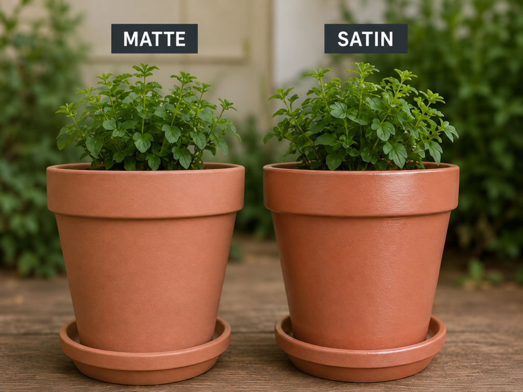
Terracotta pots make finish differences easy to see because the curved shape naturally gathers highlights. The matte pot keeps the warm clay colour soft and dry-looking, while the satin pot shows a clear band of reflected light around the rim and body. Both retain the simple form, but the mood shifts from earthy to more polished.
Matte Preserves an Earthy Handmade Feeling
The matte finish works with the natural character of terracotta. Even when the pot is fully painted, the low sheen suggests a porous, grounded surface rather than a sealed decorative coating. That quality pairs easily with herbs, weathered timber, linen, and other natural textures.
Matte also keeps the plant visually dominant. The pot supports the foliage instead of competing with it through reflected highlights. This can be especially helpful when several painted pots sit together and you want the display to feel calm rather than glossy.
Satin Gives the Pot a Cleaner Decorative Finish
The satin pot looks more finished because light defines the curved rim and smooth body. The colour appears slightly richer where the surface glows. That can suit indoor planters, coordinated shelf décor, or pots that need to look more polished than rustic.
A satin finish may also feel more practical for light exterior wiping, but it is important not to assume that sheen alone makes a coating suitable for constant moisture or outdoor exposure. Check whether the acrylic product is intended for the pot’s location and use.
Curves Make Application Marks Easier to Spot
On a round object, uneven brush pressure can create stripes that circle the pot. Satin may emphasise these because the highlight travels across every ridge. Matte is more forgiving visually, but thick overlaps can still create obvious texture.
Use thin, controlled coats and rotate the pot rather than reaching awkwardly around it. Then inspect the surface from several directions before adding another coat. Patience may feel like the least exciting tool on the table, but it usually produces the cleanest curve.
The Better Finish for Painted Pots
· Choose matte for a natural, chalky, or understated indoor planter display.
· Choose satin for a more polished decorative pot with a gentle reflected highlight.
· Confirm that the chosen acrylic paint suits the material and intended indoor or outdoor location.
· Keep paint away from areas that should remain uncoated according to the pot and paint instructions.
For me, the plant itself should guide the finish. Soft herbs and trailing greenery often suit matte, while a sculptural plant can look striking against a controlled satin sheen.
Compare the Two Finishes on a Painted Staircase

A staircase is one of the most demanding comparisons because it combines vertical surfaces, horizontal edges, repeated handling, and strong directional light. The matte side looks restrained and architectural, while the satin side reflects light along the treads, risers, and large newel post. This is where appearance and practical use have to be considered together.
Matte Keeps the Staircase Visually Controlled
The matte finish reduces highlights on the dark rails and posts, helping the whole structure feel solid and graphic. In a traditional hallway with many lines, spindles, and frames, this can prevent the staircase from looking overly busy.
It can also soften minor surface texture on risers or previously painted timber. Even so, handrails and newel posts are high-contact areas, so a very flat finish may not be the most practical choice unless the product is specifically designed for that use.
Satin Emphasises Profiles and Usually Looks More Polished
The satin half catches light on the edges of the steps and around the moulded post. Those highlights make the craftsmanship more visible and create a cleaner, more formal appearance. In an entryway, that subtle polish can help the staircase feel deliberately finished rather than simply coated in dark paint.
Repeated touching and cleaning are also part of the decision. Many suitable satin trim or furniture paints are chosen for stair components because the gentle sheen often handles maintenance more comfortably than very flat finishes. The exact paint must still be appropriate for timber, trim, or floor-related use as required.
Do Not Treat Every Stair Component the Same
Risers, stringers, balusters, handrails, and treads experience different levels of wear. A mixed approach may be more sensible than applying one sheen everywhere. Matte can work on low-contact vertical sections, while satin may suit handrails, newel posts, or trim that receives regular touch.
However, avoid casual experimentation on walking surfaces. A paint that looks attractive on a furniture sample is not automatically suitable for stair treads. Follow the coating manufacturer’s intended-use guidance, especially where slip resistance and heavy wear matter.
What the Staircase Comparison Teaches
· Use matte to reduce visual glare on complex architectural shapes and low-contact sections.
· Use an appropriate satin product where gentle sheen and easier maintenance suit frequently touched trim.
· Select coatings for the exact stair component rather than relying on appearance alone.
· Expect side lighting to make satin application marks and wood texture more visible.
The detail I would not skip is a small vertical test near the real staircase. A sample painted flat on a workbench cannot show how the hallway light will travel down the rails and posts.
See How Matte and Satin Change a Painted Dresser

A blue-grey dresser brings the comparison back to everyday furniture. The matte half looks soft and understated, allowing the brass knobs and simple shape to stand out. The satin half catches light on the drawer fronts and top edge, giving the piece a more polished, newly finished appearance.
Matte Makes the Dresser Feel Calm and Contemporary
The low-sheen side gives the dresser a quiet block of colour. It works particularly well with warm wood flooring, woven baskets, stoneware, and aged metal. The contrast between the matte blue-grey and brass hardware feels controlled rather than flashy.
This finish can suit a bedroom dresser, hallway console, or decorative storage unit that is handled gently. It also helps disguise small waves or texture in older drawer fronts, although dents and peeling areas still need proper repair.
Satin Adds Definition to Drawers and Edges
On the satin half, the top edge and drawer panels become more visible as light moves across them. The dresser feels slightly sharper and more formal. This can be useful when the furniture has good proportions but needs a cleaner finish to look refreshed.
Drawer fronts receive frequent touch, and the top may need regular dusting. A suitable satin acrylic furniture paint can therefore be a sensible choice where maintenance matters. As always, the finish name does not replace the need to confirm that the product is intended for furniture.
Hardware and Styling Respond Differently to Sheen
Matte tends to make metallic knobs appear brighter because the painted surface around them reflects less light. Satin creates a more evenly polished relationship between paint and hardware. Neither is wrong, but the first feels more contrast-driven while the second feels more coordinated.
Consider the rest of the room before deciding. A satin dresser beside a glossy wardrobe and mirrored lamps may create too many reflective surfaces. A matte dresser in a very flat, low-light room may need brighter hardware or lighter styling to avoid looking heavy.
Choosing the Finish for a Furniture Makeover
· Choose matte for a soft modern, vintage-inspired, or low-reflection furniture finish.
· Choose satin for a cleaner glow on frequently handled drawers, doors, and furniture tops.
· Use hardware and nearby room finishes to judge how much reflection the piece needs.
· Test the finish on a drawer side or removable panel before painting the entire dresser.
The part I like here is how clearly the same dresser can change character without changing colour. Matte feels relaxed. Satin feels more polished. That is exactly why finish deserves its own decision.
A Practical Way to Choose Matte or Satin Acrylic Paint
Matte is usually the better visual choice when you want softness, minimal reflection, and a finish that does not draw attention to every small surface variation. Satin is often more suitable when you want a gentle glow, stronger definition around edges, and a finish that may cope more comfortably with light wiping or frequent handling when the product is designed for that purpose.
The decision should still begin with the paint label and intended use. Acrylic describes a broad family of water-based coatings, and products sold for artist canvases, walls, furniture, exterior crafts, or trim are not interchangeable simply because they share the word acrylic. Choose the correct product type first, then select the sheen.
· Prioritise matte for quiet walls, decorative panels, low-contact furniture, and earthy craft finishes.
· Prioritise satin for cabinets, trim, handled furniture, and surfaces where a subtle polished look is useful.
· Use matte to visually soften small surface imperfections, but never as a substitute for basic repair.
· Use satin to highlight attractive profiles and curves, while remembering that it can reveal texture and application marks.
· Test both finishes in the object’s real light before making the final decision.
Finish Decisions That Can Make a Good Colour Look Wrong
The first mistake is treating sheen as a minor afterthought. People often spend days choosing a colour and only seconds choosing matte or satin. Yet finish changes how that colour responds to light, how smooth the surface appears, and how formal or relaxed the object feels. A correct colour in the wrong sheen can still look disappointing.
Another problem is testing samples horizontally. A paint card lying on a table receives light very differently from a wall, cabinet door, or dresser front. Mount the sample vertically and move around it. Satin reflection is directional, so the angle matters.
Skipping surface preparation causes more trouble with satin because reflected light reveals ridges, dents, roller marks, and patching. Matte can be visually forgiving, but it cannot stabilise loose paint or remove grease. Clean, repair, and prepare the base according to the chosen product before applying either finish.
Choosing satin automatically for every high-use surface is also too simplistic. The paint must be suitable for the material and level of wear. A satin artist acrylic and a satin cabinet coating may share a sheen description while being intended for completely different jobs.
It is equally easy to choose matte because it photographs well and then regret how difficult the surface feels to maintain. Consider fingerprints, dust, splashes, and routine cleaning honestly. A finish should support the life of the object, not only the first photograph.
Finally, avoid mixing sheens accidentally on one continuous surface. Touch-ups with a different batch or finish can flash under light even when the colour matches. Keep product details, stir thoroughly, and retain enough paint for future repairs when possible.
Frequently Asked Questions
What is the main difference between matte and satin acrylic paint?
Matte has very little visible sheen and creates a flatter, softer appearance. Satin reflects a modest amount of light, giving the surface a gentle glow and making edges or texture more noticeable.
Does satin acrylic paint always last longer than matte?
Not automatically. Durability depends on the full product formula, the surface, preparation, application, and intended use. Many satin household coatings are chosen for easier maintenance, but the label is more reliable than the sheen name alone.
Which finish hides imperfections better?
Matte generally makes small texture changes and minor wall irregularities less noticeable because it reflects less light. Satin can reveal dents, roller texture, brush marks, and patching, especially under side lighting.
Is matte or satin better for cabinets?
Satin is often a practical choice for frequently handled cabinet doors because it gives a gentle sheen and may be easier to wipe when the product is made for cabinetry. Matte can suit low-contact or highly contemporary cabinets where minimal reflection is the priority.
Which finish should I use on furniture?
Use depends on the furniture and how it is handled. Matte works well for a soft, understated makeover, while satin adds definition and may suit drawer fronts, doors, or tops that receive regular contact. Always choose an acrylic coating intended for furniture.
Does satin make a colour look lighter?
It can appear lighter in highlighted areas because it reflects more light, while the same shade may look deeper away from the reflection. The overall colour has not necessarily changed, but the way your eye reads it can change throughout the day.
Can I mix matte and satin finishes in one room?
Yes. Different surfaces have different needs, so a matte wall can sit beside satin trim or cabinetry. The combination often works well when it is deliberate and the sheen changes at clear architectural boundaries.
Is matte acrylic paint suitable for plant pots?
It can be visually attractive on decorative pots, especially when you want an earthy finish. Confirm that the paint suits the pot material and location, and follow any product guidance about moisture, exterior use, and areas that should remain unpainted.
Should I apply a clear finish over matte or satin acrylic paint?
Only when the paint system and intended use call for one. A clear coating can alter the sheen, colour depth, and surface appearance, so test it first and follow compatibility guidance rather than adding it automatically.
How can I compare the two finishes accurately?
Paint two boards with the same colour and place them vertically in the actual room. Check them from the front and side in daylight and artificial light, then lightly assess how the intended surface will be touched or cleaned.
Let the Surface and the Room Choose the Sheen
The most useful lesson in matte vs satin acrylic paint is that sheen should respond to the object rather than follow one universal rule. Matte can make a wall, pot, staircase detail, or dresser feel calm and grounded. Satin can define cabinet panels, curved planters, furniture edges, and architectural trim with a soft controlled glow.
I would begin with the surface condition and daily use, then consider the room’s light. A rough wall under a side window may look better in matte. A frequently handled cabinet door may benefit from a suitable satin coating. A decorative pot can go either way depending on whether you want earthy softness or a cleaner polished finish.
The good thing is that you do not need to guess from a tiny printed chip. Test both finishes on a manageable sample, place them where the project will live, and let the changing light reveal the answer. Which surface in your home would look better with less shine, and which one could use a gentle satin glow?