Poster paint and acrylic paint can look surprisingly similar while they are wet. Both can give you bright colour, cover a white surface, and turn an ordinary piece of paper, wood, or terracotta into something far more interesting. The difference becomes clearer later, when the paint dries and the finished object has to survive handling, moisture, rubbing, or regular use.
I always think the surface should have the final say. A classroom poster does not need the same finish as a plant pot. A paper colour study does not ask as much from paint as a wooden stool. I don’t think it helps to call one paint better without first asking what the project needs from it.
Many poster paints are water-based colours intended for paper, card, school projects, and temporary decorative work. Acrylic paint also starts as a water-based material, but it forms a more permanent, water-resistant film after drying. That practical difference affects colour depth, layering, surface choice, and how confidently you can use the finished piece.
Check Whether the Project Is Temporary or Meant to Last
A poster, practice sheet, or children’s art activity may only need to stay attractive long enough to display or photograph. In that setting, easy mixing, broad coverage, and simple clean-up can matter more than long-term toughness.
Acrylic becomes more useful when a project will be handled, dusted, displayed for a long time, or placed on a firm craft surface. Its dried film generally holds together more reliably than ordinary poster paint, although the exact result still depends on the product and the surface underneath.
Match the Paint to Paper, Canvas, Wood, or Terracotta
Paper and card are natural homes for poster paint because they absorb colour and do not flex heavily after the work is finished. Acrylic also works on paper, but its greater body can create stronger texture or make thin sheets curl if too much wet paint is applied.
Canvas, wood, painted storage pieces, and plant pots ask for more durable adhesion. Acrylic is usually the safer choice for these surfaces, while poster paint is better treated as a decorative experiment unless the item will remain indoors and receive very light handling.
Decide How Much Layering and Colour Strength You Need
Poster paint often gives a soft, opaque, easy-going colour that suits bold shapes and quick designs. It is friendly when you want to cover an area without building complicated layers.
Acrylic can create stronger contrast, deeper shadows, sharper highlights, and more visible brush texture. I know it can feel tempting to keep adding layers because the colour builds so well, but the best result still comes from letting each layer serve a clear purpose rather than covering every inch with extra paint.
A Blue Swatch Shows the Difference in Colour Body and Brush Texture
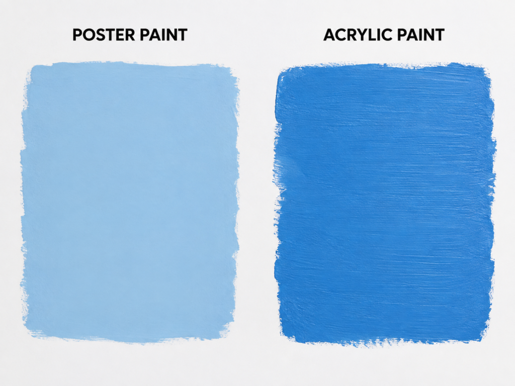
A simple blue swatch removes the distractions and lets the paint itself do the talking. The poster-paint sample looks pale, soft, and evenly spread, while the acrylic sample appears deeper and carries more visible brush direction. Even though both areas are blue, the finished surfaces feel like they belong to different kinds of project.
Why Poster Paint Looks Softer on Paper
Poster paint is often formulated to spread easily across paper and card. That can create a flatter, less demanding block of colour, especially when the paint has been diluted slightly or applied with a broad brush. The result suits backgrounds, signs, school displays, and quick colour studies because it reads clearly without needing a complicated build-up.
The softer blue also feels forgiving. Small variations do not become the centre of attention, which is helpful for beginners or large areas where perfect brush control is not the goal.
Why Acrylic Holds More Visible Movement
The acrylic side keeps more of the brush texture, giving the swatch greater depth and energy. This can be useful when the surface itself is part of the visual result. A visible stroke may suggest direction, layering, or a deliberate hand-painted finish rather than an accidental uneven patch.
Acrylic can also maintain stronger colour saturation as it builds. That matters when you want a bold background behind lighter shapes or when one coat needs to support additional details later.
What the Swatches Suggest for Real Projects
· Choose poster paint for paper signs, school displays, temporary decorations, and colour-mixing practice.
· Choose acrylic for canvas boards, wooden panels, craft objects, and paintings where texture should remain visible.
· Use a test swatch to check the dried colour because both types may look different after the water has evaporated.
· Avoid judging coverage only while the paint is wet; a second coat may change the result considerably.
For me, this is the clearest comparison of all. Poster paint gives you an easy coloured area. Acrylic gives you a painted surface with more physical presence.
A Daisy Study Reveals How Each Paint Handles Petals and Fine Details
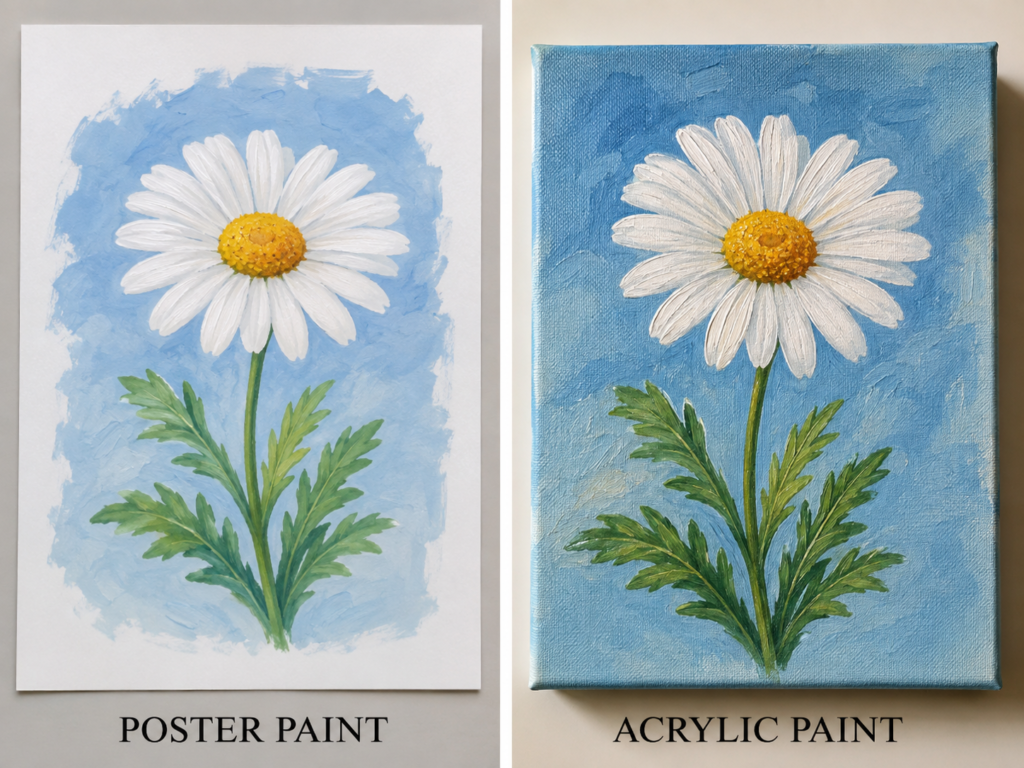
A white daisy against a blue ground is a useful test because the flower needs clean petals, a strong yellow centre, and enough green variation to keep the leaves from looking flat. The poster-paint version feels gentle and illustrative, while the acrylic version carries heavier texture and more defined shadows.
Poster Paint Keeps the Flower Light and Graphic
On paper, poster paint can create broad white petals without making the flower feel too heavy. The pale background and simpler leaf shapes give the whole study the look of a hand-painted poster or classroom botanical illustration. That lightness is part of its appeal.
The limitation is that repeated wet layers may disturb the colour underneath, especially with washable or rewettable formulas. It is usually better to plan the larger shapes first, allow them to settle, and then add only the details that are truly needed.
Acrylic Builds Stronger Highlights and Shadows
The acrylic flower feels more three-dimensional because the paint can sit on the canvas with greater body. White highlights remain visible over the blue, while darker greens can be placed beside lighter ones without everything blending into one middle shade.
That makes acrylic especially useful for petals, flower centres, and textured backgrounds. You can keep the simple daisy shape while giving it more visual weight through controlled layering.
Which Flower Style Suits Your Surface
· Use poster paint for greeting-card designs, classroom flower studies, paper crafts, and temporary wall displays.
· Use acrylic for canvas art, wood panels, decorative plaques, and paintings intended for longer display.
· Keep the poster-paint version simple so repeated brushing does not muddy the pale petals.
· Use acrylic sparingly in the centre of the flower; thick texture works best when it has a clear focal purpose.
I would not try to make the paper version imitate the canvas version exactly. The softer poster-paint finish is not a failure. It is a different visual language, and the flower looks calmer because of it.
A Landscape Comparison Shows the Value of Layering and Distance
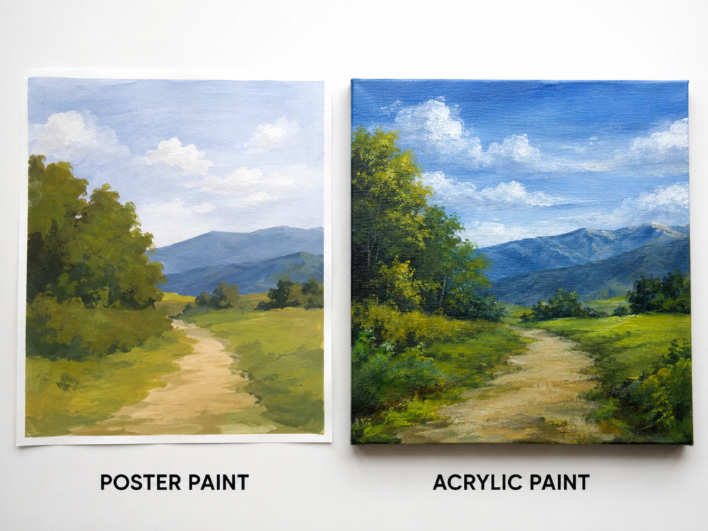
Landscapes ask more from paint than a single object does. The sky needs distance, the mountains need separation, the foreground needs texture, and the path has to guide the eye without becoming a hard stripe. The poster-paint landscape handles this with broad, simplified shapes, while the acrylic version uses stronger colour and denser layering.
Poster Paint Encourages Clear, Simplified Shapes
The paper landscape works because it does not chase every small leaf or cloud edge. Large areas of sky, mountain, grass, and path are kept readable. Poster paint suits this approach because it can cover a shape quickly and mix into muted colours without forcing the artist to create heavy texture.
This is a useful way for beginners to practise composition. You can study where the horizon sits, how the path narrows, and which shapes overlap before worrying about tiny details.
Acrylic Creates More Depth in the Foreground
The acrylic version has room for deeper greens, brighter highlights, and stronger contrast between the trees and the distant mountains. The canvas texture also helps the surface feel more layered, particularly where small brush marks suggest leaves, grass, and cloud edges.
Because dried acrylic layers are more stable, you can place highlights over darker passages and correct areas without reactivating the entire painting. That makes the paint more flexible for a landscape built over several sessions.
The Better Choice Depends on How Finished the Painting Must Feel
· Choose poster paint for composition practice, colour exercises, school landscapes, and quick paper studies.
· Choose acrylic for a finished canvas, a textured landscape, or a painting that needs repeated corrections and layers.
· Keep thin paper supported on a board if you use a lot of wet poster paint.
· Use fewer, more deliberate highlights in acrylic so the foreground does not become visually noisy.
The part I like here is that the poster-paint landscape still feels complete. It does not need acrylic-level texture to succeed. Its strength comes from clear shape relationships and an easy sense of distance.
A Painted Desk Organiser Tests Adhesion on a Practical Object
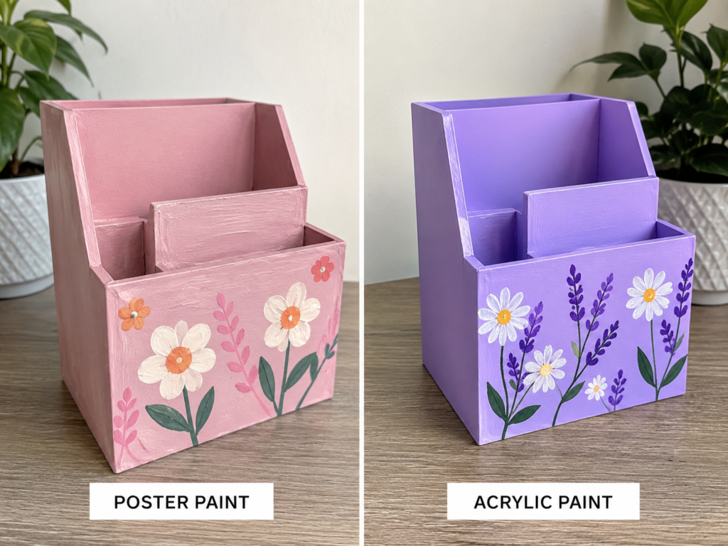
A desk organiser changes the comparison because the finished surface is no longer just for looking at. Pens, notes, and small tools will rub against the compartments, and the outside may be handled often. The poster-painted version can look cheerful, but the acrylic version is more naturally suited to repeated use.
Why Poster Paint Can Still Work for a Light-Use Makeover
Poster paint may be enough when the organiser is made from card, papier-mache, or another absorbent material and will remain in a dry indoor spot. Its opaque colour makes it easy to cover the base quickly, and simple flowers can be added without needing specialist tools.
The weakness appears at corners and edges. Those are the areas most likely to be rubbed by hands or desk items, so an unprotected poster-paint finish may show wear sooner than the front panel.
Acrylic Gives the Organiser a More Reliable Craft Finish
Acrylic makes more sense for wood, MDF, thick card, or a reused storage box that needs to stay presentable. It can create a firmer colour layer and support finer stems, leaves, and petal outlines without the same risk of the decoration softening during a later pass.
The stronger purple base also shows how acrylic can hold a vivid background while lighter flowers remain visible on top. That kind of colour separation is useful on practical objects where the design should stay clear from a normal viewing distance.
How to Choose for a Storage Piece
· Use poster paint on a lightweight card organiser intended for gentle indoor use.
· Use acrylic on wood, MDF, or a storage piece that will be touched and moved regularly.
· Keep paint away from sliding joints or tight-fitting sections that may stick when extra layers build up.
· Let each side dry before turning the organiser so the base does not mark the work surface.
I know it can feel tempting to paint every inner compartment, but that can create unnecessary rubbing. For a beginner version, I would concentrate the colour and flowers on the visible outer surfaces.
A Terracotta Pot Makes Durability and Moisture More Important
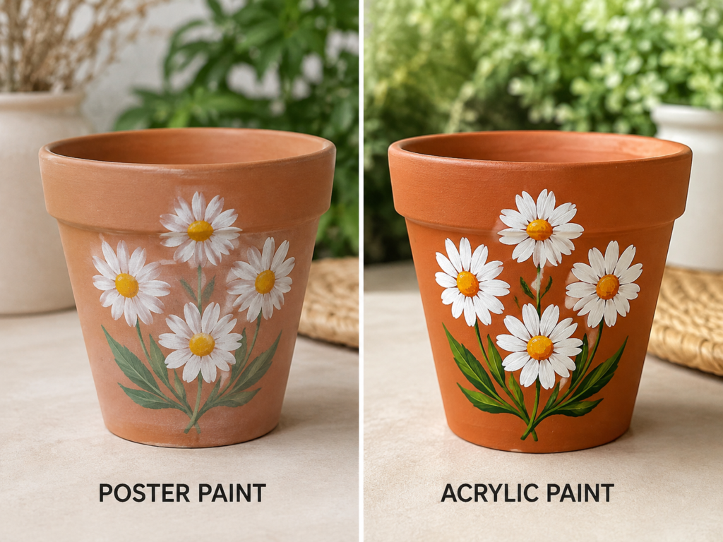
Terracotta is porous, textured, and closely connected with moisture, so it reveals the practical limits of paint very quickly. The poster-painted daisies look soft and slightly faded, while the acrylic version appears brighter and more clearly defined against the warm clay colour.
Poster Paint Gives a Gentle Decorative Effect
The softer flower arrangement can suit a pot used as an indoor cover pot or a dry decorative container. Poster paint allows the original clay tone to remain part of the look, and that slightly chalky softness can feel pleasant in a calm room.
Even so, this should be treated as a low-contact decorative finish. Water, wiping, or outdoor exposure may affect many poster paints, so the project needs realistic expectations from the start.
Acrylic Produces Clearer Flowers on the Clay Surface
The acrylic daisies hold stronger white petals and richer green leaves. That clarity is helpful on terracotta because the orange-brown base can otherwise dull pale colours. Acrylic also forms a more cohesive dried film, making it a more practical choice for a pot that will be handled.
Surface preparation still matters. Dusty clay can prevent neat adhesion, and moisture moving through the pot may affect any decorative coating. A cleaned, fully dry pot used in an appropriate setting gives the paint a better chance.
Use the Pot in a Way That Matches the Paint
· Choose poster paint for an indoor decorative pot, craft demonstration, or temporary seasonal display.
· Choose acrylic for a longer-lasting indoor planter or cover pot, especially when the design contains light details over dark clay.
· Avoid painting surfaces that will remain continuously wet or sit directly in pooled water.
· Keep drainage and plant care in mind; decoration should not interfere with how the pot functions.
To be honest, this is one comparison where appearance and practicality point in the same direction. The acrylic flowers look stronger because the paint is better suited to the demands of the object.
A Wooden Stool Shows Why Decorative Paint Must Respect Furniture Use
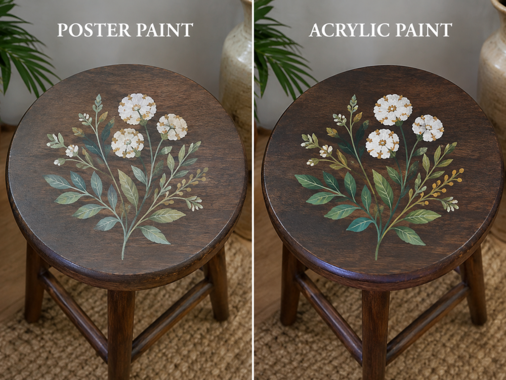
A round wooden stool offers a broad surface for a floral motif, but it is still furniture. The top may be touched, wiped, or used to hold objects. The poster-paint design looks muted and delicate, while the acrylic version has stronger leaves, clearer petals, and greater contrast against the dark wood.
The Poster-Paint Version Feels Like a Temporary Decorative Study
Poster paint can be used to test the flower arrangement, colour balance, and scale before a more permanent finish is attempted. On a dark wood surface, however, pale colours may need repeated applications, and the result can remain vulnerable to rubbing.
That makes poster paint more convincing as a planning medium or for a stool that is purely decorative. It is less convincing for a seat or table surface expected to receive regular contact.
Acrylic Supports Stronger Contrast on Dark Wood
Acrylic can hold brighter whites and greens over a dark base, especially when the design is built in controlled layers. The leaves can be separated with lighter veins, and the flower centres can remain readable instead of sinking into the wood tone.
It also suits the practical nature of a furniture surface more closely. The paint itself is not the only durability decision, but it gives the decoration a more stable foundation than ordinary poster paint.
Think About Whether the Stool Will Be Used or Displayed
· Use poster paint to plan a motif on paper or make a temporary decorative version of a display stool.
· Use acrylic for a wooden stool, small table, or furniture accent that needs a more dependable painted design.
· Repair loose joints before decorating; a flower cannot make unsafe furniture usable.
· Keep the central motif balanced and leave enough plain wood around it so the design does not feel crowded.
One detail I would not skip is checking the furniture itself before painting. A solid, clean stool is worth decorating. A loose one needs repair first, no matter how tempting the empty top may look.
A Bold Poster Board Highlights Flat Shapes and Graphic Colour
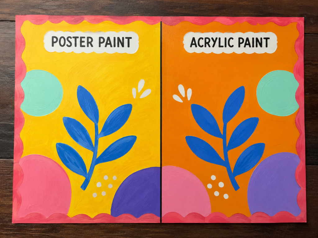
The final comparison returns both paints to a flat board filled with large circles, leaves, and bright backgrounds. This is where poster paint feels most naturally at home. The design depends on broad opaque shapes, clean contrast, and immediate visual impact rather than fine realism.
Poster Paint Suits Large Classroom-Style Graphics
The yellow background, blue branch, and oversized colour shapes can be blocked in quickly with poster paint. The surface feels playful and direct, which is exactly right for signage, project boards, event displays, and decorative paper work.
Because the shapes are large, the paint does not need to create sophisticated texture. Good spacing and strong colour relationships matter more than tiny brush details.
Acrylic Gives the Graphic Design a Firmer Finish
On the acrylic side, the colours look denser and more stable, with clearer separation between the orange ground and the blue leaves. Acrylic becomes useful if the board is made from wood, canvas board, or another surface meant to be kept and displayed for longer.
It can also make repeated shapes easier to refine because dry layers allow corrections without disturbing the whole background. That is helpful when a border, leaf edge, or circle needs to be sharpened after the first pass.
Choose According to the Life of the Display
· Choose poster paint for school boards, party signs, short-term displays, and low-cost paper decoration.
· Choose acrylic for reusable signs, canvas boards, wood panels, and display pieces intended to last.
· Plan the largest shapes before painting so the design stays balanced on both sides.
· Limit the palette enough that the colours feel connected rather than randomly collected.
The good thing is that this design does not need realism to work. Its success comes from confidence. Large shapes, a limited palette, and clear spacing do more than a dozen tiny decorations ever could.
A Practical Poster Paint vs Acrylic Paint Comparison
Poster paint is usually the easier choice for paper, card, school displays, quick colour studies, and temporary decorative work. It is often affordable, simple to mix, and friendly for broad opaque shapes. Many formulas are also designed with easy clean-up in mind, although product behaviour varies.
Acrylic is usually the stronger choice for canvas, wood, terracotta, craft storage, furniture accents, and projects meant to remain on display. Once dry, acrylic forms a more permanent and water-resistant film, which is why it appears more naturally suited to the practical objects in these comparisons.
· Choose poster paint when easy paper coverage and temporary display matter most.
· Choose acrylic when adhesion, layering, stronger contrast, and longer use matter more.
· Test both paints on a spare piece of the same material before committing to the main object.
· Treat the product label as the final authority because poster-paint and acrylic formulas vary between manufacturers.
Paint Choices That Can Undermine an Otherwise Good Project
Using poster paint on a high-contact object without considering wear is one of the most common problems. The colour may look convincing at first, yet corners, rims, and handles can show damage once the piece is moved or wiped. A temporary paint is not automatically a practical furniture finish.
Another mistake is assuming acrylic will solve poor surface preparation. Dust, grease, loose old paint, and damp terracotta can still weaken the result. Acrylic is more durable after drying, but it cannot turn an unsuitable or dirty base into a reliable surface by itself.
Too much water can also create trouble. Poster paint may become streaky and weak, while over-thinned acrylic may lose the body needed for even coverage. Add only enough water to improve flow, and test the mixture before spreading it across the main project.
Beginners sometimes keep brushing an area that has already started to dry. That can lift poster paint or leave obvious drag marks in acrylic. Place the colour, smooth it while it is workable, and then leave it alone until the next layer is genuinely ready.
Finally, copying the visual idea without considering the object’s function can lead to the wrong paint choice. A daisy on paper and a daisy on a plant pot are not the same technical project. The subject may match, but the surface and the future use must guide the material.
Frequently Asked Questions
Is poster paint the same as acrylic paint?
No. Both are commonly water-based while wet, but they use different binders and are intended for different kinds of work. Many poster paints are designed for paper, card, and temporary projects, while acrylic dries into a more permanent, water-resistant film.
Which paint is better for beginners?
Poster paint is often easier for young artists, classroom work, broad shapes, and colour-mixing practice. Acrylic is also beginner-friendly, but it rewards more careful brush cleaning and surface planning because the dried paint is harder to remove.
Can poster paint be used on wood?
It can colour wood for a temporary indoor craft or a practice design, especially if the surface is absorbent. For a wooden object that will be handled or kept long-term, acrylic is usually the more practical option.
Can acrylic paint be used on poster board?
Yes, although thick wet layers may cause lightweight board to bend or curl. Use controlled amounts of paint, support the board on a flat surface, and allow one area to dry before adding another heavy layer.
Which paint gives brighter colour?
That depends on the brand, pigment, surface, and number of coats. Acrylic often maintains stronger saturation and contrast in layered work, while poster paint can give bright, opaque colour very quickly on white paper.
Is poster paint waterproof after it dries?
Many poster paints are not intended to become waterproof and may soften or mark when exposed to moisture. Check the label of the specific product rather than assuming every poster paint behaves the same way.
Which paint is better for terracotta pots?
Acrylic is generally the more suitable choice for a decorative terracotta project because it forms a more durable film. The pot still needs to be clean and dry, and the decoration should match how the pot will be watered and used.
Do I need to seal acrylic paint on furniture?
That depends on the acrylic product, the surface, and how much contact the item receives. A decorative panel may need nothing extra, while a stool or table top may benefit from a compatible protective finish after the paint has fully cured.
Can I mix poster paint with acrylic paint?
The two may physically mix because both are often water-based while wet, but the blend may not perform like either product was intended to perform. For predictable durability and colour, it is better to keep the paint systems separate unless you are only experimenting on a practice surface.
Let the Surface Choose the Paint
The most useful lesson in poster paint vs acrylic paint is that the subject of the picture does not decide the material. A daisy can be painted with either one. A landscape can be painted with either one. What changes the decision is whether the surface is paper, canvas, wood, terracotta, or furniture, and whether the finished piece is temporary or expected to last.
Poster paint remains a sensible choice for quick colour, paper crafts, displays, practice work, and bold graphic projects. Acrylic earns its place when stronger layering, reliable adhesion, richer contrast, and a more permanent finish matter. Neither needs to replace the other.
Begin with the project you actually have in front of you, not the paint you wish would work everywhere. Which surface are you planning to paint first?