Tempera and acrylic can look surprisingly similar while they are still wet. Both can give you bright colour, both can be brushed onto paper, and both can handle simple flowers, landscapes, and decorative motifs. The real difference appears later, when you begin layering, touching the surface, moving the object, or deciding whether the finished piece needs to last beyond a short classroom-style project.
I’m always more interested in how a paint behaves on the actual object than how attractive it looks in the container. A soft, matte finish may be exactly right for a paper study, while a stronger acrylic film may suit a reused pot, a small stool, or a desk organiser that will be handled often. I don’t think either paint needs to win every comparison. They simply solve different problems.
One small clarification helps before going further. Here, tempera means the common ready-mixed craft or school tempera seen in everyday projects, not traditional egg tempera used in fine art. That practical comparison makes the differences in coverage, layering, surface choice, and durability much easier to understand.
Understand What Changes After the Paint Dries
Ready-mixed tempera usually dries with a flat, soft appearance. It often remains visually gentle, and some formulas can be more sensitive to rubbing or moisture than acrylic. That makes it comfortable for paper studies, temporary display work, children’s art, and projects where easy handling during the painting session matters more than long-term surface strength.
Acrylic dries into a more durable paint film. Depending on the formula and the way it is applied, it may appear matte, satin, or slightly glossy, but it generally holds its colour and shape more firmly once dry. That is why acrylic is usually the more dependable option for rigid craft objects, canvas, wood, and pieces that may be touched or moved repeatedly.
Match the Paint to the Surface and the Purpose
Paper, canvas, wood, terracotta, and reused cardboard organisers all behave differently under paint. Paper absorbs moisture quickly. Canvas accepts repeated layers.
Bare terracotta can pull water from the paint. Painted wood may need a surface that can cope with handling. The best choice becomes clearer when you stop asking which paint is better and start asking what the surface needs.
Purpose matters just as much. A colour exercise does not need the same durability as a flower pot. A landscape study kept in a sketch folder does not face the same wear as a small stool. I’d rather choose a modest paint that suits the job than force a more expensive or more permanent material into every project.
Decide Whether You Need Easy Experimentation or Lasting Finish
Tempera is often forgiving for quick experiments because it encourages broad shapes, simple mixing, and an uncomplicated matte result. Acrylic usually rewards more deliberate layering, stronger contrast, and surfaces that need a finished decorative presence. The good thing is that the subject can stay the same while the paint changes the entire mood.
That is exactly what the comparison projects reveal. A leaf can feel like a gentle colour study in tempera and a richer botanical panel in acrylic. A painted pot can look softly handmade with tempera and more finished with acrylic. Neither result is automatically wrong; the intended use decides which one makes more sense.
Compare a Leaf Study on Paper with a Layered Botanical Canvas
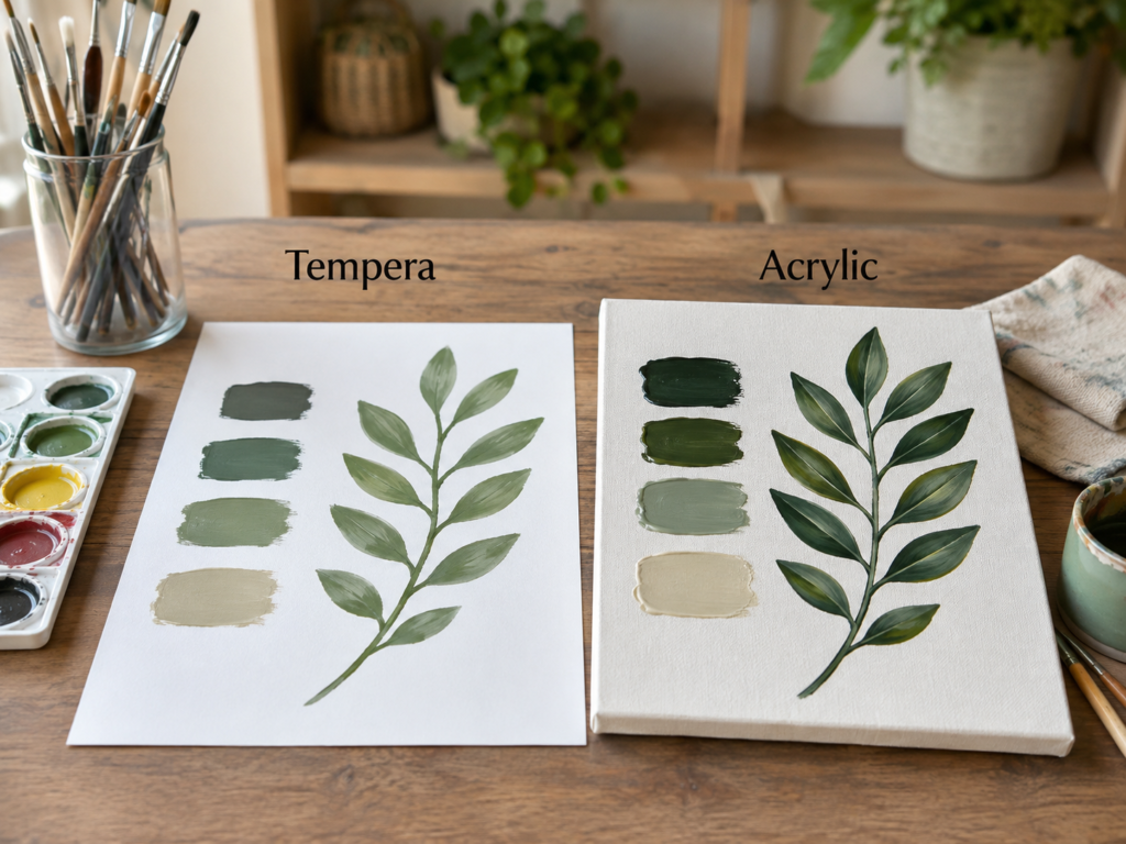
A leafy branch with nearby colour swatches strips the comparison back to the basics. On the tempera side, the pale greens sit quietly on paper and the leaves remain soft, simple, and easy to read. On the acrylic side, the darker greens build a stronger branch on canvas, with more visible depth through the leaves and a firmer relationship between the paint and the textured base.
This pairing is especially useful because the subject is not doing all the work. There are no complicated petals or dramatic shadows to distract from the paint itself. You can see how colour strength, surface texture, and layering change even when the composition stays calm.
Why Tempera Feels Natural for a Paper Colour Study
Tempera suits this kind of exercise because paper does not need a heavy paint film. The muted swatches and light botanical shape feel like a study rather than a final decorative object. That can be helpful when you are testing colour families, practising leaf shapes, or making a draft before moving to a more permanent surface.
The flatter finish also reduces glare, so the eye notices the relationship between the colours instead of the shine. If the goal is learning rather than displaying, that simplicity is a real advantage.
How Acrylic Builds More Depth on Canvas
The acrylic branch uses stronger darks and more layered leaf shapes. Canvas supports that treatment because the paint can sit across the weave, hold firmer edges, and accept additional strokes without the surface becoming as fragile as ordinary paper.
Acrylic also makes it easier to create contrast inside one leaf. A dark base, a lighter centre stroke, and a small highlight can remain distinct. The result feels more finished because the paint film supports those separate layers.
What the Swatches Tell You Before a Larger Project
The four swatches are not just decoration. They show how the same general palette can feel dusty and quiet in tempera but deeper and more saturated in acrylic. This is why I always like a test area before committing to a full panel or object.
You may find that a colour you enjoy in tempera looks too strong in acrylic, or that a gentle green becomes far richer once it dries on canvas. A small test helps you adjust the palette before the whole piece starts arguing with itself.
The Better Choice for This Botanical Idea
Tempera makes sense for sketchbook studies, classroom exercises, colour planning, and paper-based botanical art that will stay protected. Acrylic is the stronger choice for canvas panels, wooden boards, or decorative pieces where the leaves need to hold up visually and physically.
Practical Takeaways for This Comparison
· Choose tempera for quick paper studies and easy colour testing.
· Choose acrylic for a layered botanical panel with stronger contrast.
· Use heavier paper if the tempera application contains much water.
· Let canvas texture support the acrylic rather than trying to smooth every brush mark away.
For me, the biggest lesson here is not that darker paint is automatically better. It is that acrylic gives the darker palette enough structure to feel intentional, while tempera keeps the softer study pleasantly uncomplicated.
Paint the Same Daisy with Soft Tempera and Textured Acrylic
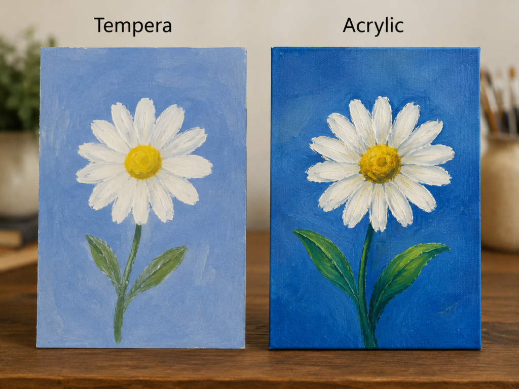
A white daisy against blue makes every difference in opacity and texture easier to notice. The tempera version has a calm, poster-like simplicity. The petals are broad, the background feels flat, and the flower reads quickly. The acrylic version is more textured, with stronger blue, thicker petal strokes, and a centre that feels built up rather than simply filled in.
This is a useful beginner comparison because the subject is familiar. You already know what the flower should look like, so your attention naturally moves toward the paint handling instead of the drawing challenge.
Why Tempera Keeps the Flower Clear and Approachable
The tempera daisy works because it does not chase realism. Broad petals, a simple yellow centre, and two green leaves are enough. That directness suits children’s art, teaching demonstrations, signs, and decorative paper work where the shape matters more than tiny tonal changes.
The pale blue background also helps the white petals remain visible without needing many layers. This is where tempera can feel very friendly: the painting stays readable even when the brushwork is loose.
How Acrylic Adds Weight to Petals and the Flower Centre
The acrylic petals carry more visible ridges and slightly warmer shadows. That texture gives the flower a physical presence on canvas. The yellow centre can also hold several tones, which makes it feel rounded rather than flat.
Acrylic is more comfortable with that kind of repeated layering. You can place a lighter stroke over a dry darker one, then add another small highlight without dissolving the earlier work in the same way a more water-sensitive paint might.
The Background Changes the Whole Impression
The softer tempera blue gives the flower a gentle, classroom-poster feeling. The stronger acrylic blue creates a more dramatic contrast and makes the white petals stand forward. The flower drawing is similar, but the background decides whether the result feels quiet or bold.
I know it can feel tempting to focus only on the flower, but the large surrounding colour often controls the mood more than the subject itself.
Which Paint Fits the Daisy Project Best
Use tempera when you want an easy paper flower study, a simple decorative sign, or a low-pressure painting session. Use acrylic when you want the daisy to remain on canvas or another rigid surface and you want visible texture to become part of the finish.
Practical Takeaways for This Comparison
· Tempera suits broad petals and simple flat colour.
· Acrylic suits raised brushwork and layered highlights.
· A pale background makes a beginner tempera flower easier to control.
· A stronger acrylic background can support brighter white petals and deeper greens.
I don’t think the tempera flower needs more detail. Its strength is the clear shape. Adding too many small strokes could make the petals muddy instead of more convincing.
See How Each Paint Handles a Mountain Landscape
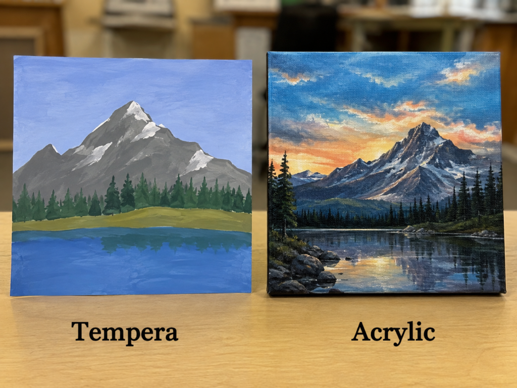
Landscape painting exposes the difference between simple colour blocking and deeper layered atmosphere. The tempera mountain scene uses broad grey slopes, a line of dark trees, a green bank, and blue water. The acrylic scene builds a more dramatic sunset, sharper mountain planes, reflections, rocks, and several layers of distant land.
Both approaches can teach useful skills. The first helps you organise a scene into large shapes. The second asks you to manage depth, value changes, and repeated layers across a surface that can support them.
Why Tempera Helps Simplify a Complicated View
Mountains can become overwhelming very quickly. Tempera encourages you to reduce them to a few main values: sky, mountain, snow, trees, grass, and water. That is excellent practice because a believable landscape begins with good large shapes, not with dozens of tiny details.
The flatter finish also makes the value groups easy to compare. You can quickly see whether the mountain separates from the sky and whether the trees are dark enough to stand in front of it.
What Acrylic Adds to Distance and Light
The acrylic landscape uses many more transitions. Warm sky colour sits behind cool mountains, bright edges catch the last light, and the lake reflects several tones instead of one blue. Acrylic supports that build-up because dried layers can remain in place while new colour is added above them.
That makes it easier to create depth. Dark foreground trees can sit over lighter distant slopes, and small bright highlights can be added after the major shapes have dried.
Choosing Between a Study and a Finished Display Piece
The tempera version feels like a strong planning study. It can help you decide whether the composition works before committing more time. The acrylic version feels suited to display because the surface and paint can hold repeated detail and contrast.
There is no shame in stopping at the study stage. A simple landscape can be more useful for learning than a complicated one filled with corrections.
The Best Role for Each Paint in Landscape Work
Tempera is practical for composition studies, value exercises, school projects, and quick scenery. Acrylic is better for layered canvas landscapes, stronger texture, detailed reflections, and finished decorative work that needs a more durable surface.
Practical Takeaways for This Comparison
· Use tempera to organise the scene into large readable shapes.
· Use acrylic to build distant layers, highlights, and reflections.
· Keep the horizon and major mountain silhouette clear before adding details.
· Avoid adding tiny trees until the large value pattern already works.
The part I like about the simpler version is that it shows the structure of the scene. The acrylic painting has more drama, but the tempera study makes the underlying decisions easier to see.
Compare Tempera and Acrylic on Painted Terracotta Pots
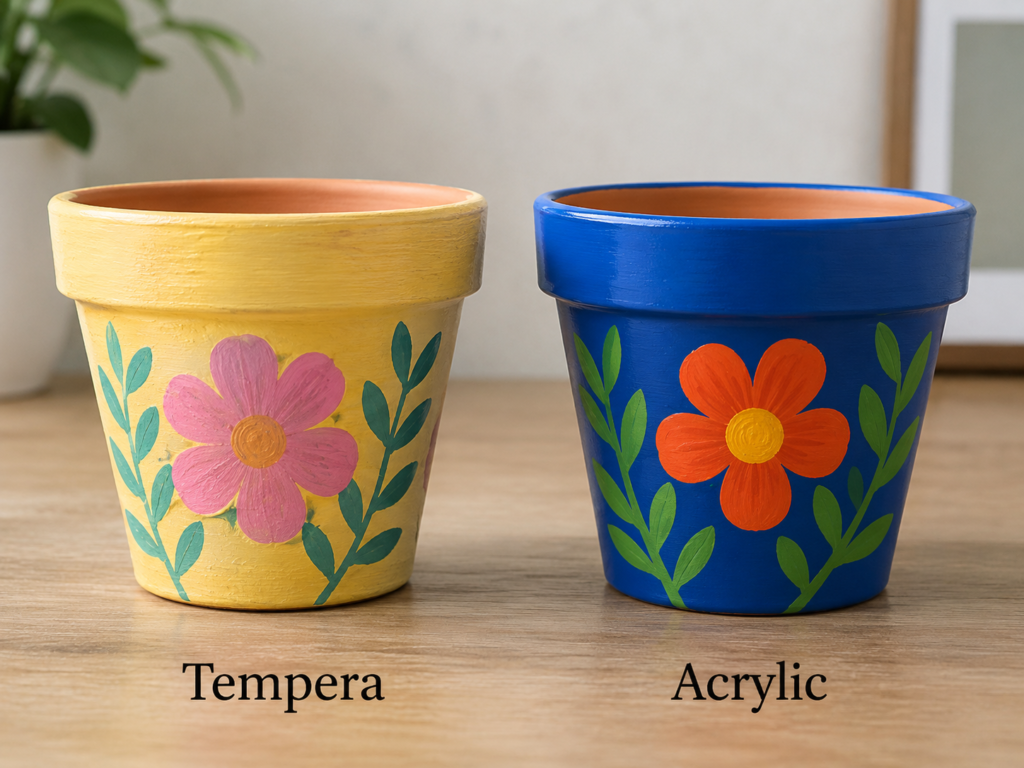
The flower pots move the comparison away from paper and canvas and onto a practical object. On the tempera side, the yellow base and pink flower have a soft, slightly handmade finish. On the acrylic side, the blue pot and orange flower look denser, brighter, and more integrated with the object.
This is where durability becomes more important than brush style. A pot may be lifted, wiped, watered around, and placed near sunlight or moisture. The surface has to do more than simply hold colour for a photograph.
Why Tempera Can Work for a Temporary Decorative Pot
Tempera can create a pleasant indoor display piece when the pot is kept dry and handled gently. The soft yellow, pale pink, and simple green leaves suit a temporary seasonal arrangement or a children’s craft that is meant to be enjoyed rather than heavily used.
Even so, tempera is not the paint I would trust first for a working planter. The surface may remain more vulnerable to rubbing and water, especially if the formula is designed mainly for paper craft.
Why Acrylic Is Usually More Practical on Terracotta
Acrylic forms a firmer film and gives the blue base stronger coverage. The orange flower stays crisp against that dark colour, and the leaves remain clear instead of sinking into the background.
For a pot that will be moved or lightly cleaned, that stronger film is useful. Surface preparation and a suitable protective finish may still matter, particularly if the pot will face outdoor conditions, but acrylic begins from a more practical position.
Colour Contrast Matters More on a Three-Dimensional Object
A pot curves away from the viewer, so the motif needs enough contrast to remain visible from several angles. The tempera palette feels soft and friendly. The acrylic palette is much bolder, which helps the flower stay readable as the pot turns.
Neither palette is wrong, but the blue-and-orange contrast has more visual strength for an object that may sit among green leaves.
Which Paint I Would Choose for a Pot
Use tempera only for a protected, low-contact, temporary decorative pot or for a practice design on a pot that will not be exposed to moisture. Choose acrylic for most indoor decorative pots and for any version intended to last longer or be handled more often.
Practical Takeaways for This Comparison
· Keep tempera-painted pots indoors and away from splashing water.
· Use acrylic when the pot needs stronger colour and a firmer finish.
· Do not paint surfaces that directly contact soil or drainage water unless the material system is suitable for that use.
· Test the base coat on the terracotta because porous clay can absorb paint unevenly.
To be honest, this is one comparison where practicality matters more than the softer look. A pot is still an object in use, and that usually pushes the decision toward acrylic.
Refresh Small Wooden Stools with Flat or More Durable Colour
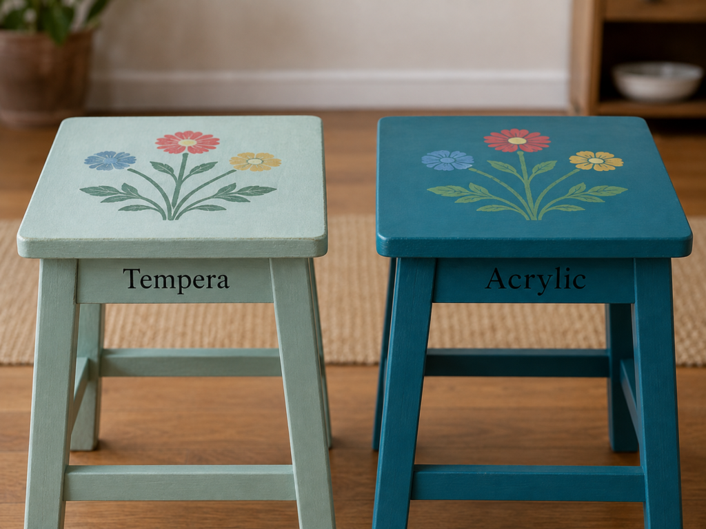
Small stools make the durability question even clearer. The tempera version uses a pale green base with a light floral motif. The acrylic version uses deeper teal with stronger flowers. Both can look attractive in a room, but a stool faces pressure, friction, cleaning, and repeated contact in a way that a paper painting never does.
Before painting any stool, the structure matters first. Loose joints, cracked wood, or weak legs need repair before decoration. Paint can change the appearance, but it cannot make unsafe furniture sound.
What Tempera Offers as a Colour Mock-Up
The pale tempera version is useful as a visual experiment. It shows how a soft green and faded floral arrangement might look on the object. If the stool is only a display prop, the low-sheen effect can feel calm and cottage-like.
For a working seat or step, however, tempera alone would usually be too vulnerable. Rubbing shoes, hands, and cleaning cloths would ask more from the finish than a classroom-style paint is designed to provide.
Why Acrylic Makes More Sense for a Used Stool
The deeper acrylic colour looks more solid across the legs and top. It also supports cleaner flower shapes because the base is less likely to lift or reactivate while the motif is added.
Acrylic is still not a substitute for good furniture preparation or an appropriate protective topcoat when one is needed. Even so, it is the more logical paint of the two for a surface that will receive regular contact.
How Colour Changes the Visual Weight of the Furniture
The light tempera stool feels airy and informal. The dark acrylic stool feels more grounded and substantial. That difference is not only about durability; it also changes how the object sits in the room.
A small stool can disappear into a pale interior or become an accent through stronger colour. The right choice depends on whether you want quiet support or a noticeable painted piece.
The Sensible Choice for Furniture
Use tempera for planning colour, temporary stage props, or a decorative object that will not be used as seating. Choose acrylic for a craft stool or low-contact furniture accent, provided the wood is prepared correctly and the finished surface is suitable for the intended use.
Practical Takeaways for This Comparison
· Repair weak joints before painting any stool.
· Treat tempera as a temporary decorative option rather than a working furniture finish.
· Use acrylic for stronger coverage and better resistance to ordinary handling.
· Keep the floral motif away from areas where repeated friction will quickly wear it down.
I know the softer stool looks appealing, but a pretty surface is not enough if the piece is meant to carry weight. Function has to come before finish here.
Decorate a Reused Desk Organiser with Gentle or Bold Paint
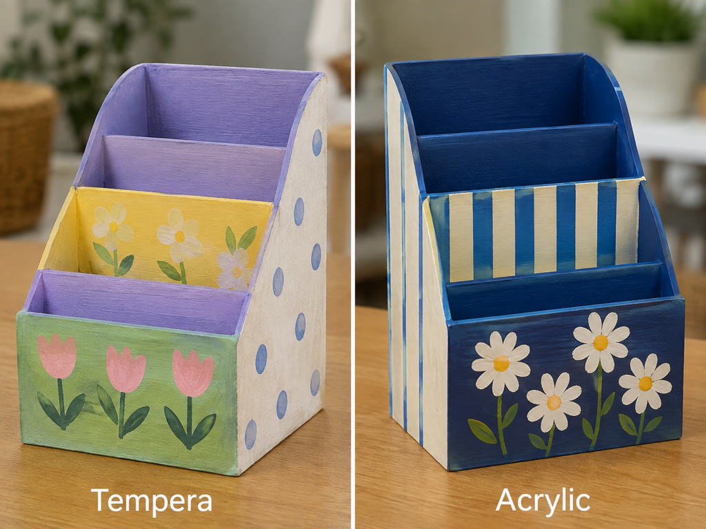
A compartment organiser is a practical reuse project because an old wooden or thick-cardboard holder can become storage for letters, notebooks, brushes, or craft supplies. The tempera version uses pastel blocks, tulips, dots, and simple flowers. The acrylic version uses navy, cream stripes, and crisp daisies.
The comparison shows how the paint changes not only the finish but also the visual organisation of the object. Soft colours make the compartments feel playful, while stronger contrast makes the structure feel cleaner and more deliberate.
Why Tempera Suits a Lightly Used Cardboard Organiser
If the organiser is made from thick card and will hold lightweight paper, tempera can be a reasonable decorative choice. It gives broad coverage, supports simple motifs, and keeps the project approachable for a beginner or younger maker.
The main risk is moisture. Cardboard can warp if the paint is applied too wet, and repeated handling may rub the finish. Thin coats and a protected location matter.
How Acrylic Creates a Stronger Graphic Finish
The acrylic organiser uses dark blue to unify the compartments. Cream stripes create order, while white daisies remain crisp against the base. That stronger contrast makes the object feel less like a temporary classroom craft and more like a finished desk accessory.
Acrylic also makes more sense when the organiser is wooden or will be handled frequently. The firmer paint film gives the edges and front panels a better chance of staying presentable.
Let the Construction Material Guide the Paint Choice
A cardboard organiser and a wooden organiser may look similar, but they do not react to moisture in the same way. Tempera can be gentle enough for card if used carefully. Acrylic can also work, but heavy wet layers may still distort weak card.
On wood, acrylic usually has the advantage because the surface can support stronger coverage and longer use. This is where the material underneath matters more than the pattern on top.
The Better Choice for Everyday Storage
Tempera works for a light-use paper organiser, a short-term school project, or a decorative prototype. Acrylic is the better choice for a wooden desk organiser, a frequently handled storage piece, or a version that needs sharper stripes and stronger floral details.
Practical Takeaways for This Comparison
· Use thin tempera coats on cardboard to reduce warping.
· Use acrylic for wooden organisers and higher-contact storage.
· Paint inside compartments only when the finish will not stick to stored papers or objects.
· Keep the pattern simple around edges that receive frequent handling.
The part I would keep simple is the inside. Decorative colour is useful, but too much thick paint in narrow compartments can make the organiser less practical.
Compare Flat Geometric Colour with Richer Acrylic Blocks
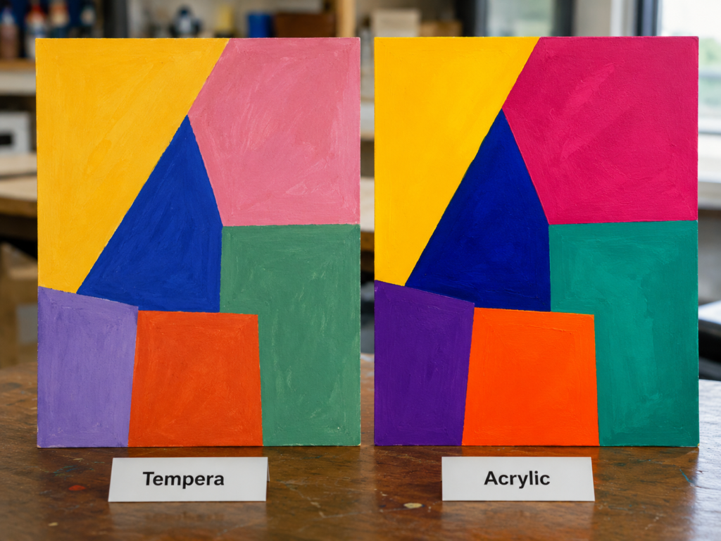
Large geometric shapes make colour behaviour impossible to hide. On the tempera panel, yellow, pink, blue, green, purple, and orange appear slightly softer and more visibly brushed. On the acrylic panel, the same general arrangement feels more saturated, with cleaner separation between shapes and a stronger overall surface.
This is a useful final comparison because there is no detailed subject to distract the eye. The success depends on coverage, edge control, and the relationship between the colours.
Why Tempera Works for Colour Planning and Poster Design
Tempera is comfortable in large, simple blocks. It is useful for experimenting with proportion, deciding which colours sit well together, or creating a temporary poster-style panel. The slight variation inside each shape can even make the piece feel handmade rather than mechanically flat.
Because the paint is usually less durable, the panel is best kept on paper, card, or another protected surface. It can be a finished study without needing to behave like a permanent wall panel.
How Acrylic Strengthens Edges and Saturation
The acrylic version holds deeper blue, brighter magenta, stronger orange, and a clearer teal. Those colours create more visual pressure, so the panel feels bolder even though the geometry is similar.
Acrylic can also support cleaner corrections. Once one shape is dry, a neighbouring colour can be adjusted more confidently. That helps when the composition relies on sharp meetings between large blocks.
What Brush Texture Adds to Abstract Work
Neither panel needs to be perfectly smooth. In tempera, visible brush variation softens the shapes. In acrylic, thicker brush texture can add energy while the stronger colour keeps the design from feeling weak.
I’d avoid overworking both surfaces. Repeated brushing can create muddiness in tempera and unwanted ridges in acrylic. A confident second coat is often better than endless small corrections.
Choosing the Paint for a Geometric Panel
Use tempera for colour exercises, temporary posters, classroom displays, and quick composition studies. Use acrylic for a lasting board or canvas panel where saturation, clean edges, and a stronger finish are central to the design.
Practical Takeaways for This Comparison
· Tempera is useful for fast colour arrangement and poster-style studies.
· Acrylic is stronger for display panels and bold saturated blocks.
· Plan the large shapes before painting so awkward gaps do not appear later.
· Let one area dry before correcting the edge beside it.
A little brush texture helps both versions. The goal is not to erase every sign of the hand; it is to keep the colour blocks clear enough that the composition still feels controlled.
A Quick Way to Choose Between Tempera and Acrylic
Choose tempera when the project is primarily about experimentation, paper-based design, teaching, quick colour studies, or temporary display. It is especially useful when you want a flat finish and an easy, low-pressure way to test shapes and palettes.
Choose acrylic when the surface is canvas, wood, terracotta, or another rigid craft base that needs stronger colour and a firmer dried film. Acrylic is also the better fit when the project will be touched, moved, layered, or displayed for longer.
· Paper study or classroom poster: tempera is often enough.
· Canvas artwork or layered landscape: acrylic is usually more suitable.
· Temporary decorative object: tempera may work if kept dry and protected.
· Handled pot, stool, organiser, or display panel: acrylic is generally the safer practical choice.
· Traditional egg tempera painting: treat it as a separate medium from ready-mixed classroom tempera.
Paint-Choice Errors That Make Simple Projects Harder
The first mistake is assuming that every water-based paint behaves the same once dry. Tempera and acrylic may both rinse from brushes with water while wet, but the dried surfaces can respond very differently to rubbing, moisture, and repeated handling. A project that will be used as an object needs more than attractive wet colour.
Another problem is putting too much water into tempera on weak paper or cardboard. The surface can ripple, soften, or lose its shape. A better approach is to use a sturdier base, apply thinner coats, and let each area settle before adding more moisture.
People also use tempera on furniture or working plant pots because the first coat looks pleasant. The difficulty appears later, when the object is wiped, splashed, or touched repeatedly. I’d use the tempera version as a colour mock-up and move to a more suitable finish for the final working object.
Acrylic creates its own problems when it is applied too thickly without a plan. Heavy ridges can make geometric edges untidy, fill the fine texture of an object, or create awkward lumps around compartment corners. Strong paint does not mean unlimited paint.
Skipping surface preparation is another avoidable error. Dust, loose old paint, grease, and weak furniture joints do not disappear under colour. Clean the surface, check its condition, and repair anything structural before decorating.
Finally, many projects become muddy because the painter keeps brushing half-dry colour. Tempera can lift and mix into the new layer, while acrylic can form rough dragged texture. Let the area dry, then make one deliberate correction instead of ten nervous ones.
Frequently Asked Questions
Is tempera paint the same as egg tempera?
No. The common ready-mixed tempera used for school and craft work is different from traditional egg tempera, which uses egg yolk as a binder and follows a much more specialised painting method. This comparison refers to the common craft type shown in the projects.
Which paint is easier for a beginner?
Tempera often feels easier for quick paper work because it supports simple flat shapes and low-pressure experimentation. Acrylic is also beginner-friendly, but its faster-setting layers and stronger surface can require a little more planning.
Can tempera paint be used on canvas?
It can be used for a study or temporary experiment, but it may not behave like a permanent canvas paint. Acrylic is usually the more suitable choice when you want the canvas piece to remain durable and accept repeated layers.
Can I use tempera paint on wood?
You can use it for a temporary decorative effect or a low-contact display object. For wood that will be handled, cleaned, or used as furniture, acrylic or another paint system designed for the purpose generally makes more sense.
Why does acrylic colour look stronger?
Acrylic often dries into a firmer film that supports deeper saturation and repeated layering. The exact result depends on the paint quality, pigment, colour, and surface, so a swatch test is still useful.
Which paint is better for children’s projects?
Ready-mixed tempera is widely used for simple paper and classroom art because it is easy to spread and gives clear flat colour. Always follow the product label and supervise children according to the tools and materials involved.
Will tempera paint wash off a flower pot?
It may be vulnerable to moisture and rubbing, especially if it is a classroom-style formula. A tempera-painted pot is best treated as a protected indoor display item rather than a regularly watered working planter.
Does acrylic need a protective coating?
Sometimes the project benefits from one, especially on high-contact objects, but the right finish depends on the surface and intended use. A clear coating cannot fix poor preparation or make an unsafe furniture piece suitable for use.
Which paint is better for a desk organiser?
Tempera can work on a lightly used cardboard organiser if applied sparingly. Acrylic is generally better for wood or a frequently handled organiser because it gives stronger colour and a firmer dried surface.
Let the Project Decide Which Paint Belongs on the Brush
The most useful lesson in tempera paint vs acrylic paint is that the subject does not decide the medium on its own. A daisy can work in both. A mountain can work in both. Even a pot or stool can be coloured with either paint for a short experiment. The real decision comes from the surface, the level of handling, and how long you expect the result to remain useful.
Tempera gives you an easy way to test colour, simplify shapes, and create flat paper-based work without making every painting feel precious. Acrylic becomes more convincing when you need stronger layers, richer contrast, or a surface that will be displayed and handled as a finished object.
For me, the best starting point is one small swatch or one simple flower. Then you can see how the paint dries on your chosen surface before committing to the whole project. Which object would you test first: a paper study, a reused organiser, or a small painted pot?