Some paint choices look simple until you put the brush down on the wrong surface. A floral design that feels smooth and durable on a metal watering can may behave very differently on canvas, and a pattern that works neatly on a terracotta pot may not give the same result on painted furniture.
That’s why I don’t think enamel vs acrylic paint is only a materials question. It’s really a surface question, a finish question, and sometimes even a patience question.
I always find it useful to think about what the painted object has to do after the decoration is finished. Will it be handled often. Will it stay indoors. Does it need to resist moisture.
Do you want a hard glossy finish or a softer painted look. Those details matter more than people expect, because both paints can look attractive at first while performing very differently over time.
What makes this comparison especially helpful is that the same kinds of motifs appear across very different bases. Leaves, flowers, swatches, stencil work, daisies, and bold abstract shapes all show how enamel and acrylic behave once they leave the container and meet the object. The designs may echo each other, but the paint chemistry, finish, feel, and ideal use are not the same at all.
Understand What Each Paint Is Meant to Do
Enamel paint is generally chosen when people want a hard-wearing finish, a smoother protective coat, or a more polished surface on metal, wood, ceramics, or furniture-style objects. It often gives a tougher film and can dry with a shinier or more sealed appearance, depending on the formula.
Acrylic paint is usually loved for its flexibility, quicker handling, easier layering, and broad usefulness on craft surfaces, canvas, paper, wood, and decorative items. It tends to feel more approachable for art and mixed craft projects, especially when you want painterly effects or an easier clean-up routine.
Think About the Surface Before You Think About the Colour
This is where the best paint decision usually begins. A porous terracotta pot, a primed canvas, a sealed side table, and a glossy ceramic pitcher do not ask the same thing from paint. Even when the motif is identical, the base changes how the paint sits, how it bonds, and how the finished result feels in the hand.
I know it can feel tempting to choose the paint you already own, but a little thought here prevents a lot of disappointment later. The surface usually tells you more than the label colour ever will.
Decide Whether Durability or Ease Matters More for This Project
Sometimes enamel wins because you want a stronger, more protective finish on a practical item. Other times acrylic wins because the project is more decorative, more art-based, or simply easier to complete when you need layering, colour mixing, and a less demanding working rhythm.
For me, that’s the most helpful way to approach enamel vs acrylic paint. One isn’t universally better. The useful question is what the finished object needs to survive and how you want it to look once it does.
Paint Leaves on a Watering Can or on Canvas
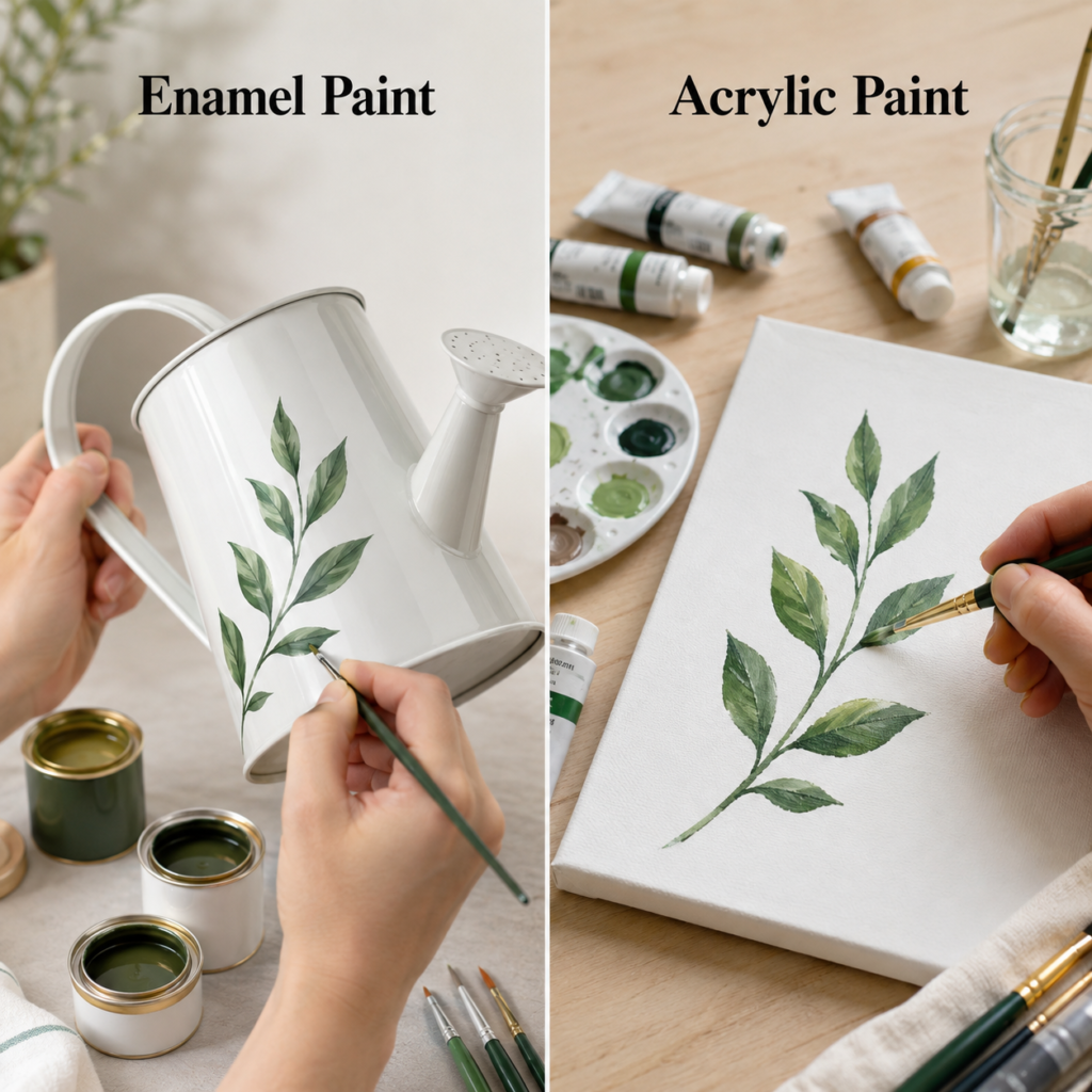
A simple leafy stem is a surprisingly good comparison because the design itself is calm and uncomplicated. That makes the surface and the paint behaviour much easier to notice.
On the left, the leaves are painted onto a metal watering can with enamel paint. On the right, the same botanical feel appears on a canvas panel with acrylic paint. Even before you think about technique, the object has already changed the purpose of the paint.
Why the Watering Can Suits Enamel
A watering can is the kind of object that benefits from a coating with presence. Metal surfaces often need paint that bonds firmly and leaves a more sealed feeling behind, especially if the item will be carried, wiped, or used near moisture. Enamel fits that role well because it is associated with a tougher finish and a more furniture-like or utility-friendly result.
The leaf design also works nicely here because enamel can help the decoration feel integrated with the object rather than sitting on it like a temporary craft layer. That matters when the item is meant to remain useful, not just decorative.
What Acrylic Does Better on Canvas
The acrylic version on canvas behaves more like art from the start. Canvas welcomes brush control, soft blending, and small tonal shifts in a way that feels very natural for botanical painting.
You can build the leaves gradually, adjust the depth of the greens, and keep the branch looking fresh and hand-painted without needing the harder finish that a metal object might require.
There is also more freedom in the surface feel. A canvas piece can remain clearly painterly, and that’s often an advantage rather than a flaw. You’re not trying to protect a tool or a household object here. You’re creating a decorative painted panel.
The Finish You’d Notice in Real Use
If you handled both items, the difference would likely feel obvious. The enamel side would usually read as smoother, more sealed, and more object-focused. The acrylic side would usually feel more matte, more textured, and more like painted artwork.
That doesn’t mean canvas can’t be durable or that enamel can’t be artistic. It simply means the strengths are showing up in different ways. One supports practical use with decoration. The other supports decoration as the main purpose.
When I’d Choose Each One
· Choose enamel for a metal watering can, bucket, tray, or similar object that may need a tougher decorative finish.
· Choose acrylic for a botanical canvas, a framed panel, or a practice painting where blending and layering matter more than protective coating.
· Use enamel when the object itself remains part of daily life.
· Use acrylic when the painted motif is meant to be viewed as art.
One detail I wouldn’t ignore here is moisture. Even if the watering can becomes mostly decorative, it still belongs to a category of object that benefits from a more resilient paint choice.
Compare Floral Painting on a Pitcher and on a Canvas Panel
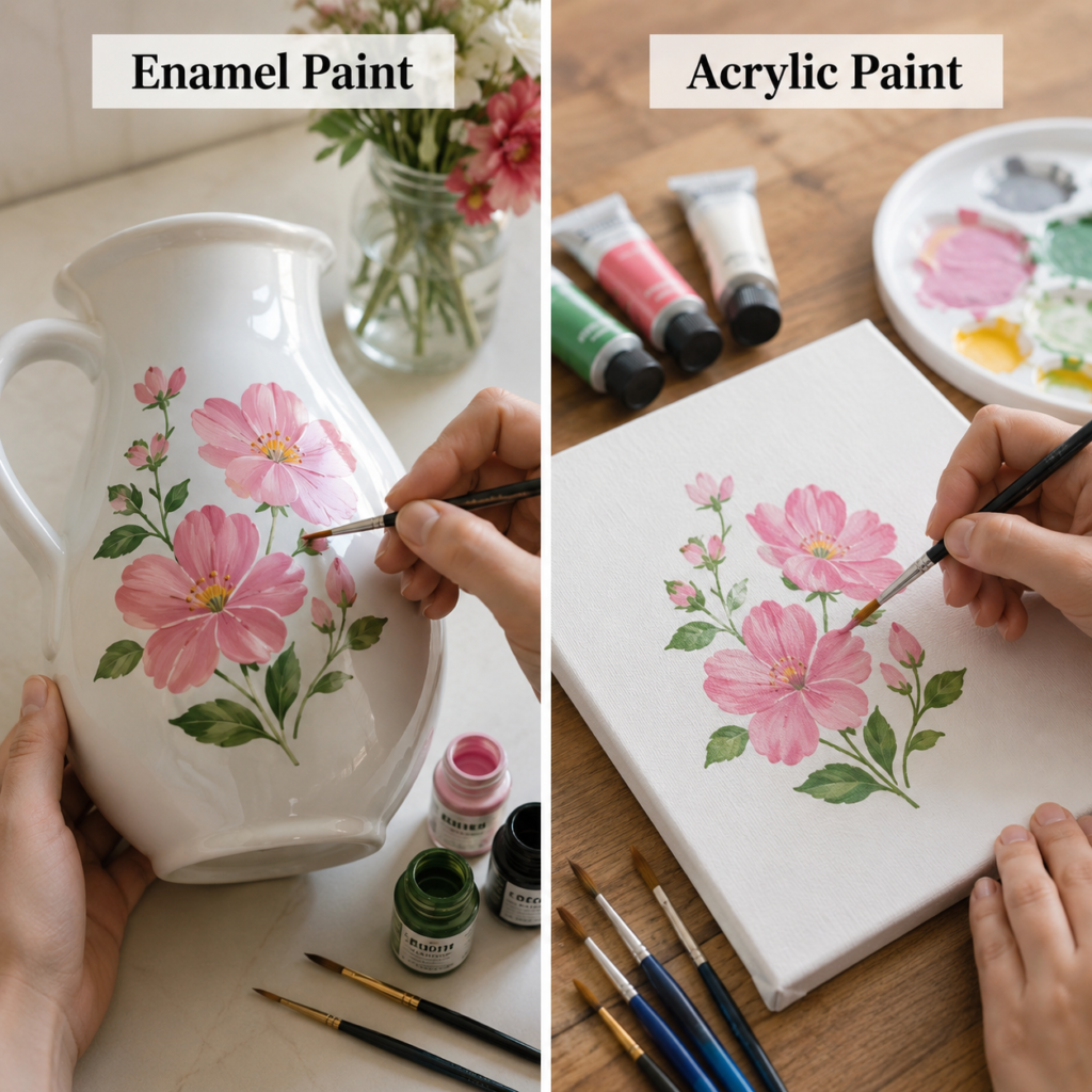
The floral comparison takes the same idea into a more delicate direction. A bouquet painted onto a white pitcher with enamel feels like functional décor, while the acrylic version on canvas leans naturally toward wall art or shelf display. The flowers may look similar, but the job of the paint changes completely once the surface shifts from a hard curved vessel to a flat art base.
Curved Surfaces Change the Difficulty
A pitcher is not a neutral painting surface. It curves, it reflects light differently, and it may already have a glossy or sealed finish underneath. That means the paint needs to sit convincingly on a shape that is both decorative and tactile. Enamel tends to make sense here because it is comfortable in the world of coated household objects, where a cleaner and more durable finish often matters.
Painting flowers around that curve also asks the artist to keep petal shapes balanced as the surface bends away from view. That challenge feels more worthwhile when the paint is suited to the object and can support a polished decorative result.
Canvas Gives Acrylic More Room to Breathe
On the acrylic side, the bouquet feels freer. Canvas lets the brush marks show a little more, and the surface helps the flower heads hold their layered colour without competing with glaze or shine underneath. Acrylic is especially comfortable in this setting because it adapts well to art-based painting where you may want to correct shapes, build highlights, or soften an edge as you go.
The whole result reads as a painting first. That sounds obvious, but it’s a useful distinction. On the pitcher, the painting has to cooperate with the object. On canvas, the object exists to support the painting.
Decorative Display Versus Functional Display
A painted pitcher can sit on a shelf, hold dried stems, or become part of a styled corner, so its decoration needs to feel at home on a three-dimensional vessel. Enamel helps with that because it creates a finish that can look more intentional on hard domestic pieces.
A canvas panel has a simpler responsibility. It only has to succeed as a painted image. Acrylic takes advantage of that simplicity. You don’t need to think about grip points, curved edges, or the way light travels over a ceramic shape.
The Better Choice Depends on the Goal
· Choose enamel if you want a floral design on a pitcher, jug, vase-like container, or other hard decorative vessel.
· Choose acrylic if you want the floral motif to become a stand-alone painting or a framed decorative panel.
· Enamel generally makes more sense for object-first décor.
· Acrylic generally makes more sense for image-first décor.
For me, the deciding factor here is whether the finished piece will be handled as an object or viewed as an artwork. That single question clears up most of the uncertainty.
Use Colour Swatches to See Opacity, Sheen, and Surface Feel
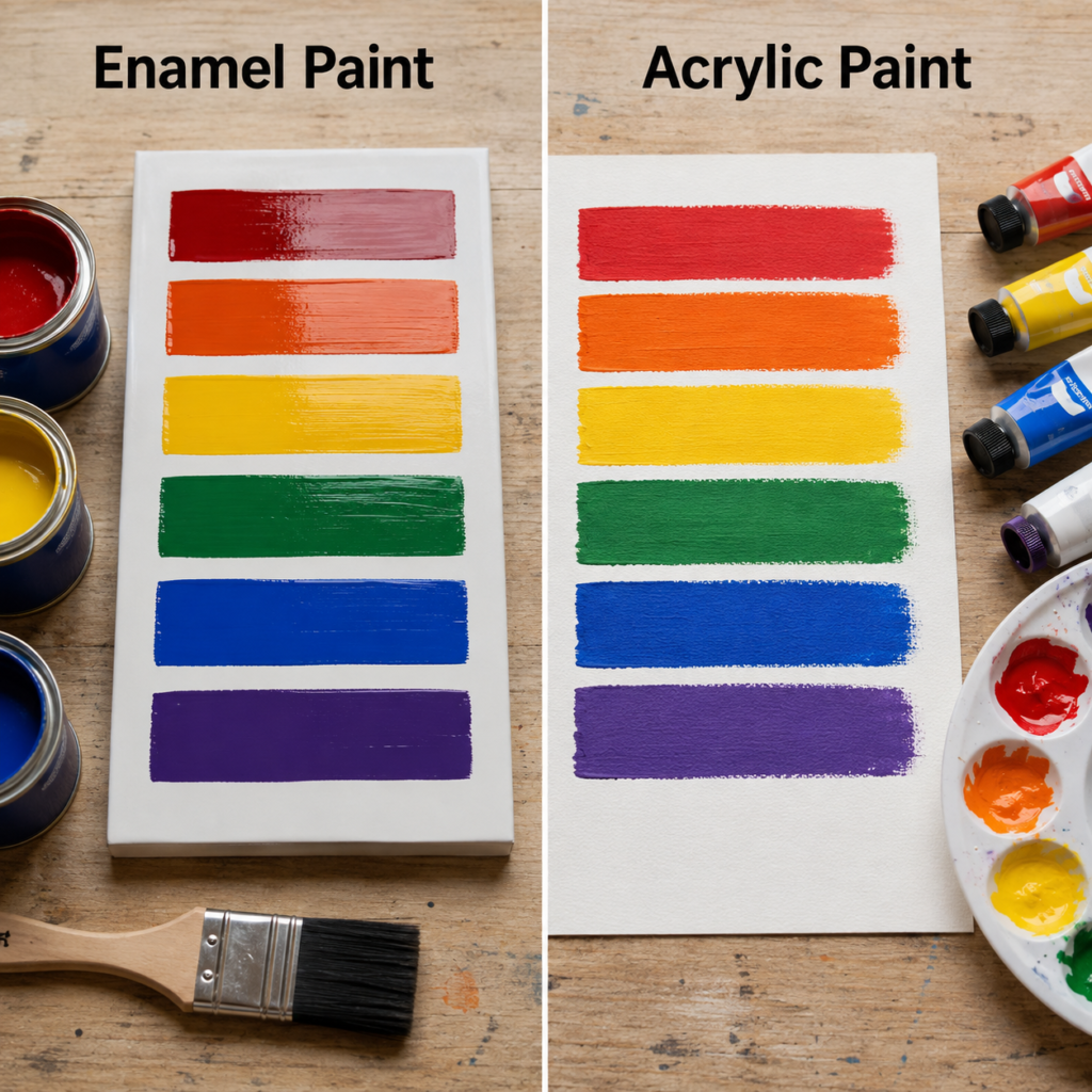
A swatch board may look simple, but it tells the truth quickly. That’s why I like this comparison so much. Instead of asking the paints to impress you with flowers or patterns, it asks them to show what they are like in their clearest form: straightforward blocks of colour. The left side presents enamel swatches on a hard board, and the right side shows acrylic swatches on an art-friendly sheet or board.
What the Enamel Swatches Reveal
The enamel bars usually look smoother and more sealed, with a slightly more lacquered character. That can be very appealing on furniture, cabinets, metal accents, or practical home projects where you want colour to feel contained and finished rather than openly painterly.
You may also notice that enamel often suggests a more polished final coat. Even when the brush strokes are visible, the impression tends to lean toward a coated surface rather than a studio painting surface.
Why Acrylic Swatches Feel Different
Acrylic swatches often show more of the surface beneath them, or at least a different sort of bond with that surface. The colour can still be bold and opaque, but the finish usually feels more like paint sitting as paint rather than paint becoming part of a sealed coating system.
That’s not a weakness. For many artists and crafters, it’s exactly the point. Acrylic is often easier to work with when you want layering, visible texture, or a matte-to-satin art finish rather than a more object-like sheen.
Why Testing Swatches Matters Before a Real Project
Swatches save you from guessing. They show how strong the colour feels, how even the coverage looks, and how the finish reads once dry. They also reveal something people often miss: some paints feel right for the surface emotionally as well as technically. A glossy enamel red may feel wonderful on a small table but too rigid on an art panel. A matte acrylic blue may feel fresh on canvas but underwhelming on a kitchen-use item.
I’d rather discover that through a test board than through a full project that already took an hour to tape off.
Where Each Type of Swatch Leads You
· Enamel swatches are especially useful when you’re choosing colours for furniture, cabinetry, utility items, or decorative hard surfaces.
· Acrylic swatches are especially helpful for canvas work, art panels, mixed-media projects, or decorative craft pieces.
· Use swatches when finish matters as much as colour.
· Look at the swatches in daylight if the project will live in a bright room.
The part I’d check carefully is the sheen. People often focus on hue, but the surface glow or flatness changes the whole mood of the finished object.
Stencil a Cabinet Front or a Terracotta Pot
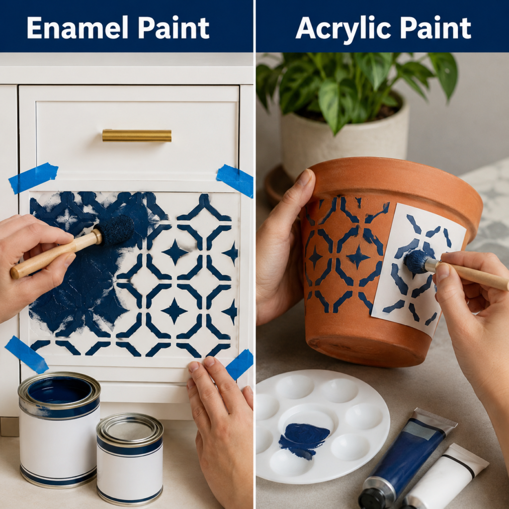
Stencil work is where paint personality becomes very noticeable. Clean pattern edges need the paint to behave itself, but different objects place different demands on that behaviour. On the left, enamel is used on a cabinet-style front or drawer face.
On the right, acrylic is used on a terracotta pot. The same blue geometric motif appears on both, yet the projects feel quite different once you think about use, texture, and finish.
Why Enamel Works on Painted Furniture Surfaces
A cabinet face is a surface that people touch, wipe, and see from close range. Stencil work here needs to look neat and hold up to ordinary home life. Enamel makes sense because it is often chosen for harder-wearing painted finishes, especially on furniture-style surfaces that benefit from a more stable and polished appearance.
The white background also matters. A sharper blue pattern reads best when the paint gives clean contrast and enough presence to look intentional against a smooth, painted base.
How Acrylic Suits the Pot in a Different Way
Terracotta already has texture and absorbency, so the acrylic side naturally feels a bit softer and more craft-oriented. That is not a problem at all. In fact, a pot often looks good when the stencil does not appear overly glossy or overly sealed. Acrylic can sit comfortably on this kind of decorative base and still give strong pattern definition.
The pot also does not have the same furniture expectations as a cabinet front. It may sit in a corner, on a shelf, or near a window where visual charm matters more than the kind of hard-wearing finish you might want on household furniture.
Sharpness, Texture, and Practical Use
Stencil designs succeed when the paint suits the surface texture. On a smoother cabinet face, a more furniture-oriented paint helps the pattern feel crisp and finished. On terracotta, a slightly softer and more art-craft feel can actually be pleasing because it respects the clay character of the object.
This is where surface honesty matters. I don’t think every object needs to look like glossy cabinetry. Sometimes the slightly more natural painted feel of acrylic is exactly what gives the piece its charm.
My Practical Choice for This Type of Pattern
· Use enamel for cabinet fronts, drawer panels, side tables, trays, or other painted furniture surfaces that are touched often.
· Use acrylic for decorative terracotta pots and indoor plant containers where a softer craft finish still looks appropriate.
· Choose the stencil scale carefully so the motif suits the size of the object.
· Test the paint on a hidden area first if the base surface is already coated or sealed.
I know it can feel tempting to use one stencil and one paint on every hard surface around the house, but the object itself should always have a vote in that decision.
Paint a Daisy on a Stool or on a Rustic Wooden Board
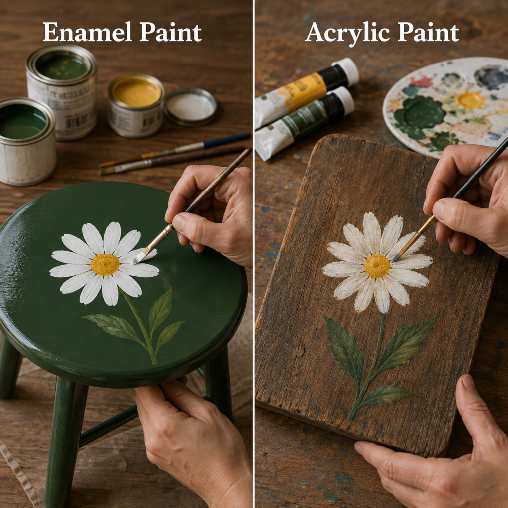
Daisy motifs are cheerful, uncomplicated, and easy to compare because they rely on clean petal shapes and a clear center. Here the enamel side places the flower on a painted stool top, while the acrylic side places a similar daisy on a rustic wooden board. At first they seem close, yet the project intention is different enough to change which paint feels most at home.
A Stool Top Needs More Than Just Pretty Colour
A stool top belongs to furniture, even if it is only a small piece. That means the painted design sits on a surface that may be wiped, touched, moved, and possibly used more actively than a wall plaque. Enamel often feels more appropriate in this setting because the finish can support the idea of a durable decorative top rather than a fragile painted image.
The green ground colour on the stool also suggests a more coated, unified surface beneath the daisy. Enamel supports that sort of look very well.
A Rustic Board Welcomes Acrylic’s Character
The wooden board on the acrylic side feels less like furniture and more like decorative craft art. The wood grain remains part of the look, and acrylic is comfortable in that space because it can feel visibly hand-painted without needing to imitate a factory-smooth finish.
The daisy doesn’t need to pretend it belongs to a sealed piece of furniture. It can simply be a painted image on wood, and that gives acrylic more freedom to stay expressive.
Surface Mood Matters as Much as Surface Strength
There is also a mood difference here. The enamel stool reads cleaner and more finished, almost like a refreshed household piece. The acrylic board reads warmer and more rustic, which suits display art, handmade signs, or decorative plaques.
That emotional difference matters. A polished finish can feel right in one room and out of place in another. A visibly hand-painted wooden board may feel far more natural in a relaxed craft corner or cottage-style setting.
Which Paint I’d Pick for Each Use
· Choose enamel for stool tops, small painted furniture, benches, or accent pieces that need a harder decorative finish.
· Choose acrylic for rustic boards, wall plaques, art signs, or small wood-based decorative panels.
· Use enamel when the object still functions as furniture.
· Use acrylic when the object is mainly there to be enjoyed visually.
For me, this comparison comes down to contact. If hands, cloths, or ordinary use will reach the surface often, I start leaning toward enamel. If the surface is mostly for display, acrylic becomes more appealing very quickly.
Compare Bold Abstract Shapes on a Side Table and on an Art Panel
The final comparison moves away from florals and into modern block colour. That is useful because abstract shapes expose finish quality very quickly. On the enamel side, the painted object is a small side table or storage stand with strong curved bands of navy, coral, teal, and white. On the acrylic side, similar shapes appear on a flat art panel. The colour story stays consistent, but the purpose of the paint changes again.
Why Enamel Makes Sense on a Small Table
A side table is one of the clearest examples of a paint-worthy household object. It needs colour, yes, but it also needs a finish that feels deliberate on furniture. Enamel is often attractive here because it helps bold graphic shapes look cleaner and more integrated with the object. The paint can feel more like part of the table rather than an added art layer sitting on top of it.
That matters even more with modern colour blocking. Crisp curves and strong flat areas ask for visual confidence, and a more furniture-friendly paint supports that confidence well.
Where Acrylic Shines on the Panel
On the panel, the same colour bands become a design study or finished artwork rather than a functional coating. Acrylic fits comfortably here because it is easy to mix, adjust, and refine as you work. If one curve feels off, you can repaint it. If you want the white edge sharper, that sort of art-based correction feels natural in acrylic practice.
Acrylic also allows the panel to remain obviously hand-painted. That is usually a strength in modern art pieces, where the slight texture of the brushwork can add interest instead of looking like a flaw.
Graphic Design Needs a Good Surface Match
Abstract shapes rely on neat borders, steady coverage, and harmony between colour and finish. When those shapes appear on furniture, enamel often helps them feel more resolved. When they appear on a display panel, acrylic often helps them feel more lively and painterly.
This is a good reminder that the same palette can create two entirely different experiences. One becomes decorative furniture. The other becomes decorative art. Same visual family, different practical logic.
The Smarter Pick for Modern Colour Work
· Choose enamel for side tables, bedside stands, drawer fronts, and similar furniture pieces with bold geometric or abstract designs.
· Choose acrylic for art panels, modern wall pieces, and abstract colour studies.
· Let the object decide whether you need a furniture finish or an art finish.
· Keep the number of colours manageable so the finish stays intentional rather than busy.
The part I like here is the clarity. Abstract painting leaves nowhere to hide, so the surface-paint match becomes obvious fast. That’s actually helpful when you’re trying to learn what each paint is really good at.
A Simple Way to Decide Between Enamel and Acrylic Paint
If the object is practical, household-based, and likely to benefit from a harder or more sealed finish, enamel usually deserves a serious look. If the project is more decorative, more artistic, more layered, or more naturally at home on canvas, board, or craft surfaces, acrylic often feels easier and more suitable.
There are exceptions, of course, and paint formulas vary. Even so, the broad pattern stays useful. Enamel tends to favour object durability and a more coated appearance. Acrylic tends to favour versatility, creative handling, and a more painterly finish.
· Pick enamel for furniture-style objects, painted household pieces, and some metal or ceramic decorative items where a harder finish is helpful.
· Pick acrylic for canvas, craft boards, decorative signs, art panels, and many indoor painted accents where easier layering matters.
· Test a small area first when the base is glossy, sealed, or unusual.
· Think about how often the object will be touched, wiped, or moved after the paint dries.
Paint Selection Mistakes That Can Spoil the Whole Finish
One of the biggest mistakes is choosing by colour alone. A beautiful shade in the tin or tube means very little if the finish does not suit the object. People sometimes fall in love with the pigment and forget to ask what the surface needs. Then the project looks wrong even when the colour is technically lovely.
Another problem is treating every hard surface as interchangeable. A metal watering can, a ceramic-style pitcher, a terracotta pot, a painted cabinet face, and a rustic board each respond differently. The surface texture, absorbency, and intended use all affect whether enamel or acrylic will feel more natural.
Skipping test swatches is another common error. I know swatches can feel like a slow extra step, but they show sheen, opacity, texture, and even mood. That’s often the difference between a project you enjoy and one you end up repainting.
People also copy the appearance of a painted object without copying the logic behind it. A glossy decorative stool and a matte painted art board may use similar colours, but they do not want the same finish. Borrow the visual idea if you like, but keep the surface logic intact.
Finally, some projects become overcomplicated because the maker adds too many colours, too many motifs, or too many extra effects. These comparisons work partly because the paint itself has room to speak. There’s no need to cover every inch of the object to prove the project matters.
Frequently Asked Questions
Is enamel paint more durable than acrylic paint?
It often feels more durable on many household and furniture-style surfaces because it tends to form a harder finish. Even so, durability always depends on the exact formula, the surface preparation, and how the object will be used afterward.
Is acrylic paint easier for beginners?
In many cases, yes. Acrylic is usually more approachable for art and craft use because it handles layering well and feels familiar on canvas, boards, and decorative painting projects. That does not automatically make it the best choice for every object.
Can I use acrylic paint on furniture?
You can, especially for decorative or art-style furniture projects, but the final finish may not feel the same as enamel. If the piece needs a tougher, more furniture-like result, enamel often deserves stronger consideration.
When would enamel paint be the better option?
Enamel is often the better fit when you are painting metal items, furniture-style pieces, household objects, or decorative surfaces that benefit from a smoother and harder finish. It is especially useful when the painted object still needs to function in everyday life.
Which paint is better for canvas art?
Acrylic is usually the more natural choice for canvas. It works well with layering, blending, and painterly effects, and the surface is designed to welcome that kind of paint handling.
Do I need to test the paint first?
Yes, I would. A small test tells you how the colour sits, how the finish looks, and whether the surface-paint combination feels right before you commit to the full object.
Can both paints be used for decorative home projects?
Absolutely. The difference is that enamel often supports practical decorative objects, while acrylic often supports artistic decorative objects. One tends to favour coated usefulness, and the other tends to favour expressive painting.
What is the easiest way to choose between them?
Ask what the finished object needs. If it is a functional item that wants a stronger finish, start by considering enamel. If it is a canvas, board, sign, or decorative art piece, acrylic usually becomes the easier and more natural choice.
Choose the Paint That Makes Sense for the Object
The most useful lesson in enamel vs acrylic paint is that good paint choice is never only about brand or colour. It’s about purpose. A watering can, pitcher, cabinet front, stool, or side table often wants the sort of finish enamel is known for. A canvas panel, rustic art board, or decorative painting surface often feels far happier with acrylic.
That’s why I keep coming back to the object itself. What will it do after the paint dries. Will it be displayed quietly, or will it be touched and used as part of everyday life. Once you answer that, the decision becomes much less confusing.
If you’re still uncertain, begin with one small test project rather than a whole room full of painted ambition. A swatch board, a small pot, or a simple panel will teach you a lot very quickly. Which surface are you most tempted to paint next?