Fabric paint and acrylic paint can look almost identical while they are sitting on a craft table, yet the difference becomes obvious as soon as the painted object bends, folds, absorbs colour, or needs to survive regular handling.
A leafy design on a tote bag has a very different job from the same leafy design on a canvas panel. One has to move with the cloth and remain pleasant to touch. The other can stay firm, hold visible brush texture, and behave like a piece of artwork.
This is the part of painting projects that interests me most: not simply whether the colour looks good, but whether the finished object still works properly. A decorated T-shirt should remain wearable.
A painted shoe should still flex. A cushion should still feel comfortable. By contrast, a terracotta pot, wooden panel, or small canvas does not need softness in the same way, so acrylic paint can use its body and stronger surface film to good effect.
I don’t think either paint is universally better. The sensible choice depends on what you are painting, how often the object will move, whether it will be washed, and what sort of finish you want. Looking at the paints side by side across several realistic projects makes those differences much clearer than a simple list of pros and cons ever could.
Understand the Job of the Finished Surface
Before choosing paint, think about what the finished item will experience. Fabric stretches, creases, rubs, folds, and sometimes goes through washing and drying. A rigid craft surface usually stays in one shape, which means it can support a firmer layer of paint without affecting comfort or movement.
That practical difference should guide the decision before colour, brush type, or decoration style. A paint that looks excellent but prevents an item from functioning properly is not really the successful choice.
· Soft garments and accessories usually need flexibility.
· Shoes and denim need paint that can tolerate repeated movement.
· Canvas, wood, and terracotta can support a firmer paint film.
· Display pieces allow more freedom with texture and thicker coverage.
Prepare Fabric and Hard Surfaces in Different Ways
Fabric should be clean, dry, and free from finishes that may interfere with absorption. It also needs firm support underneath while you paint, otherwise the material can wrinkle and the design may distort. A barrier between fabric layers helps prevent colour from transferring through to the back.
Hard surfaces need their own preparation. Dust, grease, loose fibres, and rough patches can all affect acrylic coverage. Wood may need smoothing, terracotta should be clean and fully dry, and canvas should sit securely so the brush does not push it around while you work.
· Wash new fabric when appropriate before painting it.
· Press wrinkles so the design is not distorted.
· Place card or a suitable insert beneath fabric layers.
· Remove dust and loose particles from rigid craft surfaces.
· Test paint on a hidden or spare area before beginning the main design.
Choose the Finish Before Choosing the Paint
Fabric paint usually gives the most convincing result when you want colour to become part of the textile rather than sit as a thick shell on top. The weave may remain visible, and the painted area can feel softer and more integrated with the material.
Acrylic paint is often more satisfying when you want clear opacity, sharper edge control, visible brushwork, or a solid decorative coating. Those qualities are useful on artwork and hard craft surfaces, but they can become drawbacks on clothing if they create too much stiffness.
· Choose a softer integrated finish for wearable textiles.
· Choose stronger surface coverage for rigid decorative objects.
· Use thin layers when flexibility matters.
· Allow more visible texture where the object is mainly for display.
Paint a Botanical Tote With Fabric Paint or a Canvas With Acrylic
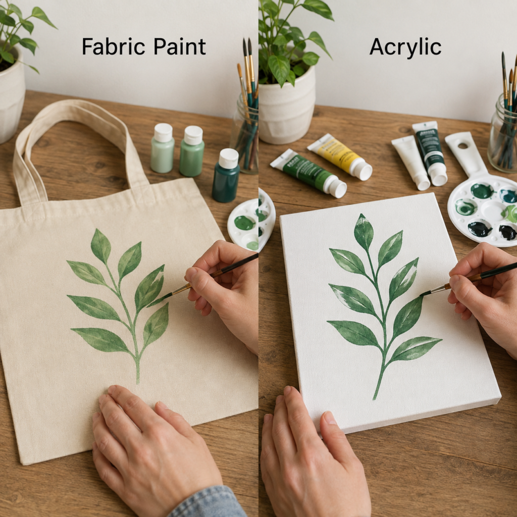
Why the Tote Bag Needs a Softer Paint Film
A cotton tote is a useful test for fabric paint because it is handled from several directions. The body folds when it is stored, the straps pull when the bag is carried, and the painted panel may brush against clothing or furniture. The leaf design therefore needs to remain flexible enough to move with the material rather than cracking along every new crease.
Fabric paint suits that purpose because it is intended to work with textile fibres. The colour can settle into the weave, which keeps the natural character of the cloth visible. The result may look slightly softer than paint on a smooth art surface, but that softness is part of what makes the finished bag feel believable and usable.
How Acrylic Creates a Cleaner Botanical Study on Canvas
The acrylic version of the leaf branch sits on a rigid white canvas, where the painter can concentrate on edge control, layering, and visual depth. The canvas does not need to fold, so a firmer paint film is not a problem. Darker greens can be added over lighter shapes, highlights can sit on top, and small corrections can be made without worrying about the painted area rubbing against the body.
Acrylic also makes it easier to preserve a clear separation between the white background and each leaf. On a framed or stretched surface, that crispness helps the work read as a finished botanical painting rather than a decorated household object.
Preparation That Matters for Each Version
For the tote, wash and dry the fabric if that is suitable for the item, then press it flat. Place a firm insert inside so paint does not pass through to the other side. Keep the straps away from the work area and lightly plan the leaf placement before applying colour.
For the canvas, remove dust and make sure the surface is stable. A light sketch can help with branch spacing, but there is no need to force every leaf into perfect symmetry. Botanical designs usually look more natural when the sizes and angles vary slightly.
The Better Choice for This Kind of Project
Choose fabric paint when the leafy design belongs on a tote that will be carried, folded, and used. Choose acrylic when the same subject is intended as artwork, a decorative panel, or a rigid sign. The motif can stay similar, but the successful finish depends on what the object needs to do afterwards.
For me, the tote should still feel like a tote once the painting is finished. If the decorated section becomes noticeably rigid, the colour has started to overpower the object rather than improve it.
Compare a Wearable Floral T-Shirt With an Acrylic Flower Painting
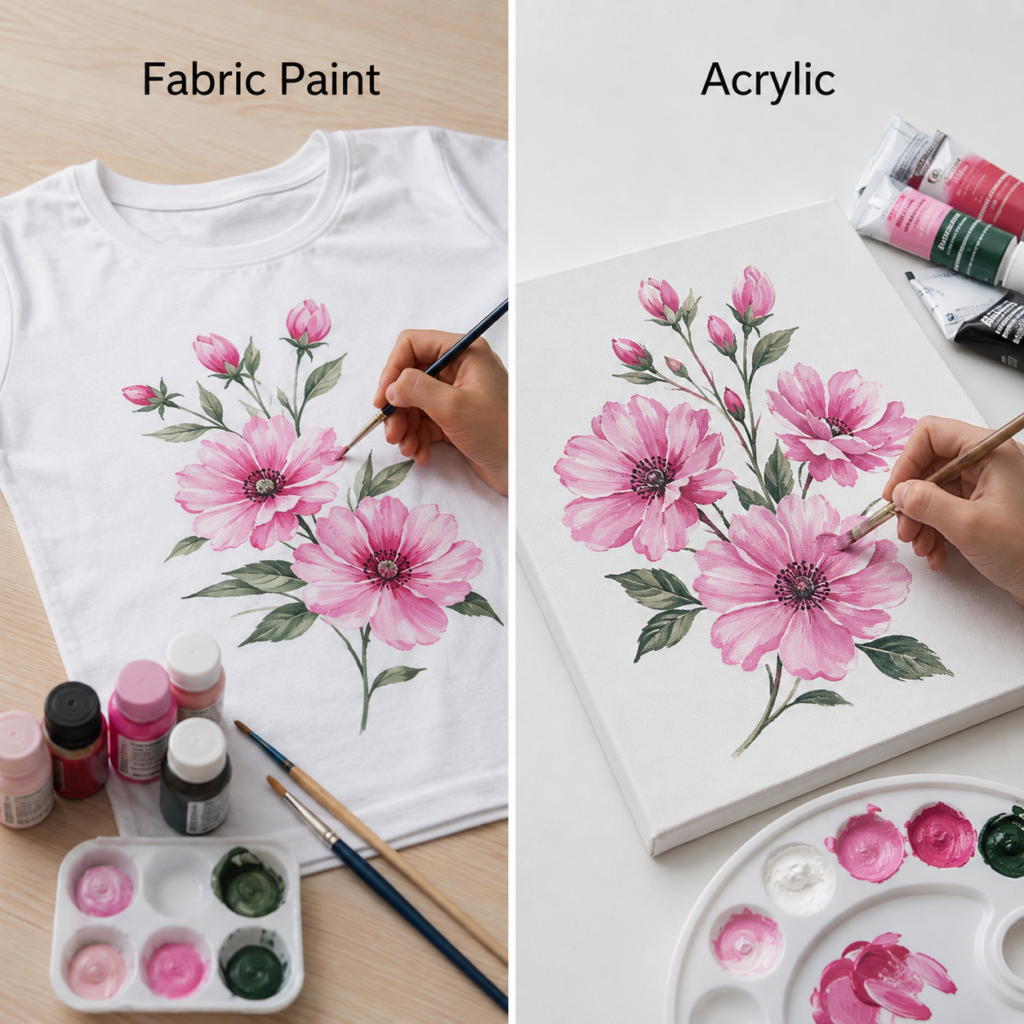
Comfort Is Part of the Design on a T-Shirt
A floral painting across the front of a T-shirt covers a wide area, so the feel of the dried paint matters just as much as the appearance. The fabric stretches when the shirt is pulled on, moves while it is worn, and may repeatedly fold in the same places. A large stiff painted patch can make an otherwise soft garment uncomfortable and warm.
Fabric paint gives you a better chance of keeping the decoration wearable. Thin, controlled layers allow the cotton texture to remain visible, and the petals can still have light and shadow without being built into a thick raised surface. The strongest textile result is often the one that looks finished without announcing itself as a heavy coating.
Acrylic Can Build More Visible Petal Texture on Canvas
The acrylic floral painting does not have to respond to body movement, so richer layers become useful. Dark pink can be placed beneath lighter strokes, leaf edges can be sharpened, and the centres of the flowers can carry more texture. The canvas supports the paint rather than flexing underneath it.
That allows acrylic to show its painterly character. Individual brush marks can remain visible, and thicker highlights can sit above earlier colour. On clothing, that same build-up may feel heavy. On canvas, it adds dimension and helps the flowers stand away from the background.
Managing Bleeding, Stretching, and Placement on Fabric
T-shirt fabric should lie flat but not be stretched out of shape while you paint. If it is pulled too tightly, the design may contract when the shirt relaxes. A firm insert helps support the area, while a light first layer reduces the chance of colour spreading beyond the intended petal edges.
The floral arrangement should also respect the garment. Avoid placing thick paint directly across areas that crease sharply or stretch the most. A design can still feel generous and full without covering every available centimetre.
Which Paint Gives the More Successful Flower Project?
Fabric paint is the practical choice for the T-shirt because the garment must remain soft enough to wear. Acrylic is the stronger choice for the canvas because it supports richer surface work and more visible layering. The subject is the same, but the measure of success changes with the object.
I know it can be tempting to judge only by which flower painting looks more dramatic. The quieter textile finish may actually be the better result if it remains comfortable after repeated use.
Use Colour Swatches to See Absorption, Opacity, and Texture
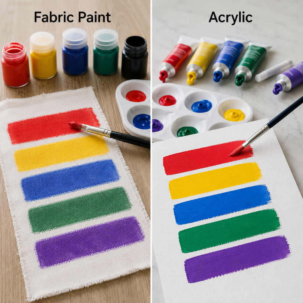
What the Fabric Swatches Reveal
Colour bars painted on woven cloth show how strongly the fabric texture influences the finish. Tiny gaps and raised fibres remain visible, especially in the first coat. The swatches may look slightly softer or more broken at the edges because the brush is moving across a textured, absorbent surface rather than a smooth board.
That is not automatically a flaw. On textile projects, the visible weave can help the colour feel integrated. The important question is whether the paint covers evenly enough for the intended style while still allowing the material to bend.
Why Acrylic Looks Denser on a Rigid Sheet
On the acrylic side, the colour bands appear more compact and solid. The rigid sheet does not absorb the paint in the same uneven way, so the brush can lay down a clearer film. This makes acrylic particularly useful for graphic designs, signs, colour-blocked décor, and artwork where a smooth band of colour matters.
The surface also makes it easier to build opacity. A second pass can sit directly over the first without the material shifting underneath. That is helpful when you want a bold red, blue, or purple to look consistent from one edge to the other.
Why Every Important Project Deserves a Test Swatch
A swatch tells you far more than the colour shown on a label. It reveals how the paint responds to the actual surface, whether the brush leaves gaps, how much the shade changes as it dries, and whether the painted area remains flexible. This is especially important on dark fabric, coarse canvas, denim, or any material with a pronounced weave.
Test the same brush pressure and number of coats you expect to use in the main design. Then allow the sample to dry fully enough for you to judge the finish rather than making the decision while the paint is still wet and glossy.
How to Read the Results Before Committing
Choose the textile paint if the swatch remains reasonably soft and the colour suits the woven texture. Choose acrylic on rigid craft surfaces when you want stronger opacity and a more continuous painted layer. If the fabric swatch feels unpleasantly stiff, reduce the amount of paint or reconsider the design size before painting the final item.
I’d rather discover a coverage problem on a small scrap than across the front of a finished cushion. A test swatch is not wasted material; it is a small insurance policy for the project.
Stencil a Cushion With Fabric Paint or Decorate Terracotta With Acrylic
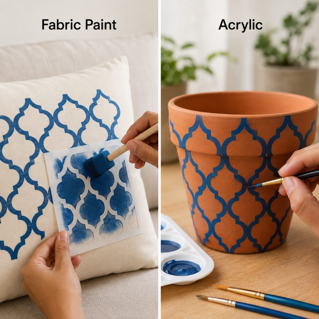
A Cushion Cover Must Stay Comfortable After Painting
A repeated blue stencil on a cushion cover needs clear edges, but the finished surface will also be touched, squeezed, and leaned against. That makes fabric paint the sensible option. The pattern should remain decorative without turning the front of the cushion into a hard panel.
The best result usually comes from applying several controlled impressions rather than flooding the stencil with paint. Too much wet paint can push under the stencil edges and leave thick, stiff patches. A lighter application lets the pattern build while preserving more of the fabric feel.
Terracotta Allows Acrylic to Hold a Stronger Pattern
The same repeating motif on a terracotta pot has a completely different set of needs. The pot is rigid, so the paint does not have to bend. Acrylic can form a clearer, more opaque blue line against the warm clay colour, which makes the geometric design easy to read from across the room.
Terracotta is porous, so its surface can absorb the first layer unevenly. A clean, dry pot and a light initial coat help reveal how the paint behaves. Once the base is stable, later colour can create the stronger decorative finish that suits a hard object.
Keeping a Repeated Pattern Neat on Two Different Materials
On the cushion, secure the fabric so it does not shift under the stencil. Work from one area to the next and lift the stencil carefully rather than dragging it across wet paint. On the pot, adjust the stencil or hand-painted guide around the curve instead of forcing a flat pattern to sit perfectly against a rounded surface.
The slight differences between repetitions do not need to be hidden. A handmade pattern often looks more appealing when it remains consistent enough to feel intentional but not so mechanical that every mark appears printed.
Choosing Between Soft Décor and Hard Décor
Fabric paint is the stronger choice for the cushion because comfort and flexibility remain part of the finished object. Acrylic is the better choice for the pot because colour strength, hard-surface adhesion, and crisp visibility matter more than softness.
The same stencil can inspire both projects, which is useful when you want matching décor. The paints do not need to match; they only need to suit the two surfaces properly.
Paint a Daisy on Denim or Recreate It on a Wooden Board
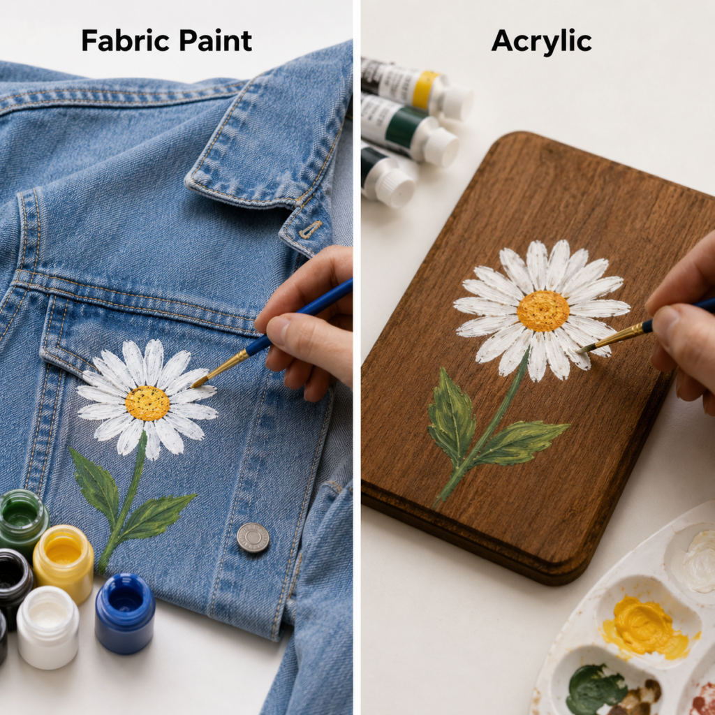
Denim Is Strong but Still Needs Flexible Colour
A denim jacket may feel much sturdier than a T-shirt, yet it still bends at the elbows, folds at the seams, and rubs during wear. The painted daisy therefore needs flexibility even though the fabric itself is heavy. Fabric paint suits that movement better than an ordinary hard coating.
Denim texture also affects the appearance of pale petals. White paint can catch on the raised weave while deeper blue remains visible between fibres. This can produce a slightly distressed floral look, which often suits denim naturally. Trying to force the petals into a perfectly smooth, plastic-looking layer may make the painted area unnecessarily stiff.
Wood Lets Acrylic Create a More Solid Decorative Flower
The wooden board provides a firm base for acrylic, allowing the daisy petals to appear more opaque and the centre to hold stronger texture. The brush can move over the surface without the base folding away, and the painter can return to small details after earlier layers have dried.
Acrylic also works well with the natural character of wood. The grain may remain visible around the flower, giving the piece warmth, while the painted motif creates a clear focal point. This balance suits small signs, plaques, trays, and decorative panels.
Where to Place the Motif for Better Wear and Better Display
On denim, choose an area that is visible but not constantly folded or rubbed. A back panel or broad pocket area often gives the flower enough space, while placing thick paint directly over a seam or elbow can create extra stress. Keep the design clear of hardware that may scrape the surface.
On wood, placement is mainly a visual decision. Leave enough surrounding space for the grain to contribute to the design, and make sure the flower does not feel squeezed against an edge unless a cropped composition is intentional.
The Meaning of Durability Changes With the Surface
A durable textile finish must move without becoming uncomfortable. A durable wooden finish must remain attached to a firm base and tolerate light handling. Those are two different jobs, even when the painted flower looks similar.
I don’t think the word ‘durable’ should be used without asking, ‘durable under what conditions?’ The denim jacket and wooden board both need lasting colour, but they demand it in completely different ways.
Compare Painted Canvas Shoes With a Graphic Acrylic Panel
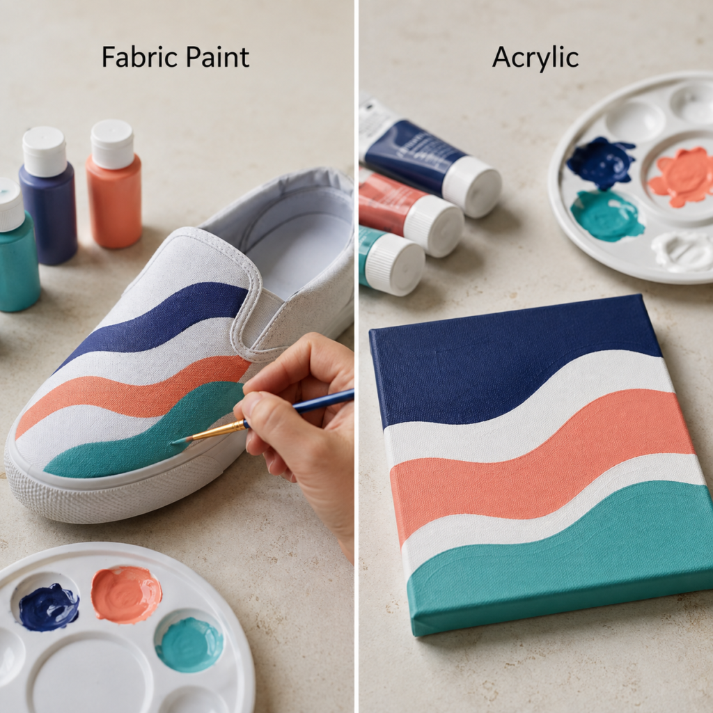
Shoes Put Paint Under Constant Movement
A slip-on canvas shoe bends at the toe, stretches slightly as the foot enters, and rubs against the ground, the other shoe, and nearby objects. That makes footwear one of the more demanding textile projects. The painted waves need to remain thin and flexible enough to follow the upper instead of cracking along the first strong crease.
Fabric paint is better suited to that movement. It can create bold colour while still respecting the textile base. The design should avoid thick ridges, especially near the toe crease, because repeated walking will test those areas far more severely than a tote bag or cushion cover.
Acrylic Gives the Graphic Panel Cleaner Colour Blocks
On the small rigid canvas, the same navy, coral, white, and teal waves can become smooth graphic bands. Acrylic suits this because the panel stays flat and the paint can form a continuous layer. The edges can be adjusted, colours can be made more opaque, and the design can be displayed without worrying about flexing.
This is where acrylic’s firmer finish becomes useful. The colour blocks read clearly, and the surface can carry repeated brush passes without changing shape underneath. The result feels like a compact modern artwork rather than a wearable decoration.
Practical Preparation for Footwear and Display Art
Clean the shoe surface carefully and place a support inside so the upper keeps its shape while you work. Plan where the waves cross the areas that bend most, and keep the paint application controlled. Decorative colour near seams should not interfere with the construction of the shoe.
For the panel, make sure the surface is dust-free and decide whether you want sharp masked bands or softer hand-painted curves. The rigid base gives you more freedom, so you can focus on balance, spacing, and colour rhythm rather than movement.
When Matching Designs Need Different Materials
You can use the same palette and wave pattern across wearable and decorative objects without using the same paint. Fabric paint can handle the shoe, while acrylic can handle the panel. The coordinated idea remains intact even though the materials change.
To be honest, footwear is where I would be least willing to improvise with unsuitable paint. A design that cracks after a few wears is disappointing, and shoes place more stress on painted fabric than most beginner projects.
Fabric Paint vs Acrylic Paint: The Practical Differences
Flexibility
Fabric paint is generally the more appropriate choice when the surface must bend, fold, or move. Acrylic is more at home on rigid objects where a firmer film does not affect use.
Surface Feel
Fabric paint is intended to leave textiles more wearable and touch-friendly. Acrylic can create a more noticeable layer, which may be desirable on art surfaces but uncomfortable across large areas of clothing.
Opacity and Edge Control
Acrylic often produces denser colour and clearer edges on canvas, wood, and terracotta. Fabric paint can still create strong designs, but the weave and absorbency of the textile influence the appearance.
Layering and Texture
Acrylic supports visible brushwork, thicker highlights, and stronger surface texture. Textile projects usually benefit from thinner layers so the fabric does not become overloaded.
Best Uses
Fabric paint suits shirts, tote bags, cushion covers, denim, canvas shoes, and fabric accessories. Acrylic suits stretched canvas, panels, wood, terracotta, signs, and decorative craft objects.
Care After Painting
The care needs of a painted textile are tied to wearing, flexing, and washing. Painted hard surfaces are more often protected from scratches, moisture, or rough handling rather than laundering.
Paint-Selection Mistakes That Can Ruin a Useful Makeover
Choosing by Colour Instead of Surface
The prettiest colour range does not make a paint suitable for every object. Start with the surface and the finished use, then choose the colour within the correct paint type.
Applying Thick Layers to Flexible Fabric
Heavy paint can make a garment, shoe, or cushion feel stiff and may place extra stress on areas that bend. Build colour gradually and stop when the design is clear rather than continuing until the textile feels sealed.
Skipping a Test Sample
A small swatch reveals absorption, opacity, colour shift, and stiffness. Without that test, you may discover a problem only after the main object has been painted.
Painting Dirty or Wrinkled Material
Dust, grease, fabric finishes, and wrinkles can interrupt coverage and distort the design. Prepare the surface properly before adding the first mark.
Ignoring High-Movement Areas
Elbows, toe creases, seams, and stretch points receive more stress than broad flat areas. Avoid placing the thickest part of a design where the object moves most.
Expecting Identical Results on Fabric and Canvas
The same colour will not always look identical across different surfaces. Texture, absorbency, base colour, and paint thickness all influence the final appearance.
Overdecorating a Practical Item
A useful object still needs to be carried, worn, washed, or handled. Leave enough unpainted space for the material to move naturally and for the design to remain visually balanced.
Frequently Asked Questions
Can ordinary acrylic paint be used on fabric?
It can be applied to fabric, but ordinary acrylic may dry firmer than you want on clothing or accessories. For a wearable or washable project, fabric paint is usually the more straightforward choice because it is intended for a flexible textile surface.
Which paint is better for a T-shirt?
Fabric paint is generally the better option because a T-shirt stretches, folds, and sits directly against the body. Thin layers help the design remain more comfortable and reduce the risk of creating a heavy painted patch.
Can fabric paint be used on wood or terracotta?
It may place colour on those surfaces, but it is not usually the most suitable choice. Acrylic normally gives stronger hard-surface coverage and better control for wood, terracotta, canvas, and similar decorative bases.
Why does paint look duller on fabric?
Textile fibres absorb colour and break up the painted surface, so the weave may soften the shade. The base colour of the fabric also affects the result, which is why a test swatch is so helpful.
How do I stop paint from bleeding through a shirt or tote?
Place a firm protective insert inside the item before painting. Use controlled amounts of paint and avoid flooding the surface, especially on thin or loosely woven fabric.
Which paint is better for denim?
Fabric paint is normally the more suitable choice because denim still bends and is worn or handled. The texture of denim may remain visible through pale colours, so test opacity before painting the main motif.
Can I use the same brushes for both paints?
You can use suitable craft brushes for both, but clean them thoroughly and avoid allowing paint to dry in the bristles. Softer detail brushes suit fine petals and leaves, while firmer flat brushes can help with blocks, stencils, and larger areas.
Which paint works better for shoes?
For textile or canvas shoes, fabric paint is generally the more appropriate option because footwear flexes repeatedly. Keep layers controlled and pay particular attention to the areas that crease during walking.
Do I need to cover every part of the fabric for strong colour?
No. Several lighter passes usually produce a more comfortable result than one overloaded coat. Strong colour should not come at the cost of turning a soft object into a rigid one.
How should I choose between them for an upcycling project?
Ask whether the object will remain flexible or stay rigid. Use fabric paint for soft textiles that will be worn or handled, and use acrylic for hard or display surfaces where firmer coverage is an advantage.
Let the Surface Decide Which Paint Belongs on the Project
The clearest lesson in the fabric paint vs acrylic paint comparison is that the object should lead the decision. A tote bag, T-shirt, cushion, denim jacket, or canvas shoe needs colour that respects movement. A canvas panel, flower pot, or wooden board gives acrylic the stable base it needs for stronger opacity, visible texture, and firmer decorative coverage.
The two paints can even support matching ideas. A floral T-shirt can coordinate with a floral canvas. A stencilled cushion can sit beside a patterned terracotta pot. A painted shoe can share its colours with a small graphic panel. Thoughtful reuse does not require forcing one material to do every job; it means choosing what helps each object remain useful.
I’d begin with one small test piece and pay close attention to the dried feel, not only the wet colour. That simple check makes it much easier to choose confidently and avoid wasting a garment or craft surface. Which object would you rather refresh first: something you can wear or something you can display?