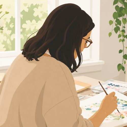
Acrylic paint usually arrives with a reputation for bold colour and solid coverage, yet it can become surprisingly light when it is handled with restraint. A small amount of paint, a generous puddle of clean liquid, and an absorbent surface can produce transparent washes, softened edges, stains, runs, and layered colour that sit much closer to watercolor than to a thick acrylic painting.
The useful difference is what happens after those washes dry. Traditional watercolor can often be disturbed again with water, while a dry acrylic layer usually stays put. That makes it possible to place one transparent colour over another without completely waking up the first layer. It also means corrections need a little more planning, because dried acrylic is not as willing to lift back to white paper.
I like this method because it gives half-used acrylic tubes another job. You don’t need a separate box of paints to experiment with loose washes.
What matters is choosing the right surface, keeping the mixtures transparent, and knowing when to stop touching the paper. I know that last part sounds simple. It rarely feels simple when a wet edge is sitting there asking for one more brushstroke.
Prepare the Paint, Paper, and Water First
A watercolor-style acrylic wash needs room to move. Heavy paper made for watercolor or mixed media is a sensible starting point because it tolerates moisture better than thin sketch paper. Tape the sheet to a board if you expect to use broad wet areas. The tape will not stop all buckling, but it can keep the edges more settled while the paper dries.
Use transparent or semi-transparent colours where possible. Opaque colours can still be thinned, but they often dry with a cloudy or chalky appearance rather than the clear stained look people usually associate with watercolor.
Fluid acrylic, soft-body acrylic, and acrylic ink are easier to dilute than a stiff heavy-body paint, although ordinary tube acrylic can still work when it is mixed thoroughly.
Set out two water containers if you can: one for rinsing and one that stays relatively clean for mixing washes and wetting the paper. Cloudy rinse water can quietly turn a clear yellow or blue mixture into a greyish surprise.
Keep a cloth or paper towel nearby for controlling the brush, but remember that blotting dried acrylic will not remove it in the same way as fresh watercolor.
Before starting the main piece, make a small test strip. Paint one pale wash, one stronger wash, and one layer placed over a dry colour. This shows how the paint changes as it dries and whether the paper stays strong enough for the amount of liquid you plan to use.
Freeze Thin Acrylic Colour to Study Flow and Blooms
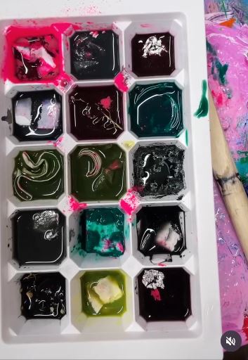
A melting-pigment experiment is a useful way to stop controlling every mark. The colour moves gradually, forms puddles, meets neighbouring washes, and leaves stronger edges where the liquid finally settles.
The original experiment includes frozen pigments and encourages unpredictable marks. A similar acrylic version can be made with very fluid paint, acrylic ink, or a well-mixed wash frozen in a small tray.
This is better treated as a study than as a guaranteed finished painting. Some mixtures dry evenly, while others separate or create rings. That unevenness is the lesson. It shows which colours spread quickly, which pigments sink into the paper, and how much water the surface can accept before it becomes fragile.
Materials and Tools
· Watercolor or heavyweight mixed-media paper
· Fluid acrylic, acrylic ink, or thoroughly diluted tube acrylic
· Small ice-cube tray or reusable silicone mould
· Clean water
· Mixing cups and a stirring tool
· Waterproof board or tray beneath the paper
· Painter’s tape
· Gloves if the pigment may stain skin or work surfaces
Make a Controlled Melting Study
1. Mix several transparent washes. Prepare each colour in a separate cup and stir until no thick paint remains at the bottom. Keep the mixtures fluid but not so weak that the dry marks disappear completely. Label the cups if two colours look similar when wet.
2. Freeze small portions. Pour a shallow amount of each mixture into a clean mould and freeze it fully. Avoid filling every section to the top; smaller cubes are easier to place and create less uncontrolled flooding on the paper.
3. Prepare the painting surface. Tape the paper to a waterproof board and divide it into small test areas if you want to compare colours. Place the board somewhere level, away from direct sun, pets, and anything that could be stained by a runaway drip.
4. Let the colour move. Place one cube in each test area and allow it to melt without repeatedly pushing it around. Tilt the board only when you want to encourage a deliberate run. Then leave the paper flat until the shine has gone and the surface feels dry.
5. Read the dry results. Notice where each wash formed a dark outline, a pale centre, a granulated area, or a hard meeting line. Keep the strongest results as a reference for later paintings rather than trying to make every square look equally tidy.
For me, the useful part is seeing the dry page, not only the glossy puddles. Wet acrylic can look far richer than it will after the water leaves, so let the experiment finish before deciding which mixture worked.
A simpler version needs no freezer. Drop a few puddles of thin acrylic onto damp paper and tip the board slowly. The marks will form faster, but you can still study flow, edges, and colour mixing.
Build a Golden Landscape With Transparent Layers
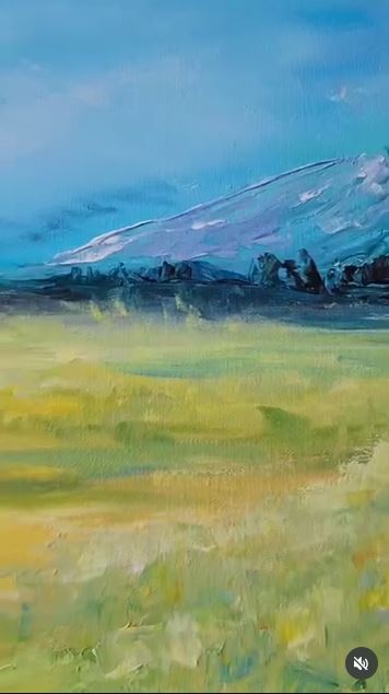
A landscape is a good subject for watercolor-style acrylic because the painting can be built from pale distance to darker foreground. The lighter sky and far landforms need very little paint. Each later layer becomes slightly stronger, sharper, or warmer as it moves toward the viewer.
Acrylic makes this sequence fairly forgiving once a layer is dry. A pale hill can be covered with another transparent glaze without completely dissolving the earlier shape.
The main limitation is that the white paper cannot easily be recovered after it has been covered with a dark stain, so the brightest areas need to be planned early.
Materials and Tools
· Watercolor paper, acrylic paper, or an absorbent ground on a rigid panel
· A small warm palette such as yellow, warm red, earth colour, and a dark neutral
· Transparent blue or violet for cooler distance
· Soft flat brush for broad washes
· Medium round brush for land shapes
· Small pointed brush for final details
· Acrylic glazing or flow medium when needed
· Clean water, palette, cloth, and tape
Layer the Scene From Light to Dark
1. Mark the horizon lightly. Use a faint pencil line or a very pale wash to place the main division. Keep it simple. Too many drawn details can make a loose landscape feel stiff before the first colour has touched the paper.
2. Wash in the sky. Wet the sky area lightly and introduce the palest warm colour. Add a cooler tone near the top or side if needed, allowing the transition to happen on the paper. Keep a strip of lighter paper where the strongest glow belongs.
3. Add the distant shapes. Once the sky is dry or almost dry, paint low hills, fields, or tree masses with a weak mixture. Reduce contrast in the distance. Soft edges and quieter colour help these forms sit behind the foreground.
4. Strengthen the middle ground. Use a slightly richer wash and fewer sweeping shapes. Let parts of the first layer remain visible between the new marks. Then dry the painting before adding the darkest accents.
5. Finish with limited dark details. Place the deepest values in the foreground, along a path, beneath trees, or around a few structural marks. Avoid outlining every shape. A handful of dark accents can hold the whole scene together without closing the transparent surface.
The part I would protect is the lightest strip in the sky. It is easy to think you can add it later, but opaque white changes the character of a transparent wash. Leaving the paper visible usually gives a cleaner glow.
You can adapt the same method to a cool misty landscape by using blue, violet, and a muted green. Keep the value sequence the same: pale distance, stronger middle ground, and a few dark marks at the front.
Paint Sea and Sky With Flowing Acrylic Washes
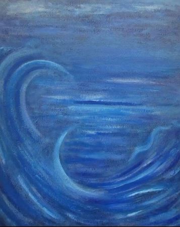
Sea and sky depend on value changes more than on a long list of colours. Pale diluted blue can suggest distant atmosphere, while deeper transparent blue builds the water in overlapping bands. White paper or a light ground can remain visible for sparkle, cloud gaps, and the brightest foam.
The challenge is keeping the broad washes open while still giving the wave a clear direction. Repeated horizontal brushing can flatten the water into stripes. Curved and broken marks, placed over a quiet wash, suggest movement without describing every ripple.
Materials and Tools
· Watercolor paper or absorbent acrylic surface
· Transparent blue acrylics
· A small warm neutral for greying selected blue mixtures
· Soft flat wash brush
· Medium round brush
· Small pointed brush or liner
· Optional masking fluid suitable for the surface, used carefully
· Acrylic medium for flow or glazing
· Clean water and absorbent cloth
Keep the Water Transparent Beneath the Foam
1. Reserve the light areas. Decide where the horizon, cloud openings, and brightest foam will sit. Leave those areas dry or paint around them. Masking can help with small highlights, but broad natural gaps often look less mechanical.
2. Lay in the palest sky and water. Use separate light mixtures so the sky and sea do not become one flat band. Let the sky wash soften toward the horizon. In the water, angle the strokes gently to establish the direction of the swell.
3. Build depth with transparent bands. After the first wash dries, add deeper blue in selected areas rather than covering the entire surface. Keep the horizon quieter and increase contrast nearer the foreground. Allow parts of the pale layer to remain visible.
4. Shape the main wave. Use a stronger but still fluid mixture to describe the curve and shadow beneath the crest. Blend one edge while the paint is wet and leave the other sharper. This contrast helps the wave turn without needing a heavy outline.
5. Add foam and broken highlights. Use the light ground, lifted wet colour, or a controlled touch of opaque light acrylic for the final foam. Keep the marks irregular and directional. Too many equal white dots can make the surface look patterned rather than moving.
I’d rather keep one convincing wave than fill the page with several competing ones. The eye needs a place to settle, especially when the rest of the painting is made from loose washes.
A beginner can simplify the subject to three horizontal zones: pale sky, middle-value distant water, and darker foreground water. Add one curved foam line only after those zones have dried.
Limit the Palette and Practise Small Washes
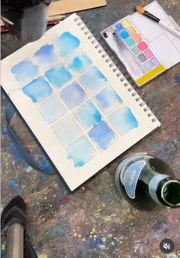
Tiny studies remove much of the pressure from this technique. A small square needs only a wash, a darker accent, and perhaps one line. That is enough space to test whether a colour stays transparent, whether two mixtures become muddy, and how a brush mark changes as the paint leaves the bristles.
A limited palette also makes the dry results easier to understand. If six colours are flowing through the same puddle, it is difficult to know which mixture caused the dull patch. Two or three colours show their behaviour more clearly and usually produce a more connected set of studies.
Materials and Tools
· One sheet of watercolor or mixed-media paper
· Pencil and ruler or a reusable square template
· Two or three acrylic colours
· One large soft brush and one smaller round brush
· Mixing palette
· Clean water
· Painter’s tape
· Optional waterproof pen for lines added after drying
Create a Page of Acrylic Wash Tests
1. Draw a loose grid. Make several small spaces with light pencil lines or tape. They do not need to be perfectly equal. The purpose is to give each experiment a boundary so you can compare the results later.
2. Mix three strengths of one colour. Prepare a pale wash, a middle-value wash, and a stronger mixture. Paint one square with each strength, leaving a small untouched patch of paper inside every shape.
3. Test two-colour meetings. Wet another square and place one colour at each side. Let them move toward each other without stirring the centre. In the next square, overlap the first colour only after it has dried so you can compare mingling with glazing.
4. Explore brush pressure. Load the brush, begin with the tip, press gently through the middle of the stroke, and lift again. Repeat with less water and then with more water. The page will become a useful record of what that particular brush can do.
5. Add only a few dry details. When the washes are fully dry, place a line, shape, or small dark accent over selected squares. Stop before every study becomes a miniature finished painting. The differences between the washes are the main subject.
This is where I would use leftover paint from another project. Even small amounts can produce a full reference page, and the exercise is more useful than letting those mixed colours dry on the palette.
You could turn the best squares into gift tags, small cards, collage pieces, or a folded booklet. Check that the acrylic is fully dry before stacking or cutting the paper.
Choose Water, Flow Medium, or Glazing Medium Carefully
Water is the simplest way to loosen acrylic paint, especially on absorbent paper where a light experimental wash is the aim.
The problem begins when so much water is added that the paint binder becomes too weak for the surface and application. There is no single safe mixing ratio for every paint because acrylic formulas, pigment loads, and surfaces vary.
A flow medium or flow improver helps paint spread with less drag. A glazing medium keeps more binder in the mixture while increasing transparency and working time.
High-flow medium can help a stiff paint behave more like liquid colour. Follow the manufacturer’s instructions for the product you use, particularly when painting on canvas, wood, or another surface that does not absorb the wash like paper.
For a first paper study, begin with a small amount of paint and add clean water gradually until the brush leaves a transparent stain rather than an opaque stripe.
For work intended to last, or for very fluid layers on a non-absorbent surface, use a suitable acrylic medium instead of relying on a large amount of water alone.
Do not confuse acrylic glazing medium with watercolor gum arabic. Both change how colour handles, but they belong to different paint systems. Keeping materials within the acrylic system makes the dry layers more predictable.
Why Acrylic Washes Behave Differently From Watercolor
The Dry Layer Usually Stays Put
A dry watercolor wash can often soften or lift when it becomes wet again. Dry acrylic usually forms a more permanent film. That lets you glaze another transparent colour on top without fully mixing the lower layer, but it also means an unwanted dark mark may be difficult to remove.
The Colour May Dry Slightly Darker or Flatter
Acrylic mixtures often change as the water leaves and the binder clears. Judge the value from a dry test, not only from the fresh puddle. Mix enough wash for a broad area because recreating the exact wet mixture halfway through can be difficult.
Edges Can Lock Quickly
Watercolor artists sometimes return to a damp edge and move it gently. Acrylic has a shorter stage between wet and fixed. Once the surface turns tacky, brushing can drag partially dried paint into rough marks. Let it dry and glaze instead of continuing to scrub.
White Paper Needs to Be Planned
Transparent acrylic relies on the light surface beneath it in much the same way as watercolor. Opaque white acrylic can restore a highlight, but it sits on top and has a different visual weight. Reserve important light areas whenever possible.
Common Mistakes to Avoid
Adding Water Without Fully Mixing the Paint
A watery ring around a lump of paint does not create a consistent wash. Break down the paint first, stir from the bottom of the palette, and test the mixture on scrap paper before it reaches the main painting.
Using Thin Drawing Paper for a Large Wet Area
Light paper can buckle, pill, and tear under repeated water. Use a surface designed to accept moisture, and tape or support it when working broadly. A small test can save a larger sheet from an unpleasant surprise.
Overworking a Wash as It Dries
The awkward patchy stage encourages one more pass with the brush. That pass often creates streaks or lifts semi-dry acrylic. Stop while the surface still looks intentional, let it dry, and adjust the value with another layer.
Making Every Colour Equally Strong
Watercolor-style painting needs pale areas as well as rich ones. If each mixture carries the same pigment strength, the painting loses air and depth. Prepare at least two values before starting a landscape or floral subject.
Mixing Too Many Colours in One Wet Puddle
Several pigments can meet in a wash and produce a dull neutral rather than a clear transition. Limit the colours that touch while wet. Let a layer dry before adding a contrasting hue when you want both colours to remain distinct.
Trying to Lift a Fully Dry Acrylic Stain
Blotting works best while the wash is still wet. Once acrylic has dried, scrubbing can damage the paper before the colour moves. Cover the area with a considered glaze, incorporate the mark into the design, or accept it as part of the loose surface.
Painting on Ordinary Canvas Without Changing the Surface
A standard primed canvas may cause a watery wash to bead, run, or sit on top rather than soaking in. Use an absorbent ground when you want paper-like behaviour on canvas or board, and test the full paint-and-medium combination before beginning a large piece.
Leaving Brushes in Thin Acrylic Mixtures
Acrylic can dry around the ferrule and damage a brush even when the mixture looks watery. Rinse brushes promptly, reshape the hairs, and let them dry flat or with the bristles pointing down rather than sitting in dirty water.
Frequently Asked Questions
Can ordinary tube acrylic paint be used like watercolor?
Yes. Mix a small amount thoroughly with water or an appropriate acrylic medium until it makes a transparent wash. Heavy-body paint takes more mixing than fluid acrylic, so test for small lumps and uneven colour before painting a broad area.
What paper works best for watercolor-style acrylic?
Watercolor paper and heavyweight mixed-media paper are practical choices because they can handle more moisture than ordinary sketch paper. The exact surface changes the effect: textured paper breaks the wash across raised areas, while smoother paper gives cleaner lines and more even stains.
How much water should I add to acrylic paint?
Add water gradually until the mixture reaches the transparency and flow you need. Avoid relying on one fixed ratio because paints and surfaces differ. When a mixture becomes extremely watery, or when painting on canvas or wood, use a compatible acrylic medium to maintain a stronger paint film.
Can I use wet-on-wet techniques with acrylic?
Yes. Dampen the paper evenly, then touch in a fluid acrylic wash and allow it to spread. Work during the glossy wet stage and stop when the surface begins to turn tacky, because semi-dry acrylic can drag into rough patches.
Can dried acrylic washes be reactivated with water?
Usually not in the same way as traditional watercolor. Once acrylic dries, it tends to remain fixed, which is helpful for glazing. It also means you should lift unwanted colour while it is still wet rather than planning to remove it later.
Do I need special acrylic medium?
Not for every small paper experiment. Water may be enough for light washes on an absorbent surface. A flow, glazing, or high-flow medium becomes more useful when you need very fluid paint, longer working time, stronger adhesion, or watercolor-like behaviour on a prepared canvas or panel.
Can I paint watercolor-style acrylic on canvas?
You can, but ordinary primed canvas is less absorbent than watercolor paper. Applying a suitable absorbent or watercolor ground can give the surface more tooth and help thin colour settle rather than bead. Follow the ground manufacturer’s instructions and test the finish before committing to a large painting.
Let the Paper Remain Part of the Painting
Learning how to use acrylic paint like watercolor is mostly a lesson in using less: less paint in the first wash, fewer colours in one puddle, fewer brushstrokes as the surface begins to dry, and fewer dark marks at the end. The untouched paper and pale layers are not empty areas. They carry the light that makes the stronger colour feel clear.
Begin with a page of small squares rather than a large finished picture. Test one colour at three strengths, allow two washes to meet, and place a transparent glaze over a dry layer. Then move to a simple sky, leaf, flower, or horizon once you know how your paint behaves on your paper.
Use what is already in the paint box, keep the rinse water clean, and give each layer enough time to settle. Which acrylic colour would you thin first: a clear blue for a loose sky, a warm yellow for a glowing landscape, or a deep green for a page of leaf studies?