Soft pastel can make a sheet of paper feel completely different within the first few strokes. On one surface, the pigment catches immediately and leaves a dense, velvety mark. On another, the same pastel skates across the page, fills the shallow texture quickly, and starts pushing earlier layers around before the drawing is anywhere near finished. That is why paper choice affects far more than whether a drawing looks smooth or textured.
For pastel work, I would pay closest attention to tooth, layer capacity, surface strength, and paper color before worrying about the thickness number by itself. A 360gsm pastel card and a 95gsm laid drawing paper can both be useful, but they behave in very different ways.
The better choice depends on whether you make quick studies, softly blended portraits, detailed wildlife, heavily layered landscapes, or paintings that begin with a wet underpainting.
The seven papers here cover several distinct approaches. Some are traditional textured art papers, two are general sketchbooks that can accept pastel for practice, one is a graded sanded surface built for repeated layering, and one is a dense pastel card with unusually strong pigment grip. There is no single surface that is automatically right for every pastel artist. The useful goal is to match the paper to the way you build color.
Why the Surface Beneath Soft Pastel Changes the Result
Soft pastel does not soak into paper the way ink does. Most of the color remains near the surface, held by tiny peaks, valleys, fibers, or abrasive particles. As those irregularities become filled with pigment, the paper loses its ability to accept more pastel. Artists often describe this ability to grip pigment as the paper’s tooth.
Tooth determines how much pigment the surface can hold
A smooth sheet can still take soft pastel, especially for light sketches, but it usually reaches saturation faster. Once the shallow surface texture is full, a new stroke may slide over the existing color or lift pigment instead of adding another clean layer.
A more pronounced surface gives pastel more places to lodge. Traditional pastel papers achieve this through a textured fiber surface, laid pattern, honeycomb grain, or similar paper texture. Sanded papers such as UART create stronger mechanical grip. Clairefontaine Pastelmat uses a different high-grip surface that feels softer than conventional sandpaper while still holding substantial pigment.
More tooth is not always better. A coarse surface can consume soft pastel quickly and may leave visible grain unless enough pigment is applied to cover it. A finer surface makes small details and thin transitions easier but usually offers less aggressive grip. The best tooth is the one that supports your normal number of layers without fighting the marks you want to make.
Layer capacity matters more than a simple smooth-versus-rough label
Two papers can both feel textured under your fingertips and still behave very differently after five or six pastel passes. Surface geometry, coating, fiber structure, and how quickly the valleys fill all affect layer capacity.
This is where purpose-made sanded and high-grip pastel surfaces separate themselves from ordinary sketch paper. UART specifically offers multiple grit grades so artists can choose how much bite they want. Clairefontaine describes Pastelmat as a surface that allows repeated layers without the same saturation effect common on conventional paper. By comparison, the CONDA and SuFly sketchbooks are versatile drawing books first. They can accept pastel, but their value is portability and general dry-media use rather than maximum pastel buildup.
If your style depends on glazing one pastel color over another, scumbling broken color, or repeatedly correcting shapes, the paper needs enough unused tooth left after the early layers. Otherwise, the surface itself starts setting the limit before your drawing is ready.
Traditional pastel paper and sanded paper feel different under the stick
Traditional papers such as Canson Mi-Teintes and Strathmore’s pastel or charcoal sheets have a familiar paper feel. The pastel stroke responds to the direction and pressure of your hand, and the visible grain can become part of the finished image. These surfaces are approachable for sketches, life drawing, portraits, and work where you want some paper tone to remain visible.
Sanded paper gives a more assertive response. The abrasive surface scrapes pigment from the pastel stick efficiently, which makes rich coverage and repeated layering easier. The trade-off is faster pastel consumption and a different tactile feel. Artists who love delicate, barely-there strokes on smooth paper may find a coarse grit too hungry.
Pastelmat sits between familiar paper and obvious sanded grit. Clairefontaine describes it as coarser than velour but softer than sandpaper. That combination is one reason it is popular for artists who want substantial layer capacity without the scratchier feel of a conventional abrasive sheet.
Paper weight affects handling, but it does not measure tooth
GSM tells you the mass of the paper per square meter. It is useful for judging how substantial a sheet may feel, but it does not tell you how well pastel will grip.
Strathmore 300 Series Charcoal paper is 95gsm and has a laid finish specifically suited to charcoal and pastel. Strathmore 400 Series Pastel is 118gsm with a textured pastel surface. Canson Mi-Teintes is 160gsm. SuFly’s toned sketchbook listing specifies 150gsm paper. Pastelmat is much heavier at 360gsm.
Those numbers help with handling and stiffness, but the 360gsm Pastelmat is not simply “better” because it weighs more. Its specialized surface is the important part. Likewise, a lighter laid paper can be very satisfying for a direct pastel study even though it would not be my first choice for repeated wet underpainting or extremely heavy buildup.
The color of the paper can do part of the painting for you
A toned sheet is not merely decorative. It establishes a value and color family before the first pastel touches the surface. Mid-tone paper lets you build lights upward and shadows downward instead of covering a white background completely.
Canson Mi-Teintes is available in a wide range of colors. Strathmore 400 Pastel pads use assorted subtle tints. SuFly’s book uses toned tan paper. Pastelmat pads are sold in several assortments and individual colors. UART is available in light and dark surface options depending on format and current range.
A toned ground can be especially useful for portraits, animals, landscapes, and still life because small gaps between pastel marks read as intentional color rather than unfinished white paper. If you like broken strokes and visible surface, background color should be treated as part of the palette.
Acid-free construction matters when the work is worth keeping
Acid-free paper is not a guarantee that a pastel drawing will survive every storage condition, but it removes one avoidable source of long-term paper deterioration. Strathmore 400 Pastel, Strathmore 300 Charcoal, Canson Mi-Teintes, UART, and the CONDA sketchbook are all currently described as acid-free or archival/pH-neutral by their manufacturers or current product information.
For finished work, the rest of the storage system matters too. Keep pastel away from rubbing surfaces, moisture, dirt, and pressure. Use suitable interleaving and frame valuable work so the pastel surface does not touch the glazing.
| Product Image | Product Name | Features | Price |
|---|---|---|---|
 |
Strathmore 400 Series Pastel Pad | Specially designed surface ideal for creating artwork with soft, oil, or chalk pastels. Ideally textured paper enhances pastel adhesion. Prevents yellowing over time, preserving the brilliance and longevity of your artwork. |
Check Price |
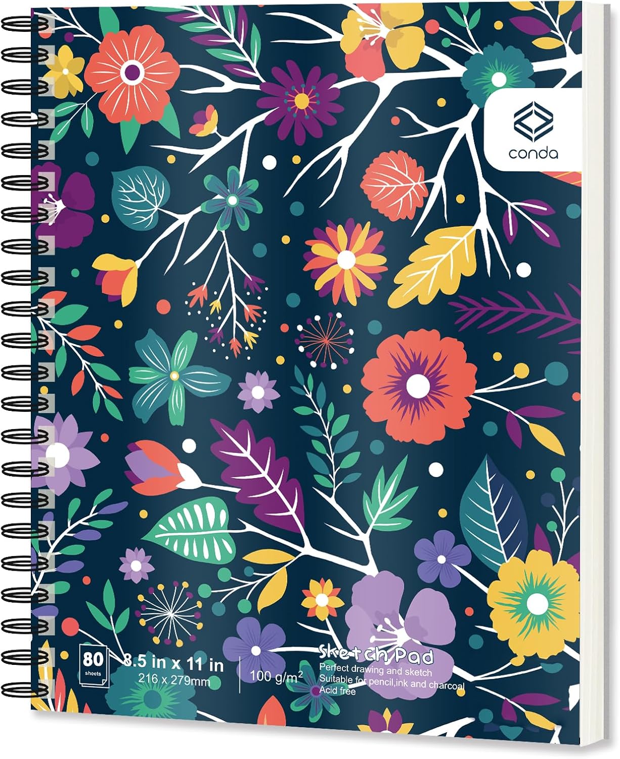 |
conda 8.5″x11″ Sketch Book | Pages flip smoothly, lay flat, and include perforated edges for clean removal. Textured, slick-smooth, and waterproof cover protects artwork while adding a premium feel. Preserves vibrant colors and prevents yellowing |
Check Price |
 |
SuFly Toned Paper Sketch Book | Micro-perforated sheets tear out cleanly, giving artwork a polished presentation. Double-wire binding ensures the sketchbook lies flat for seamless drawing across pages. 60 sheets per pad offer durability, performance, and eco-conscious artistry at an accessible price. |
Check Price |
 |
Canson Artist Series Mi-Teintes Pastel Paper | Recognized globally as a preferred choice for pastel, drawing, and paper craft projects. Made with 50% cotton fibers for strength, resilience, and a professional-grade feel. Special sizing enhances durability. |
Check Price |
 |
Strathmore 300 Series Charcoal Paper Pad | Prevents yellowing and preserves artwork for long-term storage and display. Offers the right balance for both detailed lines and expressive strokes. Lightweight pad makes it easy to carry for sketching on the go. |
Check Price |
 |
Uart Sanded Pastel Art Paper | Choose from several grades to match your artistic style and project needs. Off-white sheets designed to maintain vibrancy and integrity for years. Optimized for pastels, colored pencils, and charcoal, offering smooth blending and layering |
Check Price |
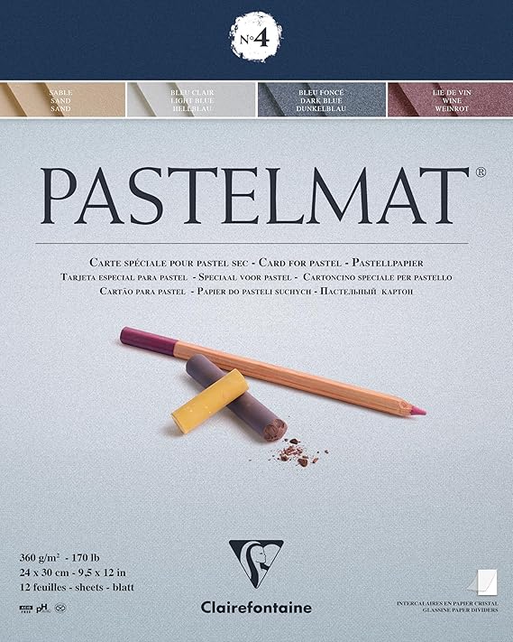 |
Clairefontaine 24 x 30 cm Pastelmat Glued Pad | 360gsm heavyweight card designed specifically for pastel techniques. Spacer sheets between each page safeguard artwork from smudging or damage. Acid-free and pH neutral to preserve artwork vibrancy and prevent deterioration over time. |
Check Price |
What to Check Before You Choose
A paper that looks impressive in a specification list can still be wrong for the way you draw. I would narrow the decision by answering a few practical questions first.
Start with the number of layers you normally use
If you make quick figure studies with three or four decisive color passes, you may be happier on a traditional textured paper than on a deeply abrasive surface. The paper feels responsive, uses less pastel, and lets the grain remain visible.
If you build ten or more layers, repeatedly soften edges, add new color over established passages, or work back into the surface after corrections, you need more grip. UART and Pastelmat are the obvious choices in this group for that kind of workflow.
Do not buy an aggressively toothy paper simply because it sounds more professional. Buy enough tooth for your actual technique. Excessive tooth can make a simple sketch slower and more pastel-hungry than it needs to be.
Decide whether you want the paper texture to remain visible
Canson Mi-Teintes has two deliberately different sides: a honeycomb grain and a finer grain. That gives you control over how much surface character appears. Strathmore 300 Charcoal has a traditional laid finish. Strathmore 400 Pastel has a textured finish and muted paper colors.
On a sanded surface, visible texture depends strongly on grit and coverage. Coarser UART grades can leave a pronounced broken mark until enough pastel is applied. Finer grades make delicate detail more natural.
If your finished style is very smooth, test the paper before committing to a large piece. A surface that looks beautiful in a landscape may feel distracting in a softly modeled portrait.
Think about underpainting before you choose a sheet
Some pastel artists start with watercolor, alcohol, diluted pastel, or another wet wash to establish big shapes before applying dry pastel. That changes the paper requirements.
UART explicitly describes its surface as able to handle water-, oil-, and alcohol-based media without losing the sanded texture. Clairefontaine states that Pastelmat keeps its properties after being wet. Those are strong reasons to consider them when wet underpainting is part of your regular process.
Ordinary sketchbook paper should not be treated the same way. The CONDA book is a lightweight 90gsm drawing paper, and the SuFly book is 150gsm. Even if a seller describes broad media compatibility, I would reserve heavy wet techniques for paper specifically designed to tolerate them.
Match the sheet size to the way you actually work
Large sheets are useful for expressive strokes because your arm can move freely. Smaller pads are easier to store, travel with, and protect.
Strathmore 400 Pastel is sold in several pad sizes, including 9 x 12, 11 x 14, and 18 x 24 inches. UART sheets run from small formats to large sheets, while its pads are available in a compact 9 x 12 format. Pastelmat pads include 24 x 30 cm and other sizes. Canson Mi-Teintes is sold in sheets, pads, and rolls.
The CONDA 8.5 x 11 sketchbook is particularly portable. SuFly’s 11 x 14 book gives more room while retaining a bound format. The easiest paper to use regularly is often the paper that fits your drawing board, storage, and framing habits without extra cutting.
Consider whether you need a bound sketchbook or loose art paper
A sketchbook keeps practice work together and makes drawing away from the studio easier. It is also convenient for value studies, color notes, and thumbnail compositions.
Loose sheets and glued pads are better for finished pastel work because you can mount, tape, rotate, and frame the sheet without fighting a binding. Sanded paper can also be cut to exact dimensions for a panel or frame.
If your goal is deliberate finished work, I would not choose CONDA or SuFly simply because the binding is convenient. If your goal is daily practice, those bound books may be used far more often than a premium sheet stored carefully in a drawer.
Check how the paper handles erasing and correction
Pastel correction is not the same as graphite erasing. You can lift pigment with kneaded eraser, tape, stiff brushes, or other methods, but every surface has a limit.
Pastelmat is specifically described by Clairefontaine as retaining its properties after erasing and wetting. UART’s sanded coating is designed for substantial working and underpainting. Traditional paper surfaces can become smoother if scrubbed aggressively.
If you tend to redraw repeatedly, use a lighter touch early in the piece. Preserve the surface for the later stages rather than grinding pigment into the paper before the proportions are settled.
Decide how much pastel consumption you are comfortable with
Sanded surfaces remove more pigment from a soft pastel stick. That is part of why they create rich marks and hold so many layers, but the effect is noticeable.
A finer traditional paper usually uses less material. For students or artists doing large amounts of practice, that can matter. One sensible approach is to use a general or traditional paper for studies and reserve premium sanded sheets for finished work that actually needs the extra capacity.
Strathmore 400 Series Pastel Pad — Traditional Pastel Paper With Toned Sheets
Strathmore 400 Series Pastel is the most straightforward traditional pastel pad in this group. Current product information lists 80 lb/118gsm acid-free paper with a textured finish, 24 sheets per pad, and six assorted subtle colors. It is intended for oil pastel and soft or hard dry pastel, while also supporting charcoal and other dry drawing media.
This is the kind of surface I would consider when you want recognizably pastel-friendly paper without moving into sanded or coated territory. The texture gives dry pigment something to catch, but the paper still behaves like paper. That makes blending, feathering, hatching, and leaving broken areas of the tinted ground visible feel natural.
The assorted colors are a practical strength. White, cream, blue, green, light pink, and brown tints are commonly included in current pad descriptions. Those backgrounds encourage you to think in value rather than automatically building every image from white. A cream or brown sheet can support warm portraits and still life, while blue or green can become an active part of a landscape or shadow scheme.
At 118gsm, this is not a heavyweight board. That is fine for dry pastel. It also keeps the pad easy to handle and store. The limitation appears when you ask the paper to behave like a wet-media surface or carry extremely heavy repeated layers. For those methods, UART or Pastelmat gives you more working reserve.
Key features
The textured 118gsm surface is specifically intended for pastel, so it provides more useful pigment grip than an ordinary smooth drawing sheet without becoming aggressively abrasive. This is a comfortable middle ground for artists learning how much pressure and layering soft pastel needs.
The 24-sheet pad makes repeated practice practical. Because the sheets are tinted, you can use the paper color as a middle value and begin by placing only the darkest darks and lightest lights. That is an efficient way to train value judgment.
Acid-free construction makes the pad suitable for work you may want to keep, provided the finished drawing is stored and framed appropriately. The glue-bound format also lets you remove a sheet for mounting or framing without carrying a spiral edge into the artwork.
The main limitation is layer capacity. Traditional texture can fill. If you push a very soft pastel hard from the first layer, the surface may reach saturation sooner than a sanded sheet. Build lightly at first and save the softest, most opaque marks for later stages.
- Purpose-made textured surface works with soft, hard, and oil pastel without the harsh feel of sanded paper.
- Assorted toned sheets make it easier to use the background as part of the value and color design.
- The acid-free 118gsm paper is substantial enough for normal dry pastel handling while staying easy to mount and store.
- Twenty-four sheets per pad provide enough material for both exercises and finished drawings without turning every experiment into a premium-paper decision.
- The traditional tooth fills sooner than UART or Pastelmat when you build many dense layers or repeatedly rework the same area.
Who It’s Best For
Strathmore 400 Pastel suits students, portrait artists, life-drawing practice, and anyone who likes traditional paper texture with useful toned backgrounds.
Not Ideal For
It is less suitable for artists whose normal method depends on aggressive wet underpainting, very heavy scumbling, or extensive layer-after-layer correction.
CONDA 8.5 x 11 Hardbound Sketch Book — Portable Practice Paper for Dry-Media Studies
The CONDA hardbound sketchbook needs to be understood for what it is: a general dry-media sketchbook that happens to accept pastel, not a specialist pastel surface. Current listings for the 8.5 x 11-inch version specify 80 sheets of 90gsm/60 lb acid-free drawing paper, spiral binding, a hard cover, and perforated sheet edges. Pastel and charcoal are included among the recommended dry media.
That distinction matters. If you compare it directly with UART or Pastelmat only on pastel performance, the specialist surfaces win easily. If you compare it as a book for daily sketching, color thumbnails, composition studies, classroom exercises, and travel practice, its strengths become much more obvious.
The 90gsm paper keeps the book relatively light. Fine texture gives dry media some grip, and the spiral binding allows the book to lie flat or fold back while drawing. Perforated edges are useful when you want to remove a successful sketch without cutting it from the binding.
For soft pastel, I would use lighter pressure and fewer layers. The paper can support a pastel study, but it does not have the deep reserve of an abrasive or coated pastel sheet. Once the shallow texture fills, extra rubbing tends to move pigment around rather than build clean new color.
Key features
The hard cover and spiral binding make this a convenient everyday pastel-practice book rather than a fragile stack of loose sheets. It can travel in a portfolio or bag, and the cover gives the pages more protection between sessions.
Eighty sheets provide a lot of practice surface. That encourages experimentation with limited palettes, value studies, edge exercises, and color mixing without the hesitation that can come with an expensive premium sheet.
The acid-free paper is a better long-term choice than low-grade acidic sketch paper, although finished pastel still needs careful protection from rubbing and dust. The perforated edge makes it easier to remove work cleanly for storage behind glassine or for mounting.
The paper’s relatively light 90gsm weight is the main technical limitation. It is not where I would start for solvent underpainting, repeated scrubbing, or a pastel painting built through many dense passes.
- Eighty-sheet format gives you abundant space for pastel practice, thumbnails, and color studies.
- Hard cover protects the pages better than a simple paper-covered pad during transport and storage.
- Spiral binding opens flat and makes it easy to work on either side of the book without fighting a stiff spine.
- Acid-free dry-media paper can take pastel, charcoal, pencil, and other sketch materials in one portable book.
- The 90gsm general drawing paper has limited tooth compared with dedicated pastel surfaces, so heavy layering reaches saturation quickly.
Who It’s Best For
CONDA is most useful for beginners, students, travelers, and artists who want an inexpensive place to practice pastel ideas before moving to a finished surface.
Not Ideal For
It is not the paper I would choose for a heavily layered commission, solvent underpainting, or a finished pastel painting that depends on deep surface tooth.
SuFly Toned Paper Sketch Book — Toned Tan Practice Surface With More Body
SuFly’s toned sketchbook offers a different kind of practice surface. Current product information for the 11 x 14-inch version specifies 60 sheets of 90 lb/150gsm toned tan paper, Wire-O binding, micro-perforated sheets, and a textured surface intended for graphite, colored pencil, charcoal, pastels, and other drawing media. The listing also describes the paper as made from recycled material.
The mid-tone tan sheet is the main attraction for pastel. Instead of starting on white, you can establish highlights with pale pastel and shadows with darker colors while allowing the paper to remain visible through the middle values. That is especially useful for portrait heads, animal studies, fabric folds, and objects with warm local color.
At 150gsm, the sheet has noticeably more body than the 90gsm CONDA book. That does not automatically give it more pastel tooth, but it makes the page feel more substantial during erasing and general drawing. The larger 11 x 14 format also gives enough room for a complete head study or a small landscape without becoming cumbersome.
I would still treat it as a versatile sketchbook rather than a substitute for a true sanded surface. The texture can hold pastel for studies and moderate layering, but a specialist pastel painting with extensive buildup will benefit from UART or Pastelmat.
Key features
The toned tan ground immediately gives light and dark pastel marks something to work against, which can make value structure easier to see than it is on bright white paper. Beginners often discover that they use highlights more selectively when the paper itself already supplies a middle value.
The 150gsm weight provides a sturdier feel than lightweight sketch paper. That is useful when you blend with fingers, silicone tools, paper stumps, or cloth because the sheet is less flimsy under pressure.
Wire-O binding lets the book lie flat, while micro-perforation helps you remove a finished sheet cleanly. Sixty sheets provide enough room for a sustained series of studies rather than a handful of precious pages.
The recycled construction is also attractive if mindful material use matters to you. Still, surface performance should remain the deciding factor for finished work. Recycled content does not tell you how many pastel layers the paper can carry.
- Toned tan paper creates an immediate middle value that works particularly well with light highlights and dark charcoal-like pastel marks.
- The 150gsm sheet has enough body for repeated dry-media practice without feeling like thin notebook paper.
- Eleven-by-fourteen-inch pages provide more drawing room than a compact sketchbook while remaining easy to store.
- Wire-O binding and micro-perforation make the book convenient both for in-book practice and for removing successful sheets.
- The surface is a general mixed-dry-media texture, so it cannot match the layer capacity of UART sanded paper or Pastelmat.
Who It’s Best For
SuFly suits artists who enjoy toned grounds, students practicing light-and-shadow studies, and anyone who wants a sturdy bound book for pastel mixed with charcoal, graphite, or colored pencil.
Not Ideal For
It is less suitable for very heavy pastel layering, aggressive underpainting, or artists who want a highly predictable professional pastel tooth from sheet to sheet.
Canson Artist Series Mi-Teintes Pastel Paper — Two Textures and a Broad Color Range
Canson Mi-Teintes is one of the most versatile traditional art papers in this selection. Canson currently lists the Artist Series paper at 98 lb/160gsm, acid-free, available in 50 colors, and double-sided. One side has the recognizable honeycomb grain that grips pigment; the reverse has a finer grain for more controlled drawing. Canson also notes a high cotton content, pulp-dyed color, and light-resistant color performance.
That two-sided design is unusually useful because it changes the drawing experience without requiring a different product. Use the honeycomb side when you want visible texture, broken color, and stronger pastel pickup. Turn the sheet over when you want fine contours, delicate facial details, pencil underdrawing, or a less assertive pattern.
The color range is another major advantage. Toned paper can replace a surprising amount of base-layer work. A dark sheet lets light pastel become immediately luminous. A warm earth tone can unify skin and landscape colors. A cool blue or gray can establish atmosphere before the first stroke.
Mi-Teintes is still a traditional paper rather than a sanded surface. It can take substantial pastel, especially on the honeycomb side, but it will eventually fill. Canson’s own guidance notes that the textured side accepts heavier layering than smoother pastel papers. For artists who enjoy allowing paper grain and background color to participate in the image, that limitation can be part of the appeal rather than a defect.
Key features
Two usable surfaces make Mi-Teintes unusually adaptable: the honeycomb grain holds more visible pastel texture, while the fine-grain side supports smaller controlled marks. This can save you from buying separate pads for studies and more detailed work.
The 160gsm weight gives the paper enough substance to handle normal pastel rubbing and erasing while remaining flexible enough for mounting and framing. Because the paper is pulp-dyed, cut edges and small surface gaps do not expose a white coating over a different-colored core.
Canson’s acid-free manufacturing and ISO 9706 permanence information make it a sensible choice for finished work. The very broad color range also gives experienced artists much more control over the initial value and temperature of a piece than an assorted pad with only a few tints.
The honeycomb pattern is distinctive, and not everyone likes seeing it. If you work with thin pastel layers, the pattern can remain visible. Test both sides before deciding which face belongs under a detailed portrait or a large area of smooth sky.
- Double-sided construction gives you both a pronounced honeycomb grain and a finer drawing surface in the same sheet.
- A wide range of pulp-dyed colors lets the paper function as an intentional middle value or dominant undertone.
- The acid-free 160gsm paper has enough body for finished pastel work while remaining easy to cut, mount, and frame.
- High cotton content contributes strength and flexibility, which is useful when the paper is handled repeatedly during drawing and mounting.
- The honeycomb texture can show through light pastel applications, which may distract artists who prefer a uniformly smooth-looking finish.
Who It’s Best For
Mi-Teintes is an excellent fit for portrait, figure, still-life, and landscape artists who want traditional paper feel, deliberate toned backgrounds, and a choice of two textures.
Not Ideal For
It is less suitable for artists who routinely build exceptionally deep layers or use aggressive wet underpainting and want the surface to remain unchanged throughout.
Strathmore 300 Series Charcoal Paper Pad — Laid Texture for Direct Pastel Studies
Although the name says charcoal, Strathmore 300 Series Charcoal paper is also explicitly recommended for pastel. Current product information lists natural white, acid-free 64 lb/95gsm paper with a traditional laid finish. Common pad sizes include 9 x 12, 11 x 17, and 18 x 24 inches, with 32 sheets in the smaller pads and 24 sheets in the largest size.
The laid surface is the reason it belongs in a pastel discussion. Parallel texture and fiber pattern give soft pastel more purchase than ordinary smooth sketch paper. The effect is traditional and visible, making the paper especially pleasant for gesture drawing, figure studies, quick portraits, charcoal-and-pastel combinations, and work where the energy of the mark matters more than polished coverage.
At 95gsm, the paper is lightweight compared with Mi-Teintes or Pastelmat. That keeps the pad economical and easy to handle, but it also means this is not the surface I would choose for a demanding wet process. Its strength is direct dry drawing.
I know it is tempting to equate a lower paper weight with lower usefulness, but that misses the point here. The laid finish is more important to pastel performance than the gsm number alone. If your process is quick, dry, and linear, this paper can feel more appropriate than a much heavier but smoother mixed-media sheet.
Key features
The traditional laid finish gives charcoal and pastel a directional texture that can support hatching and broken strokes. It also makes it easier to keep some surface character visible in the finished piece.
Acid-free construction is helpful for drawings worth keeping. The natural white color is neutral enough for broad subject matter, though it does not provide the immediate middle-value advantage of toned paper.
The pad format and sheet count encourage frequent practice. Life-drawing artists, in particular, can go through paper quickly, and a surface like this makes sense when you need enough tooth for pastel without reserving a costly sanded sheet for every ten-minute pose.
Because the paper is relatively light, mount or tape it to a firm drawing board before vigorous blending. Supporting the sheet prevents the paper from flexing under hand pressure and makes large strokes feel more controlled.
- Laid texture is deliberately suited to charcoal and pastel, giving dry pigment a useful traditional paper grain.
- Natural white surface keeps color relationships predictable when you do not want a tinted ground influencing the palette.
- Acid-free paper is appropriate for studies and finished drawings that will be stored carefully.
- Multiple pad sizes and generous sheet counts make it practical for life drawing, classroom exercises, and frequent practice.
- At 95gsm, the paper is better for dry pastel work than for wet underpainting or unusually aggressive reworking.
Who It’s Best For
Strathmore 300 Charcoal suits figure drawers, charcoal-and-pastel artists, students, and anyone who prefers a laid texture for energetic direct marks.
Not Ideal For
It is not the strongest choice for heavily layered pastel paintings, abrasive scrubbing, or techniques that repeatedly wet the surface.
UART Premium Sanded Pastel Art Paper — Graded Tooth for Heavy Layering and Underpainting
UART is the most technically adjustable surface in this selection because the artist chooses the grit grade. The manufacturer currently offers sanded paper in grades 240, 320, 400, 500, 600, and 800. Lower numbers are coarser; higher numbers are finer. UART describes the paper as archival, pH-neutral, suitable for pastel, colored pencil, and charcoal, and capable of handling wet underpainting without losing the working surface.
That range matters because “sanded pastel paper” is not one experience. Grade 240 is very coarse and designed for extra layering. Grade 400 is a widely used middle choice and a sensible starting point for artists new to UART. Grade 500 offers moderate tooth. Grades 600 and 800 move progressively toward detail and finer application.
Sanded paper changes the way a pastel stick deposits color. The surface pulls pigment from the stick quickly, producing rich marks with less need to press. That helps preserve bright color because you can layer with a lighter hand instead of grinding early pigment deeply into the paper.
The major advantage is working reserve. You can build color, brush passages back, add new layers, and use underpainting techniques while keeping enough tooth for later stages. For landscape painters, animal artists, and anyone who develops a pastel painting through many passes, this can be transformative.
Key features
Six grit grades let you choose the amount of tooth instead of accepting one manufacturer texture for every subject. Coarser grades favor bold layering and broken marks; finer grades are easier for whiskers, hair, architecture, and other small detail.
UART states that its paper can handle water, oil, and alcohol-based media, making it well suited to artists who establish a watercolor-like or solvent-based underpainting before dry pastel. That opens a much wider range of starting techniques than lightweight traditional paper.
The sanded surface is designed to maintain tooth through substantial working. This is particularly useful when you change your mind. A passage can often be brushed back and rebuilt more effectively than it could on shallow sketch-paper texture.
UART sheets are sold in several sizes, and the current range also includes pads, rolls, mounted boards, and adhesive-backed formats. That gives artists a consistent surface across small studies and larger finished work.
There is a cost in material use. Coarse abrasive paper eats pastel faster, especially very soft sticks. It can also be harder on fingertips if you blend directly with your hand. Use tools, light pressure, and the grit that matches the detail level you need.
- Multiple grit grades provide unusually precise control over how coarse or fine the pastel surface feels.
- Strong sanded tooth supports repeated layering and lets artists keep working after ordinary paper would already feel full.
- Wet-media compatibility makes UART particularly useful for watercolor, alcohol, or other underpainting methods approved by the manufacturer.
- Archival pH-neutral construction and multiple formats make it suitable for serious finished pastel work as well as smaller studies.
- The abrasive surface consumes soft pastel faster than traditional paper, and coarse grades can feel unnecessarily aggressive for light sketches or very delicate blending.
Who It’s Best For
UART is best for artists who layer heavily, use underpainting, make substantial corrections, or want to choose a specific grit for landscapes, portraits, animals, or detailed work.
Not Ideal For
It may be excessive for casual pastel sketching, artists trying to conserve expensive soft sticks, or anyone who strongly prefers the tactile feel of conventional paper.
Clairefontaine Pastelmat Glued Pad — High-Grip Pastel Card With a Softer Feel
Clairefontaine Pastelmat takes a different route to high layer capacity. The manufacturer describes its surface as softer than sandpaper but more gripping than velour, allowing repeated layers of dry pastel without the same saturation effect found on ordinary paper. Current 24 x 30 cm glued pads use 360gsm pastel card, and common assortments contain 12 sheets with protective crystal-paper dividers between the sheets.
That combination makes Pastelmat feel more like a substantial art support than a light drawing sheet. The card stays relatively firm on a drawing board, and the surface accepts soft pastel with strong adhesion while still allowing delicate marks. Artists who find conventional sanded paper too abrasive often appreciate this softer tactile response.
Clairefontaine also states that Pastelmat keeps its properties after erasing or wetting. That is valuable for mixed pastel processes because you can establish an underpainting, let it dry, and then continue with dry pastel without expecting the surface to become ordinary smooth card.
The protective interleaving inside the pad is a thoughtful detail. Pastel transfers easily when sheets rub against each other. Separate dividers reduce that contact while the work remains in the pad, although finished paintings still deserve careful storage after removal.
Key features
The 360gsm high-grip card supports deep layering while feeling softer under the pastel than many conventional sanded papers. This is particularly useful for artists who want both substantial pigment hold and fine finishing detail.
Pastelmat’s ability to retain its surface properties after wetting makes it suitable for underpainting methods that would be risky on lightweight paper. It can also tolerate erasing and reworking more confidently than a shallow paper texture.
The 24 x 30 cm pad is a practical medium size for portraits, animals, still life, and small landscapes. Twelve sheets make it more of a finished-work material than an everyday practice pad, which helps explain why many artists reserve it for pieces where the surface advantage matters.
Assorted colors let you choose a ground that supports the subject. Different Pastelmat pad assortments use different color combinations, so check the exact palette before ordering if the background color is important to your plan.
The main trade-off is that a premium high-grip support can feel unnecessary for quick exercises. If you only need a few layers, Strathmore 400, Mi-Teintes, or a practice sketchbook may be more economical and simpler.
- Strong pigment grip allows repeated pastel layers without the scratchier feel associated with many sanded surfaces.
- Heavy 360gsm card stays substantial during blending, erasing, mounting, and underpainting.
- Clairefontaine states that the surface retains its useful properties after wetting or erasing, supporting flexible working methods.
- Protective dividers between pad sheets help reduce accidental rubbing and transfer while drawings remain stored in the pad.
- The premium surface is more than most quick sketches need, so using it for every exercise can be an expensive way to practice basic marks.
Who It’s Best For
Pastelmat suits portrait, wildlife, pet, still-life, and landscape artists who want strong layer capacity with a smoother, softer surface feel than coarse sanded paper.
Not Ideal For
It is less compelling for fast classroom studies, artists who deliberately want obvious laid-paper texture, or anyone whose work rarely exceeds a few light pastel layers.
Comparing the Seven Papers by How They Behave
The easiest way to choose among these papers is to stop asking which one is “best” in isolation. Think about the point at which your current paper normally starts resisting you.
For traditional pastel technique and visible paper character
Strathmore 400 Pastel and Canson Mi-Teintes are the strongest choices if you want a recognizable paper surface rather than an abrasive ground. Strathmore gives you a simple textured pad with assorted colors. Mi-Teintes gives you a broader color range and two distinctly different sides.
Mi-Teintes is the more flexible option for artists who care deeply about the starting paper color. Strathmore 400 is simpler for someone who wants a dependable pad without choosing among dozens of individual colors.
Strathmore 300 Charcoal is even more direct. Its laid texture works beautifully for drawing-oriented pastel use, especially when line, gesture, and exposed paper remain important parts of the finished image.
For heavy layering and repeated correction
UART and Pastelmat are in another class for layer capacity. UART offers the most control over tooth because you select a grit. Pastelmat provides a high-grip surface with a softer feel and very substantial 360gsm card.
Choose UART when grit selection and wet underpainting flexibility matter most. Choose Pastelmat when you want strong pigment hold but dislike the rough tactile sensation of conventional sanded paper.
If your current drawings fail because the surface fills before you finish, changing to UART or Pastelmat will usually make a bigger difference than simply buying a thicker ordinary sketch paper.
For detailed pastel work
Fine detail depends on more than paper. Pastel hardness, sharpening method, edge control, and hand pressure matter too. Still, the surface can help.
The fine side of Mi-Teintes is useful when you want a traditional paper that does not impose a large visible pattern. UART’s 600 and 800 grades are designed for finer application while retaining the advantages of a sanded surface. Pastelmat can also take very fine marks once enough underlying color is established.
A coarse UART grade is not my first choice for tiny whiskers or architectural line unless you intentionally want broken texture. Match grit to mark size.
For inexpensive daily practice
CONDA is the obvious quantity-first choice because the current 8.5 x 11 format provides 80 sheets in a durable sketchbook. It is useful for thumbnails, color notes, compositional studies, and learning basic pastel handling.
SuFly gives you fewer sheets but a heavier toned tan surface and larger format. It is better if your practice specifically involves working from a middle value and using both light and dark media.
Neither should be confused with a premium pastel surface. Their role is different: they make frequent practice easy.
For toned-ground drawing
Canson Mi-Teintes offers the greatest color freedom. Strathmore 400 supplies a smaller assortment of gentle tints in one pad. SuFly gives you a consistent tan ground through the book. Pastelmat offers several pad palettes and individual colors.
A consistent toned book like SuFly is excellent for building a series because every study begins from the same middle value. A broad range like Mi-Teintes is better when you choose paper color specifically for each subject.
For underpainting
UART and Pastelmat are the clear choices from this group because their manufacturers specifically support wet working. Underpainting on lighter traditional paper can buckle or weaken the surface, and general sketchbooks should not be assumed to tolerate the same treatment simply because they can handle dry pastel.
Let the underpainting dry fully before adding soft pastel. A damp surface can change how pigment releases from the stick and may lead you to press harder than necessary.
How to Test and Use Pastel Paper Before Committing to a Finished Piece
A small test strip can tell you more than a long specification list. Use the same pastel brands and tools you expect to use on the final drawing.
1. Make a pressure scale first
Start with one pastel color and make marks from barely touching the paper to firm pressure. Watch how quickly the surface fills and whether the texture remains visible.
This simple test tells you whether the paper encourages a light hand or requires more pigment to cover. On sanded paper, you may discover that much less pressure is needed than on ordinary sketch paper.
2. Layer three very different colors
Choose a dark, a mid-tone, and a light. Apply the first color lightly, then cross it with the second, then place the light on top. Repeat several times in one section of the strip.
The point is not to make a beautiful swatch. The point is to find the moment when the surface stops accepting clean new color. That moment tells you whether the paper has enough working reserve for your normal method.
3. Test blending separately from layering
Blending can flatten surface tooth. Make one patch where you blend aggressively and another where you leave strokes untouched. Add the same final highlight to both.
If the highlight sits cleanly on the unblended patch but skates across the blended one, your blending method is consuming too much tooth. Change pressure or use a more capable surface before starting the real drawing.
4. Test lifting and correction
Use a kneaded eraser, a stiff dry brush, or your normal lifting tool to remove a small area. Then reapply pastel.
Traditional paper may show more change after repeated rubbing. UART and Pastelmat are built for more sustained working. The test helps you learn how far you can correct without damaging the support.
5. Test the exact background color under your palette
Pastel colors are optically influenced by the surface around them. A pale yellow can feel much brighter on blue paper than on cream. A cool gray can make warm skin colors appear more saturated.
Lay several planned colors over a small strip of the paper you intend to use. If the ground fights the palette, change it before the drawing begins rather than trying to bury the entire sheet under pastel later.
6. Mount or tape the paper securely
Even heavyweight paper is easier to work on when it does not shift. Use artist tape or an appropriate mounting method on a firm board. Leave enough edge for handling and framing.
For lightweight Strathmore 300 or sketchbook sheets, firm support is especially useful during blending. For heavier Pastelmat, the sheet is stiffer but still benefits from being held flat.
7. Build early layers with a lighter hand
Soft pastel rewards restraint at the beginning. If you press hard immediately, you can fill tooth before the color structure is resolved. Use harder pastels or lighter pressure for the first passes, then bring in softer sticks and stronger pressure as the painting develops.
This approach helps on every surface, but it is particularly important on traditional paper. Preserving tooth early is one of the simplest ways to keep later highlights clean and luminous.
Protecting Pastel Paper and Finished Drawings
Pastel remains vulnerable after the drawing is finished because loose pigment sits at the surface. Good paper cannot protect the painting from careless storage by itself.
Keep unused paper flat, clean, and dry
Store loose sheets flat when possible. Keep them away from high humidity, dirty shelves, and materials that can transfer oil or adhesive residue. Sanded paper should be protected from abrasion because the coating itself is part of the working surface.
Bound sketchbooks are easier to protect, but pastel on facing pages can transfer. Place glassine or another suitable archival interleaf over drawings you want to preserve.
Separate finished pastel surfaces from anything that can rub
Do not stack finished pastel paintings face-to-face. Even light pressure can move pigment from one sheet to another. Protective interleaving should be smooth and used with minimal movement.
Pastelmat pads include protective dividers for this reason. Once a finished work leaves the pad, continue that same principle in your storage system.
Be cautious with fixative
Fixative can reduce smudging, but it can also change color, darken values, or alter the surface appearance. The decision is artistic as well as protective.
Test fixative on a sample made with the same paper and pastel before spraying a finished piece. Follow the product label, use appropriate ventilation, and do not assume every high-grip surface requires fixative. UART and Clairefontaine both promote surfaces capable of holding substantial pastel without relying on fixative between every layer.
Frame finished work so the pastel does not touch the glazing
Pastel is usually framed behind glass or acrylic with spacing that prevents the pigment surface from rubbing directly against the glazing. A mat, spacer, or suitable framing system creates that separation.
Keep loose dust away from the visible mat area during framing. A small amount of pastel trapped on a clean border becomes much more noticeable once the piece is sealed behind glass.
Where Pastel Paper Choices Commonly Go Wrong
Even good paper produces disappointing results when it is used for the wrong purpose. These problems are usually easier to prevent than to repair halfway through a painting.
Choosing by gsm alone
A heavier sheet feels more substantial, so it is easy to assume that it will automatically hold more pastel. That is not how dry pigment works.
Surface tooth is the more important factor. A lightweight laid pastel paper may hold dry pigment more naturally than a heavy smooth sheet. Compare texture, coating, and intended medium before using weight as the deciding number.
Confusing general sketch texture with deep pastel tooth
CONDA and SuFly can both accept pastel, but they are still general drawing surfaces. Their texture is useful for studies, not equivalent to a professional sanded coating.
If a sketchbook starts refusing new layers, do not force it by pressing harder. Move to a higher-tooth surface for work that needs more buildup.
Filling the surface during the first few layers
Very soft pastel and heavy pressure can overwhelm traditional paper quickly. Once the valleys are packed, later highlights become muddy or slide across the surface.
Use a lighter touch early. Consider firmer pastel sticks for first layers, then reserve the softest sticks for final color and accents.
Blending every layer until the texture is polished flat
Overblending can make beautiful gradients at first and then create trouble later. Rubbing pushes pigment deeply into the surface and can flatten fiber texture.
Blend only where the visual effect needs it. Let some color mixing happen optically through layered strokes rather than turning every transition into a rubbed patch.
Starting a wet wash on paper that was only meant for dry media
Wet underpainting is powerful, but it belongs on a support designed to tolerate it. UART and Pastelmat specifically support wet processes. Lightweight sketch paper may buckle, weaken, or change texture.
Do not infer wet-media strength from the phrase “mixed media” or from paper weight alone. Check the current manufacturer instructions for the exact surface.
Ignoring the paper color until the drawing is underway
A background that is too light, too dark, or too saturated can force you to cover more of the sheet than planned. That wastes tooth and pastel.
Choose the ground by asking which middle value will help most of the picture. Make a thumbnail on the actual paper color before committing to a large sheet.
Assuming acid-free means archival presentation is automatic
Acid-free paper is valuable, but pastel can still be damaged by rubbing, moisture, dust, poor framing, or unsuitable adhesives.
Treat paper quality as one part of preservation. Handle finished work by the edges, use clean interleaving, and frame important pieces with appropriate materials.
Working Cleanly With Soft Pastel Dust
Soft pastel creates fine pigment dust, especially on toothy surfaces that remove pigment quickly. Good studio habits matter regardless of which paper you use.
Do not blow excess pastel dust off the drawing. University and public-health art-safety guidance identifies blowing dust as a major route for inhaling pastel pigment. Let loose dust fall onto a catch sheet or gently tap the support in a controlled way instead.
Keep food and drinks away from the drawing area, wash your hands after working, and clean settled pigment with methods that do not simply throw it back into the air. Wet wiping is preferable to dry sweeping for dusty surfaces.
Read the safety labels on your pastel sticks because pigment formulations differ. Some artist pigments carry stronger health warnings than others. If you use aerosol fixative, follow its ventilation and respiratory-protection instructions carefully; spray fixatives can introduce solvent and particulate exposure beyond the pastel dust itself.
Paper choice can influence dust quantity. Coarse sanded surfaces remove pigment efficiently, so use light pressure rather than grinding the stick into the paper. A gentle stroke often produces all the color you need.
Frequently Asked Questions
What paper texture is best for soft pastels?
There is no single ideal texture. Traditional textured paper works well for lighter layering and visible grain, while sanded or high-grip surfaces are better when you build many layers. Choose enough tooth for your technique without automatically choosing the roughest surface available.
Is regular sketchbook paper suitable for soft pastel?
It can be useful for practice, thumbnails, and light studies. The CONDA and SuFly books here both list pastel among suitable media. For heavily layered finished work, a purpose-made pastel surface usually provides more predictable pigment grip.
Is sanded pastel paper difficult for beginners?
Not necessarily. UART 400 is specifically positioned as a common starting grade for artists new to the brand. The main adjustment is pressure: sanded paper removes pigment efficiently, so you can work more lightly than you might on smooth sketch paper.
What is the difference between UART and Pastelmat?
UART is a graded sanded paper with multiple grit choices from coarse to fine. Pastelmat uses a softer high-grip surface on heavy card rather than a conventional sandpaper feel. Both support substantial layering and wet working, but they feel different under the pastel stick.
Can I use watercolor under soft pastel?
Only use wet underpainting on a surface that the manufacturer says can tolerate it. UART and Pastelmat are both designed to handle wet processes. Lightweight traditional paper or ordinary sketchbook paper should not be assumed to behave the same way.
Does thicker paper always hold more pastel layers?
No. Thickness and gsm describe the physical sheet, while pastel layer capacity depends heavily on surface tooth. A lighter purpose-made textured paper can hold pigment more effectively than a much heavier smooth drawing sheet.
Should I use white or toned paper for soft pastel?
White paper gives you maximum neutrality and is useful when you want the brightest possible light ground. Toned paper can save work by establishing a middle value from the beginning. For many portraits, landscapes, and animal drawings, a carefully chosen mid-tone makes both highlights and shadows easier to judge.
Do finished pastel drawings always need fixative?
No. Many artists frame pastel without fixative because sprays can alter color and value. High-grip surfaces such as UART and Pastelmat are designed to hold substantial pigment. If you choose to use fixative, test it first and follow the product’s safety and ventilation instructions.
Choose the Surface That Matches the Way You Layer Color
The best paper for soft pastel drawing is the one that leaves you enough surface to finish the painting in your own way. Strathmore 400 and Canson Mi-Teintes are strong traditional choices when you want paper texture and toned backgrounds. Strathmore 300 Charcoal makes sense for direct, drawing-led studies. CONDA and SuFly are useful when regular practice and sketchbook convenience matter more than maximum layer capacity.
For artists who keep working after ordinary paper has filled, UART and Clairefontaine Pastelmat offer the clearest step up. UART gives you control through multiple grit grades and strong underpainting compatibility. Pastelmat combines deep pigment grip with a softer-feeling 360gsm card surface.
Choose by tooth first, technique second, and paper weight after that. Then test the surface with your own pastels before starting an important piece. A five-minute layer test can tell you whether a paper will support the next several hours of drawing far better than any specification number can.