Abstract painting becomes far less intimidating once you stop asking the canvas to look like a photograph. A line can simply be a line, a block of colour can carry the mood, and an imperfect brush mark can become the most convincing part of the whole piece. That freedom also makes abstract art a useful home for half-used paint, old canvases, worn brushes, cardboard palettes, and other materials already sitting in a cupboard.
I like projects that leave room for adjustment rather than demanding one flawless attempt. I don’t think every shape has to be planned before the brush touches the surface. A careful beginning helps, but then the painting should be allowed to respond to the marks already there. That is often where the piece starts to feel personal rather than copied.
These abstract painting ideas move between geometric structure, loose splashes, repeated lines, soft gradients, and playful simplified forms. Some rely on masking tape and measured spacing, while others work best when gravity, texture, and quick gestures are allowed to lead. The useful question is not which technique looks most advanced. It is which one gives you a practical reason to reuse a surface, open the paint you already own, and start making marks.
Inspect the Surface and Reuse What Is Still Sound
A previously painted canvas can be an excellent starting point, but only when the fabric, board, or frame remains stable. Thick ridges, dust, grease, loose paper, or a warped stretcher can affect every layer added later, so a few minutes of inspection usually saves much more time than trying to correct the surface halfway through the painting.
· Check a reused canvas for torn corners, loose fabric, mould, strong odours, water damage, or a frame that twists when lifted.
· Remove dust with a soft dry cloth and deal with greasy marks carefully before applying any fresh ground or paint.
· Sand only raised, fully dry paint ridges that genuinely interfere with the new design, and wear suitable protection when creating dust.
· Cover an old image with an opaque ground when necessary rather than adding repeated thin layers that leave distracting shapes underneath.
· Reuse clean packaging lids as palettes, jars as water pots, cardboard as test surfaces, and worn brushes for texture work.
· Test older paint on scrap card; paint that has separated badly, smells unusual, or contains hard debris should not be forced onto the canvas.
· Keep unknown coatings and solvent-based products separate from children’s craft supplies and follow their own safety instructions.
Choose a Limited Palette and a Clear Visual Rule
Abstract work can look spontaneous while still following a simple rule. The rule might be three colours, repeated circles, vertical movement, one diagonal crossing, or a quiet band of empty space. Choosing that anchor before painting keeps the composition coherent even when individual marks remain loose.
· Select one dominant colour family and one or two contrasting accents instead of opening every available colour at once.
· Mix small swatches on scrap cardboard and check how the colours look after drying, because many paints shift slightly in value.
· Decide whether the main movement will be vertical, horizontal, circular, diagonal, radiating, or evenly distributed.
· Sketch only the elements that need placement or proportion; leave expressive areas free enough to change during painting.
· Use reclaimed paper templates, jar rims, old cards, rulers, string, or masking tape as guides when repeated shapes need consistency.
· Plan at least one quiet area so bold marks have room to stand out instead of competing across the entire surface.
· Photograph a temporary arrangement of templates or colour swatches before moving them, especially when the balance feels right.
Protect the Workspace and Build the Painting in Layers
Loose painting methods can travel farther than expected. Splatter reaches floors, drips run off the lower edge, and wet tape can pull a painting across the table. A stable workspace makes experimentation easier because you are not trying to protect the room and control the brush at the same time.
· Cover the table and nearby floor with reused paper, flattened boxes, or a washable cloth that will not slide under the canvas.
· Use stable water containers and keep drinking cups completely separate from brush water.
· Work in good ventilation when using sprays, strong mediums, sealers, or any coating with a noticeable solvent smell.
· Let backgrounds dry before applying tape, crisp line work, stencils, or pale details that could pick up the colour beneath.
· Place wet paintings where pets, children, curtains, sleeves, and passing elbows cannot reach them.
· Clean brushes before paint hardens near the ferrule, reshape the bristles, and dry them without leaving them standing in water.
· Use blades and cutting tools only on a protected surface, cutting away from the body and keeping fingers outside the cutting path.
Abstract Animal Shapes
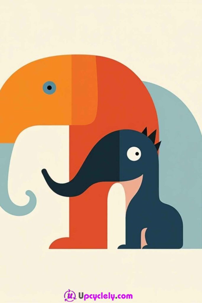
Simplified animal forms are useful when you want a recognisable subject without painting realistic fur, anatomy, or perspective. A trunk can become a rectangle, an ear can become a triangle, and an eye can be a single circle. The result feels playful because the subject is built from colour relationships rather than detailed observation.
This approach also works well on a reused canvas because opaque blocks can cover an older image. The main challenge is keeping the animal readable while allowing the geometry to remain obvious. I would choose one distinctive feature for each animal and make that feature clearer than the rest.
Materials and Tools
· Reused or new canvas with a light ground
· Acrylic paint in two contrasting families plus white and a dark detail colour
· Pencil and scrap paper for shape planning
· Small flat brush, medium round brush, and fine detail brush
· Ruler, old card edge, or reusable paper templates
· Palette, water jar, and cloth
Steps for This Abstract Painting
1. Plan the animal as a collection of large shapes. Draw a few thumbnail sketches using rectangles, circles, wedges, and curved blocks. Keep the silhouette simple enough to recognise from a distance. Once the strongest version is clear, transfer only the main boundaries lightly to the canvas.
2. Paint the largest colour areas first. Fill the body, head, ears, or background blocks with flat opaque colour, working from broad forms toward smaller ones. Let neighbouring sections dry when you want crisp divisions. Avoid correcting every edge while the paint is wet because repeated brushing can make the surface streaky.
3. Add the defining features. Use a smaller brush for the eye, mouth, trunk, tail, horn, or patterned marks that make the animal identifiable. Vary the line weight so the face does not become a cluster of equally heavy outlines. A single contrasting feature can carry more expression than several tiny details.
4. Balance the composition and refine. Step away, check whether one animal or colour block dominates too strongly, and repeat a small colour elsewhere if needed. Clean only the edges that distract from the shape. Leave a few hand-painted irregularities so the design does not feel like a printed diagram.
For me, recognition matters more than accuracy here. Once the animal reads clearly, extra detail can easily weaken the bold geometry that makes the idea interesting.
Variation: Build a small group of animals from cut paper shapes first, photograph the arrangement, then use that layout as a guide for a painted canvas in leftover wall colours or acrylics.
Abstract Dandelions
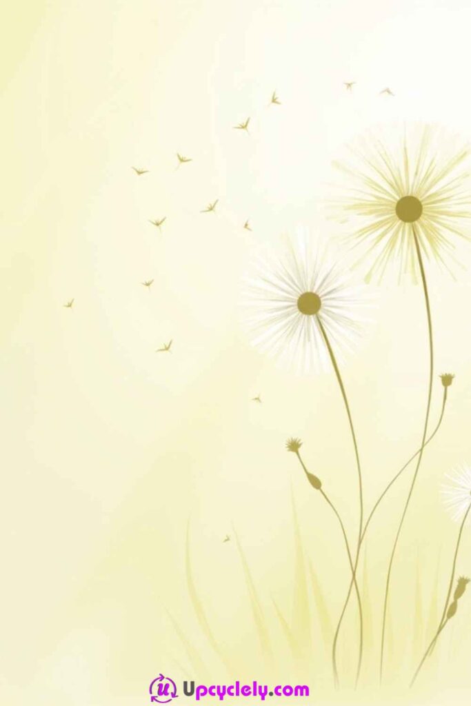
Dandelions suit abstract painting because their structure is already a collection of lines, dots, and drifting marks. A soft background, two curved stems, and a cloud of pale seeds can suggest the whole plant without botanical precision.
The painting feels most convincing when the seeds do not form a perfect circle. Uneven spacing and a few drifting away create movement. A lightly textured reused canvas can help because the brush catches on the surface and breaks the seed marks naturally.
Materials and Tools
· Canvas or thick primed board
· Acrylic paint for a soft background, stems, centres, and pale seed heads
· Wide blending brush and very fine round brush
· Toothpick, cotton bud, or old toothbrush for tiny marks
· Pencil for light stem placement
· Palette, water jar, cloth, and scrap card
Steps for This Abstract Painting
1. Create a quiet background. Blend one or two pale colours across the canvas with broad strokes, keeping the centre slightly lighter if you want the flower heads to glow. Do not chase a perfectly smooth gradient; subtle brush texture gives the open space more life. Let the layer dry before drawing the stems.
2. Place the stems and centres. Draw two or three gently curved lines rising from the lower edge, varying their height and direction. Paint them with a fine brush and add small circular centres. Keep the stems thin enough to feel delicate but opaque enough to remain visible against the background.
3. Build the seed heads in loose rings. Work outward from each centre with short pale strokes, dots, and tiny forked marks. Rotate the canvas rather than twisting your wrist into awkward angles. Leave gaps so the seed heads feel airy, and vary the length of the outer marks instead of creating identical spokes.
4. Add drifting seeds and edit. Carry a few tiny marks away from the flowers in one general direction, spacing them farther apart as they travel. Then step back and soften any area that looks like a rigid wheel. A small touch of the background colour can reopen crowded spaces without repainting the whole flower.
I know it can feel tempting to fill every gap around the flower head, but the empty spaces are what keep the dandelion light rather than woolly and heavy.
Variation: Replace the pale seed heads with metallic dots over a dark reused canvas, or paint only one oversized dandelion that extends beyond the canvas edges.
Bold Strokes
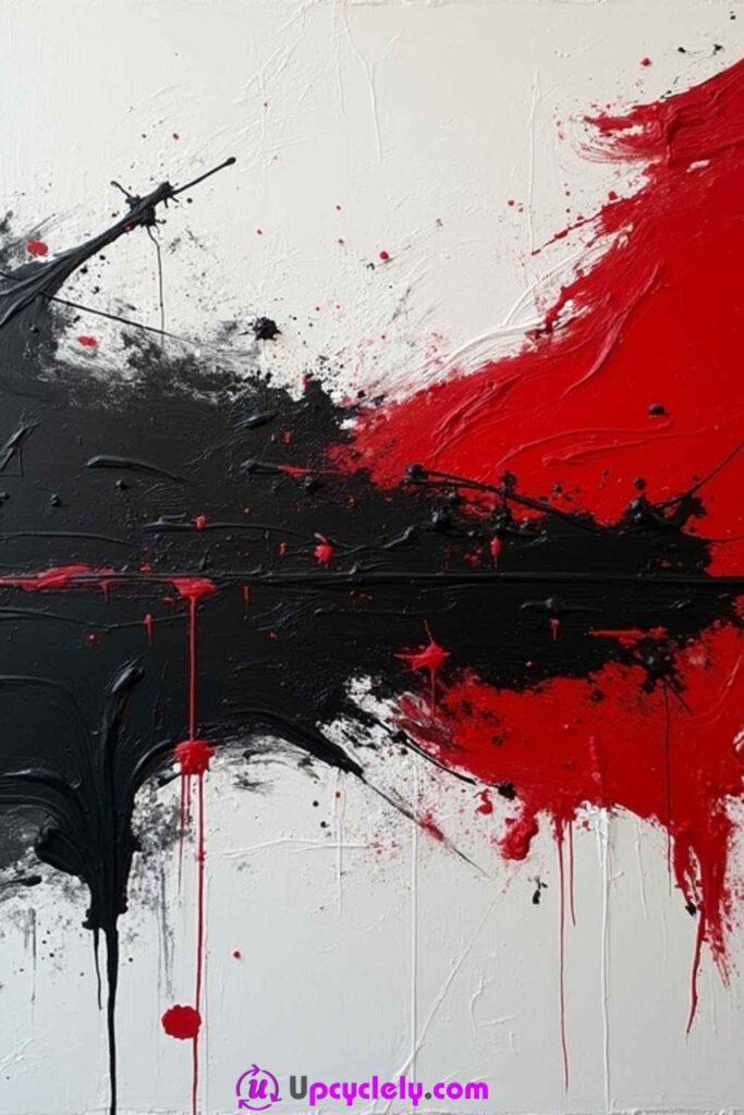
Broad strokes make the movement of the hand visible, which is why this style can feel energetic even with only two or three colours. The surface does not need delicate drawing; it needs confident direction, varied pressure, and enough contrast for the marks to remain separate.
A textured or previously painted canvas is especially useful because a palette knife and stiff brush can skim over older ridges. The piece should not become a solid block of mixed paint. I would protect some untouched ground between the strongest marks so each stroke keeps its identity.
Materials and Tools
· Canvas with a stable ground
· Heavy-bodied acrylic paint in a limited high-contrast palette
· Wide flat brush, worn bristle brush, and palette knife
· Old card or scraper for dragging paint
· Palette or packaging lid
· Paper towels, water jar, and protective floor covering
Steps for This Abstract Painting
1. Decide the main direction before loading the brush. Choose whether the strongest movement will cross diagonally, sweep upward, or push inward from opposite sides. Make two or three dry practice motions above the canvas so the arm follows the whole direction rather than making short uncertain marks from the wrist.
2. Place the first colour in large separated strokes. Load a wide brush or palette knife generously and drag it across the surface in one committed movement. Vary the pressure so some areas remain thick and others break apart. Leave visible ground between the strokes rather than repeatedly filling every thin section.
3. Introduce the contrasting colour. Work from another edge or angle so the second set of marks interacts with the first without copying it. Allow a few overlaps, but keep the majority of the colours distinct. Scrape through one wet crossing with an old card to reveal a thin line of the layer below.
4. Add restrained texture and stop deliberately. Flick a small amount of thinned paint, press the dry brush into selected edges, or add one narrow light mark to break the heavier forms. Then view the piece from several distances. Remove or cover only marks that interrupt the main movement; do not keep adding because the surface still has empty areas.
The hardest tool in this project is usually knowing when to stop. One decisive stroke often does more work than five smaller marks added to make it look finished.
Variation: Use black, off-white, and one leftover accent colour on reclaimed plywood, or make a narrow triptych by dividing the same sweeping gesture across three small reused canvases.
Brushstroke Explosion
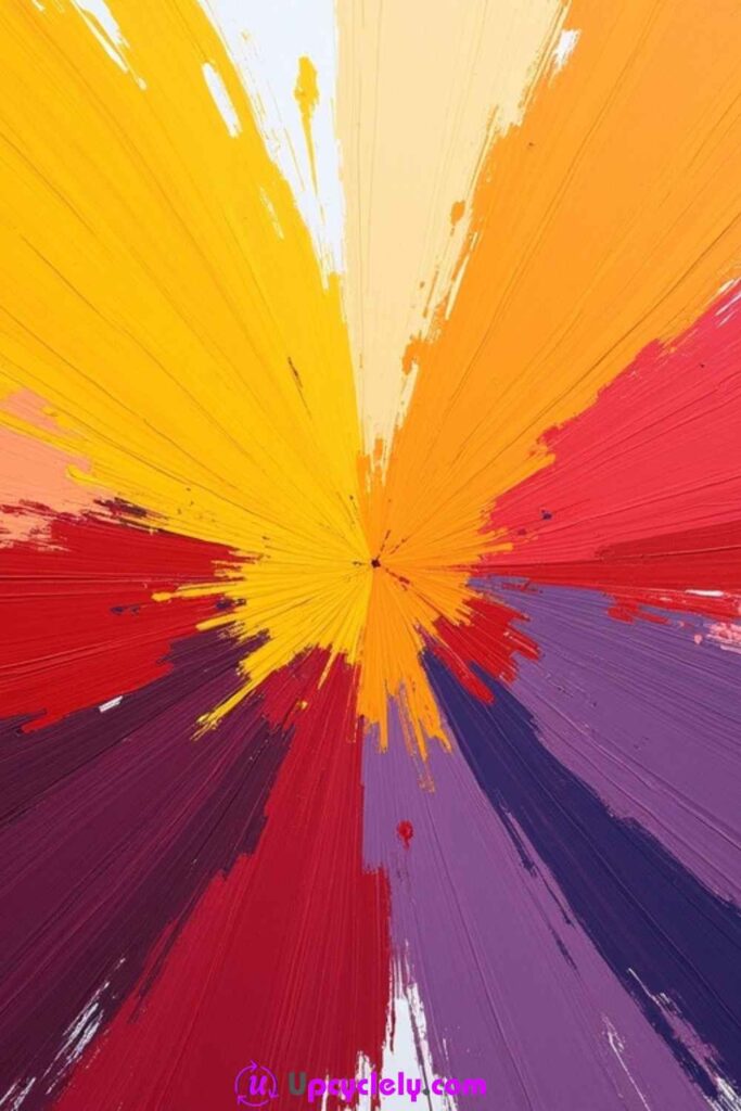
A radiating burst turns one centre point into the organising feature of the painting. Warm and cool strokes can shoot outward at different lengths, creating movement without requiring any realistic subject.
The centre should feel active, but it does not need to sit exactly in the middle. Moving it slightly off-centre usually makes the burst less formal. The edges can remain lighter and more broken so the painting appears to expand beyond the canvas.
Materials and Tools
· Smooth canvas or primed board
· Acrylic paint in three to five related and contrasting colours
· Medium flat brush, fan brush, and small round brush
· Pencil for marking the focal point
· Spray bottle or clean water for adjusting paint flow
· Palette, cloth, and scrap card
Steps for This Abstract Painting
1. Choose and mark the focal point. Place a small pencil dot slightly away from the exact centre, then imagine several large directional wedges spreading from it. Test the colour order on scrap card. Put the lightest or warmest colour near the centre if you want the burst to feel illuminated.
2. Build the first layer of rays. Starting close to the focal point, pull medium brushstrokes outward in varied lengths. Rotate the canvas as needed so the motion remains comfortable. Leave small gaps and avoid forming an evenly spaced sun shape; clustered and open areas create a more natural explosion.
3. Layer contrasting strokes between the first marks. Add cooler, darker, or more saturated colours, allowing some strokes to cross but not completely cover the earlier layer. Use less paint toward the outer edges so the brush begins to skip and break. This creates speed without requiring painted motion lines.
4. Strengthen the centre and soften the perimeter. Add a few short pale highlights at the focal point, then use a dry fan brush to pull thin fragments outward. Step back and remove any accidental ring around the centre by interrupting it with a longer stroke. Finish when the eye travels outward instead of circling one neat boundary.
I would keep the centre compact. Once it becomes a large painted circle, the outward strokes can look attached to a badge rather than growing from one energetic point.
Variation: Create the burst with reused card scrapers instead of brushes, or reverse the idea by pulling dark strokes inward toward a pale central gap.
Inverted Colors
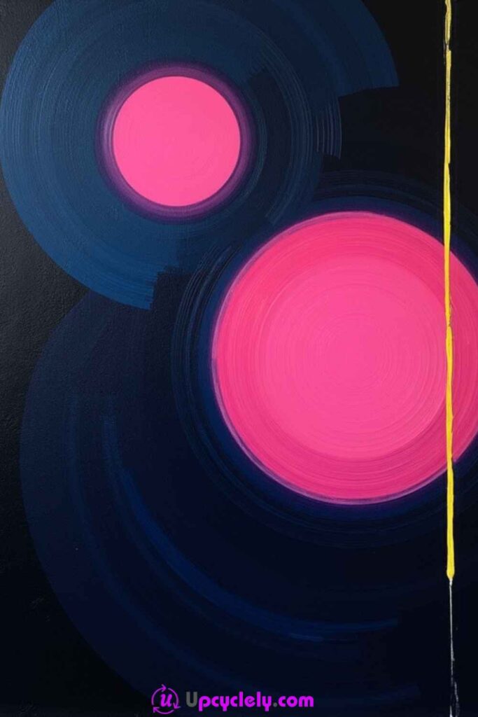
Bright shapes behave differently on a dark ground. Pale pinks, blues, yellows, and whites appear more luminous, while the untouched black or deep navy becomes an active part of the design rather than an empty background.
This style is useful for repainting a canvas that already has a dark base. Repeated arcs, circles, and one unexpected straight line can create tension between order and interruption. The edges need not be mechanically perfect, but the colour should be opaque enough to hold its shape.
Materials and Tools
· Dark canvas or a reused canvas painted with an opaque dark ground
· Opaque acrylic paint in bright and pale colours
· Medium and small round brushes
· Fine detail brush
· Jar lids, bowls, or paper circle templates
· Ruler or low-tack tape for one straight accent
· Palette, water jar, and scrap card
Steps for This Abstract Painting
1. Prepare a fully dry dark surface. Add a second ground coat where an older image still shows through and check the canvas under good light. Test the bright colours on a dark scrap first because transparent paint may need a pale underlayer to appear clean rather than muddy.
2. Place the main circular forms. Use templates or a steady round brush to paint one large circle and several smaller related forms. Keep their spacing unequal so the composition does not resemble a diagram. Build opacity in controlled coats, letting the first layer dry before correcting pale areas.
3. Add arcs and repeated bands. Paint partial rings around selected circles, changing the gap and thickness as they expand. Allow some arcs to disappear at the canvas edge. Repeating the same two colours can create rhythm, but vary the width enough to prevent the forms from looking like targets.
4. Introduce one contrasting interruption. Add a narrow vertical, diagonal, or rectangular accent that cuts against the circular movement. Then inspect the negative dark space around every shape. Touch up only the boundaries that weaken the composition and leave the rest of the dark ground visible and deliberate.
The dark background is doing real work here. I don’t treat it as an area that must eventually be filled; it is what allows the brighter colours to feel illuminated.
Variation: Use a deep bottle-green or burgundy ground instead of black, or paint the circles with leftover metallic accents for a decorative evening piece.
Colorful Smudges
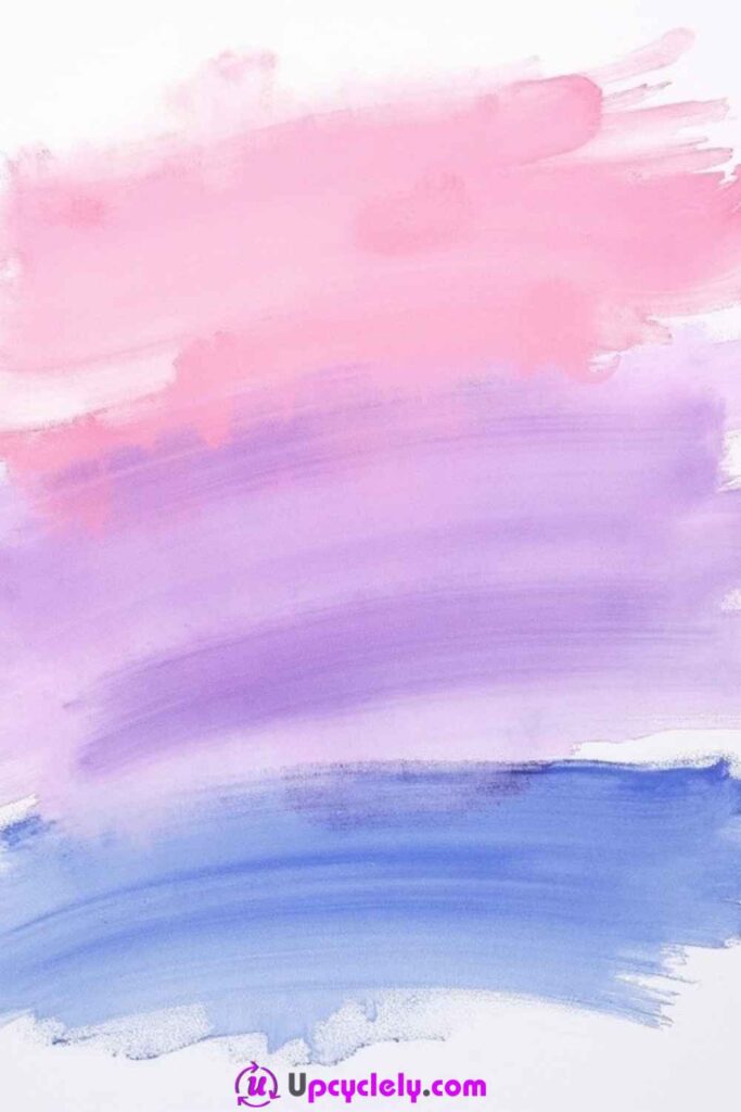
Large smudged bands show the width, texture, and drag of the brush. Because the shapes are uncomplicated, the quality of the edges matters: one side may stay crisp while the other feathers, skips, or blends into the next colour.
This is a forgiving way to reuse a clean light canvas or board. The painting can be built from three broad colour families, but each band should have a slightly different length, weight, or direction so it does not look like a basic colour chart.
Materials and Tools
· White or pale reused canvas
· Acrylic paint in three coordinated colours plus optional white
· Large flat brushes or separate brushes for each colour
· Palette knife or old card edge
· Palette, water jar, and cloth
· Scrap cardboard for testing pressure and paint load
Steps for This Abstract Painting
1. Choose the band arrangement. Decide whether the smudges will stack horizontally, drift diagonally, or overlap around one open centre. Mark only the rough limits with tiny pencil points. Test the colours together on scrap so the middle value does not disappear between a very light and very dark band.
2. Paint the first broad mark in one movement. Load a large flat brush, press it onto the canvas, and pull across without returning repeatedly to the starting edge. Let the brush run drier toward the finish so the stroke naturally thins or breaks. Preserve the visible bristle texture.
3. Add the remaining bands with different pressure. Place the second colour close to or partly over the first, then add the third at a changed length or angle. Blend only selected intersections with a clean dry brush. Too much wet mixing can turn three clear colours into one dull central patch.
4. Shape the edges and create a small accent. Drag a palette knife lightly through one band, add a narrow pale scrape, or soften one edge with background colour. Then view the piece upright. If every band has the same width and termination, shorten or extend one so the composition feels made rather than measured.
The brush texture is the subject, so I would not smooth every ridge. A slightly dry ending often gives the stroke more character than a perfectly filled rectangle.
Variation: Make the bands from several tints of one leftover colour, or use an old wallpaper brush to create an extra-wide mark across reclaimed board.
Crisscrossing Colors
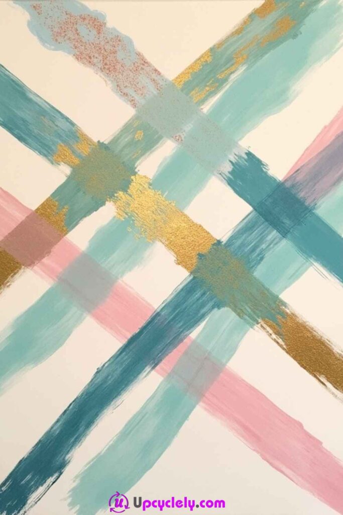
Two or three diagonal strokes can create a complete abstract composition when their widths, intersections, and colours are carefully chosen. The eye follows the crossing movement, while small accents around the meeting points add depth.
The most important decision is where the main crossing occurs. Placing it slightly away from the exact centre usually creates more tension. A metallic or pale third colour should remain limited so it highlights the intersection instead of becoming another competing stripe.
Materials and Tools
· Canvas or thick primed paper
· Acrylic paint in two strong colours and one light or metallic accent
· Large flat brush and smaller flat brush
· Old card or palette knife
· Low-tack tape for optional crisp boundaries
· Palette, cloth, water jar, and scrap card
Steps for This Abstract Painting
1. Map the diagonals on a small paper sketch. Try several crossing points and choose one that leaves unequal areas around it. Mark the entry and exit points lightly on the canvas. Decide which stroke should appear underneath so the layering looks intentional rather than like two wet colours accidentally colliding.
2. Apply the lower diagonal. Use a broad brush or card edge to pull the first colour across the surface in one or two connected movements. Vary the opacity slightly but maintain a readable direction. Let this layer dry where you want a clean overlap; keep it damp only if a blended intersection is part of the plan.
3. Cross with the second colour. Paint from the opposite direction, changing the width or pressure so the two strokes do not look mechanically identical. At the intersection, either allow a small mixed area or keep the second colour opaque. Repeat a short fragment elsewhere if the crossing feels isolated.
4. Add a restrained highlight and edit. Place several narrow light or metallic marks near the main intersection, following one diagonal rather than both. Scrape through one thick area to reveal the colour below. Step back and cover any accidental blob that interrupts the directional flow.
The intersection attracts attention automatically. I would keep the brightest detail close to it and let the outer ends stay simpler, or the eye has nowhere clear to settle.
Variation: Replace straight brushstrokes with torn-paper edges used as masks, or cross a matte painted band with a textured strip made from leftover modelling paste.
Dripping Paint
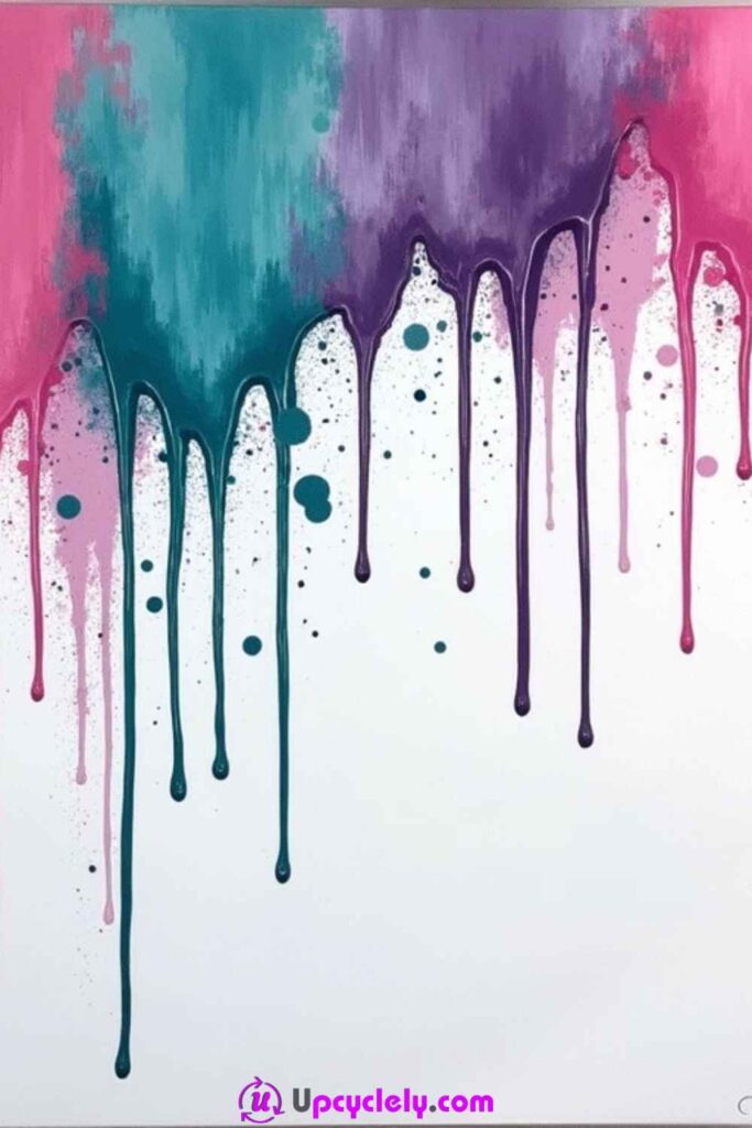
Drips allow gravity to draw part of the painting. The artist still controls colour placement, consistency, starting points, and canvas angle, but the final paths develop with small irregularities that are difficult to imitate by hand.
A vertical working position is essential, along with floor protection. The paint should flow without becoming so watery that it loses colour and adhesion. Several controlled drips usually look stronger than flooding the entire top edge.
Materials and Tools
· Primed canvas that can stand vertically
· Acrylic paint in two to four colours
· Water or an appropriate acrylic medium for adjusting flow
· Small cups, squeeze bottles, droppers, or loaded brushes
· Spray bottle and fine brush for optional splatter
· Level work support and generous floor covering
· Gloves, cloth, and palette
Steps for This Abstract Painting
1. Test the paint consistency before approaching the canvas. Mix a small amount and let it run down upright scrap card. It should travel slowly enough to leave an opaque line. If it races downward and forms a watery puddle, add more paint or medium rather than continuing to dilute it.
2. Position the canvas and place the first drips. Stand it securely over protected flooring and add paint at selected points near the upper edge. Encourage each line with a small brush or dropper, then leave gravity to continue the path. Space the starting points irregularly so the drips do not resemble a curtain fringe.
3. Add the next colours in stages. Allow some drips to cross and others to remain separate. Tilt the canvas slightly for a few lines, then return it upright before every stream travels in the same direction. Wipe paint from the lower back edge if it begins to pool where it may stick to the support.
4. Build texture above the drips and finish cleanly. Add small splashes, blended patches, or a solid colour area around selected starting points. Once the surface is stable, inspect the lower edge for heavy beads. Keep any attractive raised paint, but remove unstable excess that could crack or detach later.
Gravity needs time. Tilting the canvas every few seconds can produce nervous zigzags, so I would change direction only when a deliberate branch or crossing is needed.
Variation: Begin the drips from one side edge instead of the top, or use one monochrome colour over a textured painted ground for a quieter result.
Floating Triangles
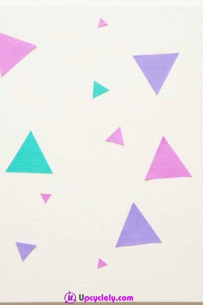
Scattered triangles can suggest fragments, folded planes, or objects drifting through open space. The design becomes more interesting when the shapes vary in size, opacity, and orientation rather than repeating one identical stencil.
A pale ground helps the gaps remain visible. Larger triangles should establish the composition first, while smaller forms connect the empty areas. Overlap can create depth, but too many intersections will turn the clean shapes into a dense mosaic.
Materials and Tools
· Light-coloured canvas or primed board
· Acrylic paint in three coordinated colours
· Painter’s tape and reusable card triangle templates
· Pencil, ruler, and eraser
· Small and medium flat brushes
· Fine detail brush for corrections
· Palette, water jar, and scrap card
Steps for This Abstract Painting
1. Plan the largest shapes on paper. Place three to five triangles at different angles, leaving one larger area of open ground. Transfer their corner points lightly to the canvas. Avoid arranging them in an even circle or a regular diagonal unless that order is intentional.
2. Tape and paint the main triangles. Use low-tack tape or reusable templates to create clean boundaries, pressing only the edge that will receive paint. Apply thin opaque coats from the tape inward. Remove the tape carefully when the paint is stable and let the shapes dry before adding overlaps.
3. Add medium and small forms freehand. Place them between the larger shapes, changing their colour, direction, and opacity. Allow one or two to disappear partly beyond the canvas edge. A translucent triangle over a dry opaque one can suggest layering without adding outlines.
4. Correct the balance, not every imperfection. Step away and look for an empty gap that feels accidental or a cluster that has become too dense. Add one small connecting shape or cover one unnecessary overlap with background colour. Refine only the edges that interrupt the intended geometry.
The open ground is what makes the triangles appear to float. I would rather remove one crowded shape than add three more to make the distribution feel even.
Variation: Cut templates from food packaging, sponge thin translucent layers through them, or create the shapes with leftover paper collage and painted edges.
Swirling Spirals
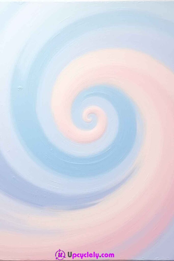
A spiral creates continuous movement from one point outward, making it useful for soft gradients and repeated brush rhythms. The shape can be exact or loose, but it should widen gradually enough that the eye can follow the path.
Pastel colours give the spiral a calm quality, while strong contrasts make it energetic. A reused canvas with light texture can help the blended bands feel less digital. The challenge is avoiding a heavy central knot where too many wet layers meet.
Materials and Tools
· Canvas or thick primed paper
· Acrylic paint in two related colours plus white and optional dark accent
· Pencil and string or a paper guide for a loose spiral
· Small and medium round brushes
· Soft sponge or clean blending brush
· Palette, water jar, cloth, and scrap card
Steps for This Abstract Painting
1. Draw a loose widening path. Begin near, but not necessarily at, the centre and sketch the spiral outward with increasing space between each turn. Rotate the canvas to check that the line does not suddenly narrow or collide with itself. Keep the guide faint so pale paint can cover it.
2. Paint the main band in alternating colour sections. Follow the path with a medium round brush, changing colour gradually rather than at perfectly measured intervals. Leave selected gaps or a narrow edge of ground visible. Work outward so the hand has room and the centre is not repeatedly disturbed.
3. Blend only the transitions that need softness. Use a clean sponge or slightly damp brush in small circular motions where the colours meet. Preserve a few sharper sections to keep the spiral readable. If the centre becomes muddy, let it dry and rebuild it with one clear light tone rather than continuing to mix.
4. Add highlights and control the outer edge. Paint a thin pale line along selected inner curves and soften it in places. Let the last turn extend beyond the canvas edge or fade into broken marks. Step back and check whether the eye travels outward smoothly; correct any abrupt kink with the neighbouring colour.
I’d keep the blending lighter than expected. A completely smooth spiral can lose the brush rhythm that makes a hand-painted version feel alive.
Variation: Paint several small spirals that overlap, or make one dark charcoal spiral over a reused canvas covered with pale layered washes.
Monochromatic Tones
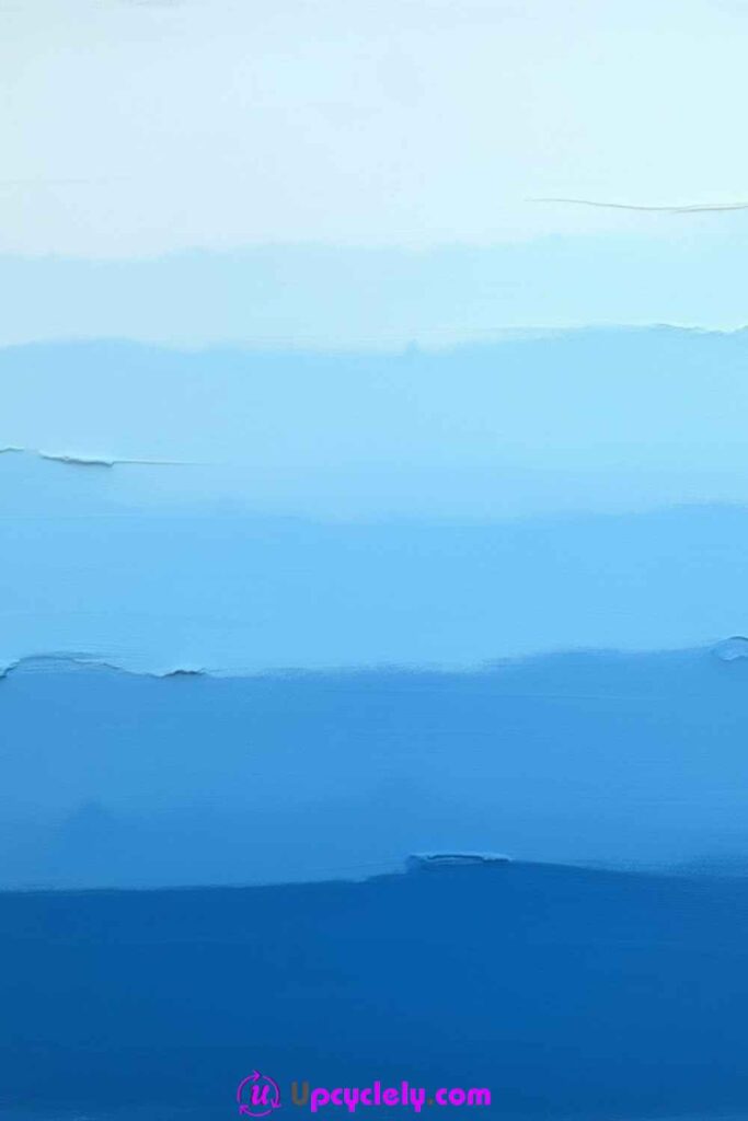
Working with one colour family shifts attention from hue to value, texture, and edge quality. A painting made from pale blue through deep navy can feel spacious, while ochre through brown can feel grounded and warm.
The method is also economical because one main colour can be mixed with white, a darker related colour, or small amounts of its complement. Smooth transitions are optional. Distinct tonal bands can be just as effective when their widths and textures vary.
Materials and Tools
· Canvas or reusable primed board
· One main acrylic colour plus white and a compatible darkening colour
· Several flat brushes or one thoroughly cleaned brush
· Palette with room for separate tonal mixtures
· Spray bottle or clean water for minor adjustments
· Old card or palette knife for texture
· Cloth and scrap card
Steps for This Abstract Painting
1. Mix a value range before painting. Create at least four versions of the main colour from very pale to deep, keeping each mixture separate. Test them in a row on scrap card and let them begin to dry. Adjust any two values that look too similar, because they may merge visually on the canvas.
2. Place the light and middle tones first. Paint broad bands, blocks, or loose horizontal areas, changing the width and edge character as you move. Keep the lightest region larger if you want an open atmosphere. Work with enough paint to avoid dry streaks where a smooth area is intended.
3. Add the deepest values as anchors. Place them in smaller areas, along one edge, or as a narrow band that gives the lighter tones contrast. Blend selected boundaries while wet, but leave others sharp or scraped. The variation prevents the painting from reading as a simple gradient exercise.
4. Introduce texture and unify the surface. Drag an old card through one area, dry-brush a pale streak across a dark band, or repeat a small value elsewhere. View the painting in reduced light to check whether the tonal structure still reads without relying on colour intensity.
A monochrome painting still needs contrast. I know the pale mixtures can look lovely on the palette, but at least one properly dark value usually gives the whole piece structure.
Variation: Use leftover wall paint from one room to create related tones, provided it is suitable for the surface, then add small acrylic marks after the base layers are dry.
Polka Dots and Stripes
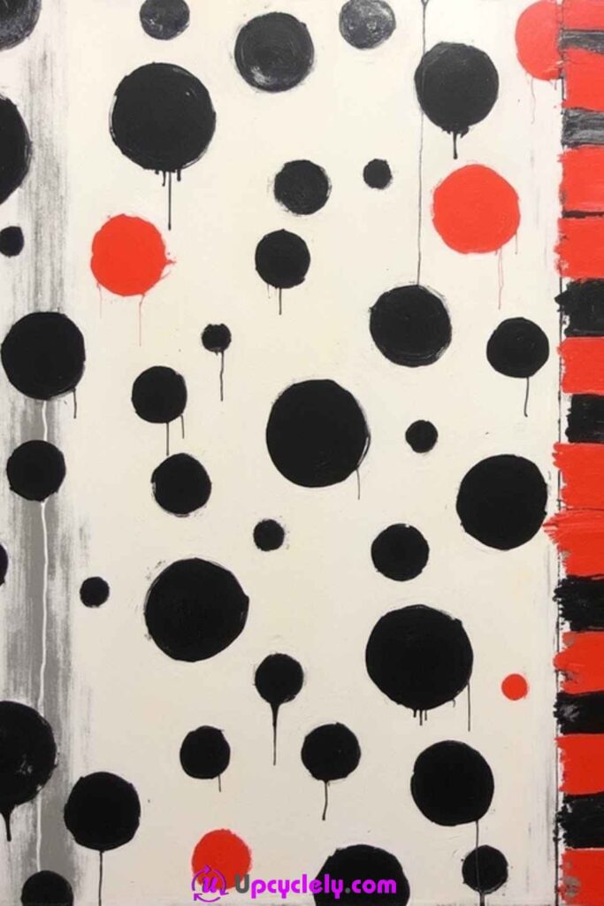
Dots and stripes bring two different rhythms into one painting. Stripes create direction and order, while dots interrupt that order with repeated round forms. The combination works best when one pattern dominates and the other acts as an accent.
The design can include drips, uneven hand-painted edges, or broken areas without losing its structure. A simple border of stripes and a field of scattered circles often feels more balanced than dividing the canvas into equal pattern halves.
Materials and Tools
· White or pale canvas
· Acrylic paint in two strong colours, one neutral, and optional background colour
· Flat brush and small round brush
· Masking tape, ruler, and pencil
· Foam dabber, cork, bottle cap, or circular stencil
· Dropper or fine brush for controlled drips
· Palette, water jar, and scrap card
Steps for This Abstract Painting
1. Assign the pattern areas. Decide where the main stripe field will sit and where dots can move more freely. Mark the broad divisions lightly. Keep the areas unequal so the composition does not resemble two fabric samples placed side by side.
2. Paint the stripes first. Tape selected lines or freehand them with a flat brush, varying their width or spacing. Let a few stop before the canvas edge if you want a less formal result. Remove tape carefully and correct only the bleeds that interfere with the intended rhythm.
3. Add dots in several sizes. Stamp or paint the largest circles first, then distribute smaller ones around them. Repeat colours from the stripe area to connect the patterns. Leave some dots incomplete or cropped by the edge, but avoid placing every circle directly between two stripe intervals.
4. Introduce drips or small linking marks. Thin a little paint and allow several controlled lines to descend from selected dots, or add narrow rectangles that echo the stripes. Step back and cover any mark that makes the piece feel evenly busy. One quiet patch will make the pattern contrast easier to read.
I would decide early whether the dots or the stripes are leading. Giving both patterns exactly the same visual weight can make the painting feel split rather than connected.
Variation: Use hand-cut cardboard stamps for imperfect circles, or limit the palette to black, off-white, and one reused paint sample for a more graphic result.
Splattered Colors
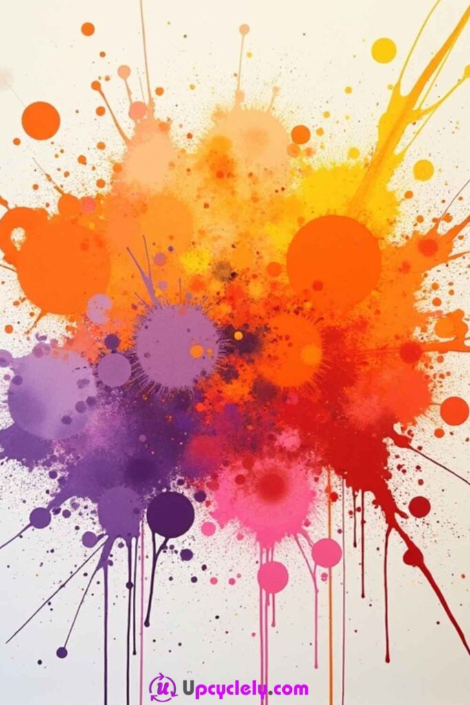
Splatter painting records speed, distance, paint thickness, and tool choice. A toothbrush creates fine mist-like dots, a large brush creates longer drops, and a loaded stick can produce heavier marks. The process looks uncontrolled, but the palette and placement still need decisions.
The safest approach is to protect a much wider area than the canvas itself. Building the piece in several splatter sizes prevents it from becoming one uniform cloud. A few deliberate circular or linear shapes can give the eye a resting point within the scattered marks.
Materials and Tools
· White or lightly coloured canvas
· Acrylic paint in several coordinated colours
· Toothbrush, stiff bristle brush, medium brush, or wooden stick
· Small cups for separately mixed paint
· Water or acrylic medium for adjusting flow
· Gloves, apron, eye protection as appropriate, and extensive floor covering
· Round brush for optional solid focal shapes
Steps for This Abstract Painting
1. Prepare the space and test every tool. Place the canvas flat or slightly angled inside a well-covered area. Mix each colour separately and test it on scrap paper. Adjust the paint until the tool creates distinct marks rather than dry dust or watery stains that soak and spread without colour.
2. Build the broadest splashes first. Use a medium loaded brush or stick to place several energetic marks around one main zone. Change the arm angle and distance from the surface. Keep some clean ground visible and avoid circling the canvas while applying equal splashes from every direction.
3. Add finer layers with controlled flicking. Pull a gloved thumb across a toothbrush or tap a stiff brush over selected areas. Rotate colours and density, concentrating the finest marks near the main cluster. Pause between layers so wet colours do not merge into an unplanned brown or grey spray.
4. Create a focal element and edit the edges. Add several solid circles, a narrow line, or one calm colour block that contrasts with the scattered marks. Cover any accidental splash that sits alone and pulls attention away. Clean the canvas edges before dried drops make the piece difficult to frame or hang.
The splatter should not be equally dense everywhere. I’d rather build one active cluster and let it fade than coat the whole surface until every mark has the same importance.
Variation: Splatter through a large reused-paper stencil to preserve a clear silhouette, or work with several tints of one colour for a softer atmospheric piece.
Square Grid
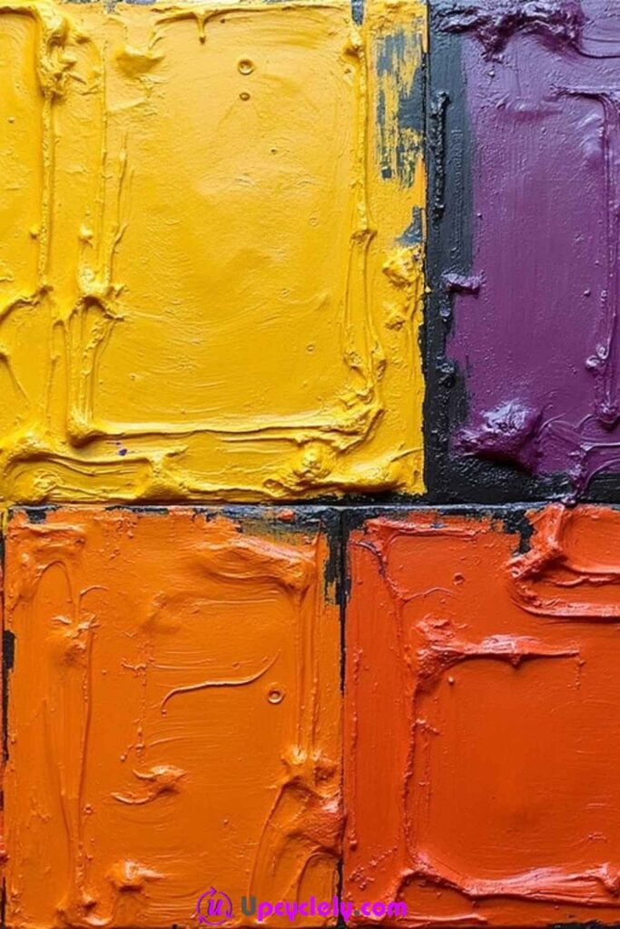
This first square-grid idea uses many small compartments, bold colour changes, and deliberately distressed brush texture. The grid gives order, while the rough marks inside each cell prevent the painting from feeling like a flat printed chart.
A smooth reused canvas is helpful because tape needs a stable dry surface. The cells do not all require equal colour intensity. Some can remain pale or partially scraped so the eye moves through the composition instead of stopping at sixteen equally loud blocks.
Materials and Tools
· Smooth canvas with a dry base coat
· Acrylic paint in five or six coordinated bold colours
· Low-tack masking tape
· Ruler, square, pencil, and old card for burnishing
· Flat brushes and one dry worn brush
· Palette knife or scraper for distressed texture
· Palette, cloth, and water jar
Steps for This Abstract Painting
1. Measure and tape a multi-cell grid. Mark the outer boundaries and divide the surface into even rows and columns, checking the spacing before pressing the tape down. Burnish the paint-facing edges with an old card. Avoid stretching the tape because it can lift and shift the line.
2. Distribute the base colours before painting. Make a small paper map so neighbouring cells do not repeat the same value too often. Paint non-adjacent squares first, pulling the brush away from tape edges. Use thin opaque coats rather than one heavy layer that forms ridges against the tape.
3. Add distressed marks inside the dry cells. Drag a dry brush, card, or palette knife through selected blocks using a lighter or darker related colour. Change the direction from cell to cell. Leave several cells smoother so the textured areas remain noticeable instead of becoming the new uniform.
4. Remove the tape and correct selectively. Peel it back carefully at a low angle, then assess the grid from a distance. Repair only major bleeds with a fine flat brush. Small broken edges can support the distressed style, so do not turn every boundary into a perfectly mechanical line.
The grid provides enough precision on its own. I don’t mind a few worn edges inside the cells; they stop the painting from looking like a colour-sample display.
Variation: Use leftover paint samples from furniture or wall projects, or replace several painted cells with thin pieces of reused patterned paper sealed beneath a compatible clear medium.
Tangled Lines
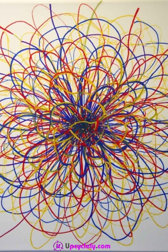
Tangled lines build complexity through repetition rather than large colour fields. Lines can loop, cross, widen, and disappear, creating a web that feels energetic without needing a recognisable subject.
The design needs a loose system so it does not become an evenly filled scribble. Beginning from one or two focal areas, varying line weight, and leaving small open pockets helps the eye follow separate paths through the painting.
Materials and Tools
· White or lightly coloured canvas
· Acrylic paint in three strong colours plus optional neutral
· Small and medium round brushes
· Pencil for a minimal starting guide
· Paint marker or fine liner suitable for the surface, if desired
· Palette, water jar, cloth, and scrap paper
· Turntable or easy-to-rotate board for comfortable line work
Steps for This Abstract Painting
1. Choose the starting zones. Mark one main point and perhaps a smaller secondary area, then sketch only a few broad curves radiating outward. Avoid drawing the whole web in pencil. The painted lines should be free to change direction once they begin interacting with each other.
2. Paint the first layer with medium lines. Use one colour at a time and vary brush pressure so each path changes thickness. Let some lines cross and others stop abruptly. Keep several clear openings near the centre rather than immediately filling every gap around the focal point.
3. Add thinner and denser paths. Once the first layer is dry enough, weave the remaining colours between and over it. Repeat small curves in selected areas to create knots of activity, but allow the density to fade toward at least one edge. This gives the tangled structure a sense of direction.
4. Strengthen key lines and simplify weak sections. Repaint several important paths so they remain visible beneath the later layer. Cover one or two confusing clusters with the background colour and redraw cleaner routes through them. Step back frequently; line paintings can become crowded long before they feel crowded at arm’s length.
For me, variation in pressure matters more than perfect curves. Lines that breathe, thicken, and fade look connected to the hand rather than generated by one repeated tool setting.
Variation: Use only black and one accent colour, or draw the first network with charcoal and fix it appropriately before adding sparse acrylic lines.
Square Grid
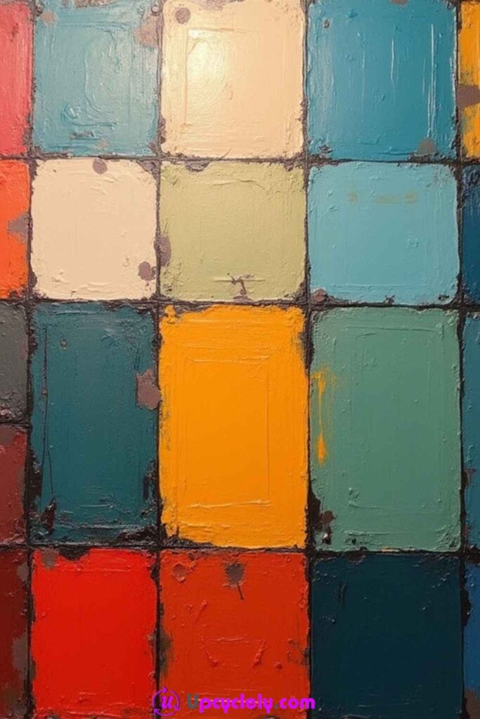
The second published square-grid project is a larger six-section composition with thicker paint and stronger blocks. Fewer cells allow each rectangle to carry more texture, so palette-knife movement becomes as important as the colour arrangement.
Because the sections are larger, adjacent values need more contrast. The grid can remain neat at the borders while the interiors stay layered and rough. This tension between clean divisions and expressive surfaces makes it clearly different from the smaller multi-cell version.
Materials and Tools
· Smooth stable canvas
· Acrylic paint in four bold colours plus white or a dark modifier
· Masking tape, ruler, and pencil
· Medium flat brushes
· Palette knives in one or two widths
· Old card or scraper
· Palette, cloth, and water jar
Steps for This Abstract Painting
1. Divide the canvas into six large rectangles. Test vertical and horizontal arrangements on paper before measuring the full surface. Tape the boundaries carefully and press the inner edges. Check that the rectangles are large enough for visible knife texture rather than becoming narrow decorative strips.
2. Lay down the base colours. Alternate warm, cool, light, and dark sections so no one corner becomes visually heavy. Paint each rectangle with a controlled flat layer, keeping excess paint away from the tape ridges. Let the base become stable before adding thicker texture.
3. Build palette-knife variation. Load a small amount of a related or contrasting colour and drag it across selected cells. Change the pressure and direction in each rectangle. Some marks can remain thick while others scrape back to reveal the base. Leave at least one quieter cell for contrast.
4. Remove the tape and unify the composition. Peel the tape slowly, touch up only distracting gaps, and repeat a tiny colour fragment in a distant cell if the palette feels disconnected. Do not add texture over every clean border; the unpainted grid lines are what keep the expressive blocks organised.
This version benefits from thicker marks, but the paint still needs to sit securely. I would avoid piling on one heavy ridge simply because the palette knife makes it easy.
Variation: Create the six sections on reclaimed wood panels mounted together, or use a neutral ground and several mixtures made from one strong accent colour.
Vertical Lines
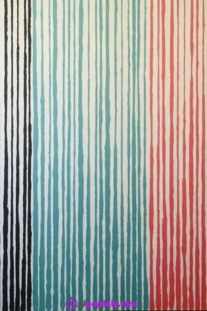
Vertical-line painting can feel architectural, textile-like, or quietly rhythmic depending on the spacing. Dividing the canvas into several colour zones adds structure while slight changes in stripe width keep the result from becoming too rigid.
The piece works well as a tall narrow canvas, but a landscape format can also create an unexpected forest of stripes. Tape gives crisp lines, while freehand brushwork produces softer edges and visible human variation. The two approaches can even be combined.
Materials and Tools
· Canvas or thick primed paper
· Acrylic paint in three colour families plus white or a neutral
· Flat brushes in several widths
· Ruler, pencil, and low-tack painter’s tape
· Old card for pressing tape edges
· Fine flat brush for corrections
· Palette, water jar, cloth, and scrap card
Steps for This Abstract Painting
1. Plan the main colour zones. Divide the canvas mentally or lightly into two or three broad vertical areas, then decide whether their widths will be equal. Test several stripe sequences on scrap paper. Avoid repeating one exact pattern across every zone unless a highly formal result is desired.
2. Paint the first set of verticals. Tape selected boundaries or use a flat brush held upright, pulling each stroke from one edge in a continuous movement. Reload consistently but allow a few lines to show brush texture. Let the first family dry before painting close contrasting stripes.
3. Develop the other zones with changed rhythm. Use a second and third palette while varying line width, spacing, or opacity. Carry one colour into a neighbouring zone to connect the composition. If freehand lines lean slightly, repeat that movement rather than correcting every stripe into a rigid column.
4. Refine the outer edges and create one interruption. Add a wider stripe, narrow pale line, or short horizontal mark that breaks the repeated rhythm without dominating it. Remove tape carefully and correct only major bleeds. View the canvas upright to make sure the vertical movement remains balanced rather than heavier on one side.
Perfectly identical stripes can feel printed. I like enough consistency for the pattern to read, with small hand-painted differences that show how the brush moved.
Variation: Use leftover house-paint colours from the room where the canvas will hang, or alternate painted lines with narrow strips of reused paper or fabric.
Abstract Painting Habits That Can Flatten the Energy or Muddy the Surface
Abstract work can look effortless, which sometimes hides how many small decisions support a convincing result. Most problems do not come from failing to draw accurately. They come from overmixing, ignoring drying stages, treating every area equally, or continuing after the strongest marks are already in place.
· Using every available colour at once can remove the relationships that make a palette coherent. Begin with a limited group and add another colour only when it solves a clear visual problem.
· Brushing repeatedly through several wet colours often creates a dull mixture. Let selected areas dry, clean the brush, and keep some intersections crisp.
· Filling every empty area gives bold shapes nowhere to stand. Preserve negative space intentionally and judge it as part of the composition.
· Applying masking tape over soft paint can lift the layer beneath. Wait until the surface is stable and test the tape on an inconspicuous edge.
· Making every mark the same size, width, or intensity creates visual flatness. Vary pressure, density, scale, and edge quality.
· Adding thick paint without checking adhesion or support can leave unstable ridges. Build texture in controlled layers and keep the underlying surface sound.
· Correcting every irregular hand-painted edge can remove the character that distinguishes a painting from a printed pattern.
· Ignoring the floor and wall around a splatter or drip project creates a cleaning problem that quickly stops the process from feeling enjoyable.
Frequently Asked Questions
Can a beginner create these abstract paintings?
Yes. Several ideas depend on repeated shapes, broad strokes, blending, or controlled dripping rather than advanced drawing. Begin with a small canvas and a limited palette so you can focus on how the paint behaves instead of managing too many decisions at once.
Can I paint over an old canvas?
A stable old canvas can usually be reused after it is cleaned and the existing surface is assessed. Cover distracting imagery with an appropriate opaque ground, and avoid using a canvas that is mouldy, badly warped, torn, or carrying loose unstable paint.
Do I need acrylic paint for every idea?
Acrylic is practical because it works with many of these layering methods, but the correct material depends on the support and intended finish. Use paint designed for the chosen surface and follow its own preparation, ventilation, drying, and cleanup instructions.
How do I stop abstract colours from becoming muddy?
Limit the palette, clean the brush between colour families, and let some layers dry before adding contrasting paint. Mix intentionally on the palette rather than repeatedly blending every intersection directly on the canvas.
Should I sketch an abstract painting first?
Sketch the elements that depend on placement, such as grids, animal shapes, circles, or a spiral path. Loose strokes, smudges, splatter, and drips usually need only a simple directional plan so they can remain responsive while you work.
How can I tell when the painting is finished?
View it from several distances and ask whether the eye has a clear place to begin, enough movement to continue, and some quiet space to rest. If the next mark has no specific purpose beyond filling an empty area, the painting may already be complete.
Can I use leftover wall paint on canvas?
It may be possible for broad decorative layers when the product is compatible with the support, but do not assume every coating behaves like artist acrylic. Check the label, ventilation needs, cleanup method, and suitability before using it, then test on scrap first.
How should an abstract canvas be cleaned after display?
Remove light dust with a soft dry cloth or clean brush without pressing into raised paint. Avoid water, household cleaners, or rubbing unless the exact paint and finish are known to tolerate them.
Let the First Mark Lead to the Next One
The most useful lesson in these abstract painting ideas is that structure and freedom do not cancel each other out. A grid can hold rough texture, a spiral can contain loose blending, and a few deliberate colour rules can make splashes or drips feel connected rather than accidental. Reusing an old canvas or leftover paint gives the experiment a practical starting point and removes some of the pressure to protect brand-new materials.
Choose one manageable idea, prepare the surface, and make the first large decision before worrying about tiny corrections. Then respond to what the painting actually needs. Which forgotten canvas, board, or collection of leftover colours would you like to turn into an abstract piece next?