Thrift store paintings are often easy to overlook because the frame feels dated, the colours seem too dark, or the subject simply does not fit the room anymore. That is exactly why I like them for upcycling. An old landscape, portrait, or still life already gives you composition, texture, and history; you are not beginning with an empty canvas and trying to invent everything from scratch.
The part I enjoy most about a thrift store painting upcycle is deciding what deserves to stay. Sometimes the best result comes from adding only a few wildflowers to a tired landscape. Another piece may need a stronger change, such as a graphic border, a modern abstract layer, or a playful detail that makes the original painting feel intentional again.
I don’t think old art needs to be valuable or perfectly preserved to deserve careful treatment. The useful question is whether the piece can become something you genuinely want to hang. A little planning matters, because once new paint goes onto an older surface, removing it may not be simple. I’d rather make one thoughtful change than cover every inch just because the brush is already in my hand.
Choose a Thrift Store Painting With Room for Change
The easiest paintings to upcycle are not always the plainest ones. I look for pieces that already have one useful quality: a pleasing frame, a calm background, an interesting subject, or enough open space for a new layer. A landscape with a quiet foreground can accept flowers, mushrooms, birds, or a painted sun without losing its original depth. A portrait may have room around the head or shoulders for decorative details. A still life can sometimes be modernized by changing only the frame or adding one graphic element.
Check the painting from a normal viewing distance before judging it. Thrift store art often looks dull under fluorescent shop lighting, while the same muted colours can feel warm at home. Look for cracked paint, flaking surfaces, mildew, water staining, loose canvas, warped boards, broken glass, and unstable frames. Minor wear can be part of the character, but active flaking or damp damage deserves caution.
Also decide how much of the original image you actually like. If you enjoy 80 percent of the painting, a small intervention will usually be more satisfying than a total repaint. If almost nothing appeals to you except the canvas and frame, then a bolder abstract treatment may make more sense. The good thing is that a thrifted painting gives you permission to experiment without treating every brushstroke like a museum decision.
A few useful questions before buying are:
· Does the frame feel sturdy enough to reuse?
· Is the painting surface reasonably clean and stable?
· Is there open space where a new detail could sit naturally?
· Do the original colours work with the room where you plan to hang it?
· Would one small change make the piece feel intentional, or does it need a larger redesign?
Clean the Artwork Without Damaging the Surface
Old paintings collect dust, cooking residue, nicotine, fingerprints, and general grime, but cleaning needs to stay gentle. Not every thrift store painting is made with the same paint, varnish, or surface. A method that is harmless on one piece may soften, smear, or dull another. I know it can feel tempting to scrub until the colours look brighter, but aggressive cleaning can remove the very layer you are hoping to reuse.
Begin with dry cleaning. Use a very soft, clean brush to lift loose dust from the surface and frame. Hold the painting upright or at a slight angle so dust falls away rather than being pushed into textured paint. For the frame, a soft cloth can usually remove surface dust, but avoid dragging a damp rag across exposed gilding or fragile decorative areas.
If the artwork sits behind glass, remove the backing only if the frame construction is straightforward and you are comfortable putting it back together. Clean the glass separately rather than spraying cleaner toward the art. If the painting itself is exposed and you are unsure how it will react to moisture, stop at dry dusting. Upcycling does not require making an old painting look newly manufactured.
The frame may need more preparation than the picture. Loose hardware, protruding nails, cracked corners, or peeling paint should be repaired before decorating. If you plan to paint the frame, lightly prepare only the frame surface and protect the artwork with paper and low-tack painter’s tape where suitable. Work in a ventilated space when using primers, varnishes, or strong coatings, and follow the safety directions for the materials you choose.
Plan the New Layer Before You Pick Up a Brush
The strongest upcycled paintings usually have a clear relationship between old and new. That does not mean the styles have to match. A very traditional landscape can look interesting with crisp modern birds, metallic rays, or tiny storybook mushrooms. What matters is that the addition feels deliberately placed rather than scattered wherever there happened to be empty space.
Take a phone photo of the artwork and sketch over the photo before touching the original. This is an easy way to test scale. Flowers that seem small on a palette may dominate a landscape once painted. A checkerboard frame may need wider squares than expected to remain readable from across the room. A moon can feel balanced in one corner but awkward when centred. Digital or paper planning lets you make those mistakes for free.
Colour planning matters too. Pull two or three colours from the existing painting and repeat them in the new work, then add one contrasting accent if you want a fresher result. This helps the new paint belong to the piece even when the motif is contemporary. I’d also mix a small test colour and let it dry on a scrap surface before committing. Wet paint can look brighter or darker than the final result.
Before you move on, decide whether you are altering the picture, the frame, or both. Changing both can work, but it increases visual competition. If the painting itself receives a bold new motif, a quieter frame may help. If the image is already busy, the frame can carry the update instead. Then you can begin with a plan instead of improvising halfway through and wondering why the piece suddenly feels crowded.
Add Wildflowers to an Old Landscape
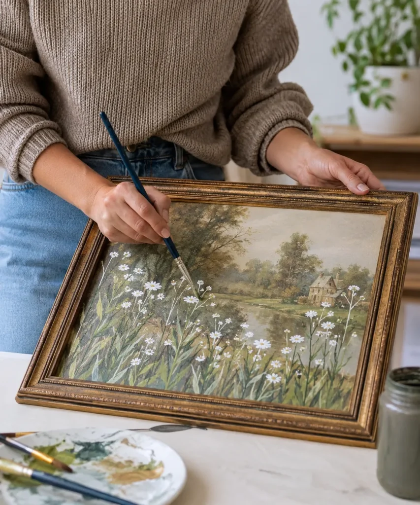
A quiet landscape is one of the easiest thrift store paintings to update because the original artist has already created depth for you. Trees, water, hills, and sky establish the scene, while an open foreground gives you somewhere to add a fresh layer. Here, small white wildflowers sit across the lower part of the painting and pull the eye forward, almost as if the viewer is standing in a meadow looking toward the distant house.
The scale is what makes this treatment work. The flowers are not the same size from edge to edge. A few larger blooms appear closer to the bottom, while smaller marks sit farther back. That variation supports the perspective already present in the landscape. If every flower were identical, the new layer could read like a flat pattern pasted on top.
Materials and Tools
· A stable thrifted landscape painting
· Acrylic paint or another paint compatible with the surface
· Small round brushes and one fine detail brush
· Palette or reusable mixing plate
· Water container and soft cloth
· Scrap card for testing flower shapes and colour
· Optional low-tack tape to protect the frame
A Practical Way to Recreate the Look
1. Study the existing foreground first. Decide where flowers could naturally grow without covering an important focal point such as a path, building, or reflection. Mark a few positions lightly on a photo or removable planning sheet rather than drawing heavily on the artwork.
2. Mix greens that connect with the landscape. Use the painting’s existing foliage as your starting point instead of reaching immediately for a bright tube green. Paint a few loose stems and leaves with varied heights, then let the placement settle visually before adding every bloom.
3. Build the flowers from simple shapes. Small white daisies can be suggested with short petal strokes around a warm centre. Keep some flowers side-facing or partially hidden so the group feels less like a row of symbols. Then add tiny buds and thin stems to break up larger empty areas.
4. Check the painting from across the room. A detail that looks delicate at arm’s length can become busy on the wall. Reinforce only the flowers that disappear completely, soften any marks that demand too much attention, and stop before the meadow overtakes the original scene.
For me, the part to watch is the white paint. Pure bright white can look very new against a softly aged landscape. Mixing a small amount of warm cream, grey, or a colour already present in the picture can make the flowers sit more comfortably on the old surface.
A beginner can simplify the idea by painting only three or five flowers in one corner. You could also use small red poppies, yellow buttercup-like dots, or muted lavender stems. The goal is not botanical accuracy. It is to create a foreground layer that makes the old painting feel freshly noticed.
Where This Version Works Best
This treatment suits landscapes with a darker or less detailed foreground, because pale petals have enough contrast to remain visible without heavy outlining. If the foreground is already full of flowers, fencing, people, or buildings, place the new growth along one side instead of across the full width. I’d also consider the room where the piece will hang. A cottage-style room may suit loose daisies, while a more restrained space may look better with only a few thin stems and seed-head shapes.
Give a Vintage Portrait a Painted Floral Crown
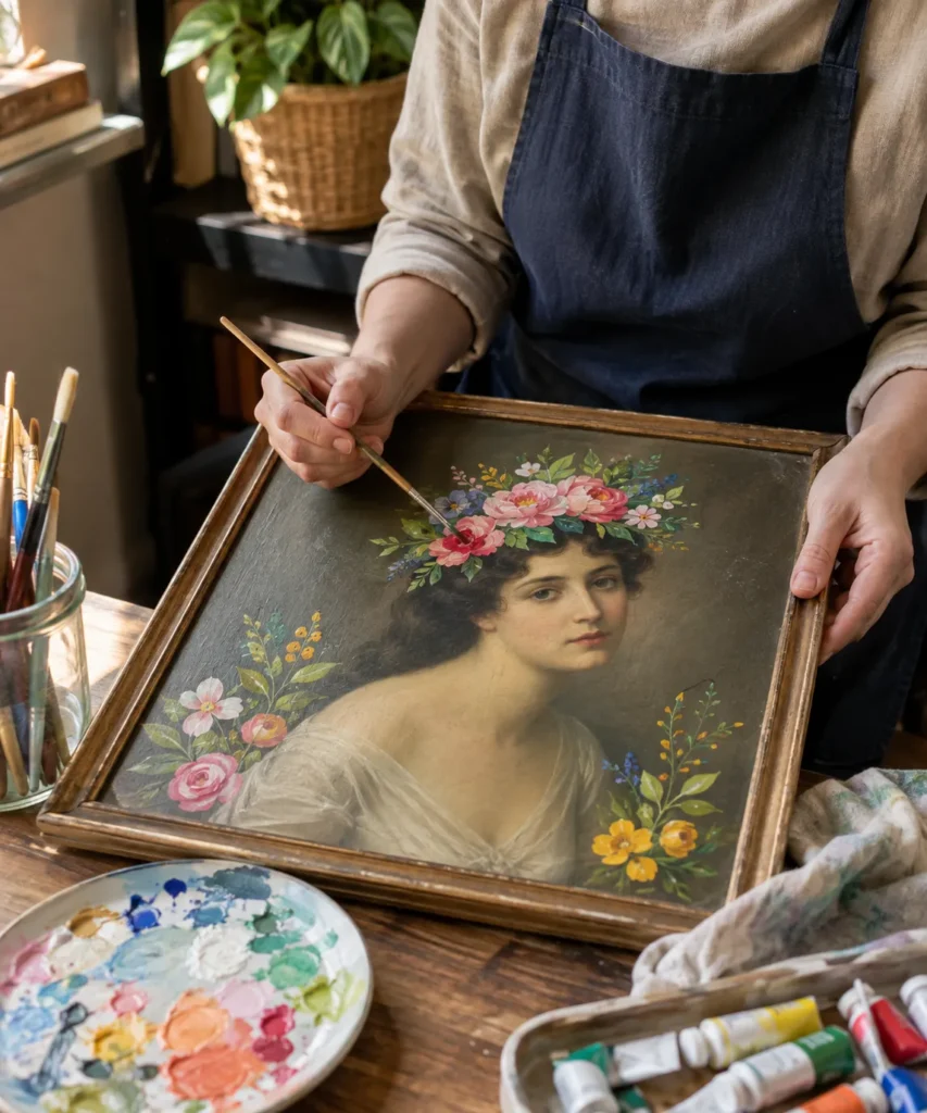
Portraits can feel harder to alter because the face immediately becomes the focal point. That is also why a restrained addition can have so much impact. A ring of flowers around the hair changes the mood without repainting the features, while smaller floral clusters near the corners connect the new decoration with the frame and background.
If the portrait has historical or sentimental value, I would leave it alone. For an inexpensive decorative print or mass-produced painting, however, this treatment can be a thoughtful way to make a formal image feel more personal. The important part is preserving the facial features. Once paint crosses the eyes, nose, or mouth, the project becomes a much more complete reinterpretation.
Materials and Tools
· A thrifted portrait with a stable surface
· Small amounts of acrylic paint in floral colours
· Fine round brushes in two or three sizes
· Palette and rinse water
· Soft pencil or removable planning method
· Scrap paper for practising flower shapes
· Optional matte protective finish if compatible with the finished surface
A Practical Way to Recreate the Look
1. Plan the crown around the head shape. Work from a photo of the portrait and sketch a loose arc that follows the hairline rather than sitting like a straight band. Leave some gaps so the original hair and background remain visible.
2. Place the largest flowers first. Paint two or three main blooms in balanced positions, using simple layered petal shapes. Keep them large enough to read from a distance but not so large that they overwhelm the face. Let these become the anchors for the smaller details.
3. Connect the flowers with leaves and tiny accents. Use softer greens and short stems to bridge empty spaces. Add a few small blossoms near the sides or lower corners if the composition needs balance, but avoid making every area equally decorated.
4. Refine the edges and colour relationship. Repeat one colour from the original portrait, dress, background, or frame in the floral additions. Then step back and remove visual competition where possible by keeping highlights and outlines softer near the face.
I don’t think every flower should be highly detailed here. A few carefully painted focal blooms surrounded by smaller suggestive marks usually feel more convincing than a crown made from twenty equally important flowers.
You can adapt the idea with leaves only, tiny stars, a simple laurel, or a monochrome floral crown. If the portrait already has a strong colour palette, working in one or two related shades can keep the upcycle elegant rather than theatrical.
Keep the Face as the Quiet Centre
A useful check is to cover the flower area with your hand and look at the face alone, then uncover the decoration. The portrait should still feel like the centre of the piece. If your eye jumps only to the flowers, reduce contrast around the crown or remove one of the largest blooms. This matters especially with small portraits, where even a modest flower can become large compared with the head. Softer leaves and broken stems can fill gaps without adding another competing focal point.
Cover a Dated Canvas With Soft Modern Abstract Shapes
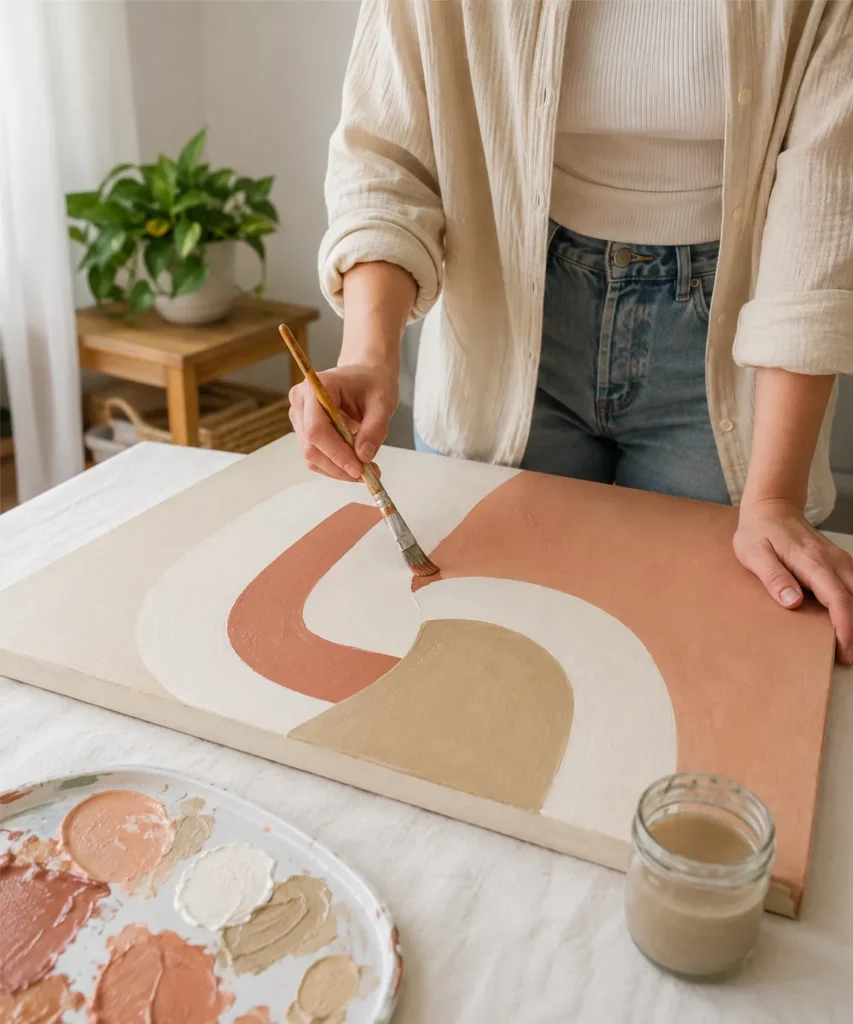
Not every thrift store painting has a section worth preserving. Sometimes the frame is useful, the canvas is sound, but the artwork itself does not fit your home. In that case, a larger repaint can still be an upcycle because the support, stretcher bars, and often the frame remain in use instead of being discarded.
Soft geometric shapes are beginner-friendly because they do not require precise drawing. The look depends more on proportion, colour, and clean coverage. Cream, clay, sand, muted pink, olive, charcoal, or other restrained colours can work especially well over a previously busy image because the new palette creates visual calm.
Materials and Tools
· A sound thrifted canvas or painted board
· Suitable primer or base coat if needed for coverage
· Acrylic paint in three to five coordinated colours
· Medium and small flat brushes
· Palette, water, and cleaning cloth
· Chalk or light pencil for planning large shapes
· Drop cloth or table protection
A Practical Way to Recreate the Look
1. Check whether the old surface needs a base coat. Dust the canvas and make sure no paint is actively flaking. If the old colours are very dark or glossy, a compatible base layer may help the new shapes cover evenly. Let each preparatory layer settle according to the product directions.
2. Sketch large shapes rather than small details. Divide the canvas into broad curves, arches, blocks, or overlapping forms. Keep the number of shapes limited. The design should still make sense when you squint at it from several steps away.
3. Paint from the largest area to the smallest. Use a larger brush for broad fields of colour and a smaller brush near curved edges. Two controlled thin coats often look neater than one heavy coat. Then adjust the border between colours once the first layer is stable.
4. Balance the final composition. If one colour feels too dominant, repeat a smaller amount elsewhere or soften it with a neighbouring tone. You do not need perfect symmetry. Slight variation often makes abstract work feel more relaxed and less like a printed template.
The part I like about this approach is that it gives a truly unwanted canvas another job. Still, I’d photograph the original before covering it. Even when the artwork has no monetary value, keeping a record is a considerate habit and gives you a satisfying before-and-after reference.
For a simpler version, use only two colours over a warm neutral background. For more texture, leave some old brush ridges visible beneath the repaint rather than sanding the canvas completely smooth. Those small irregularities can remind you that this was reused, not bought as a blank new surface.
Use the Old Texture Instead of Fighting It
A previously painted canvas may have raised ridges, cracked brush marks, or visible edges from the original composition. You can treat those as texture rather than defects. Broad abstract shapes often become more interesting when the surface is not perfectly smooth. If one ridge catches too much attention, shift a colour boundary so it feels intentional. I would avoid heavy sanding on an unknown old painting just to chase a factory-flat finish; keeping some history is part of what makes this a genuine upcycle rather than a disguised new canvas.
Paint a Checkerboard Border Around a Still Life
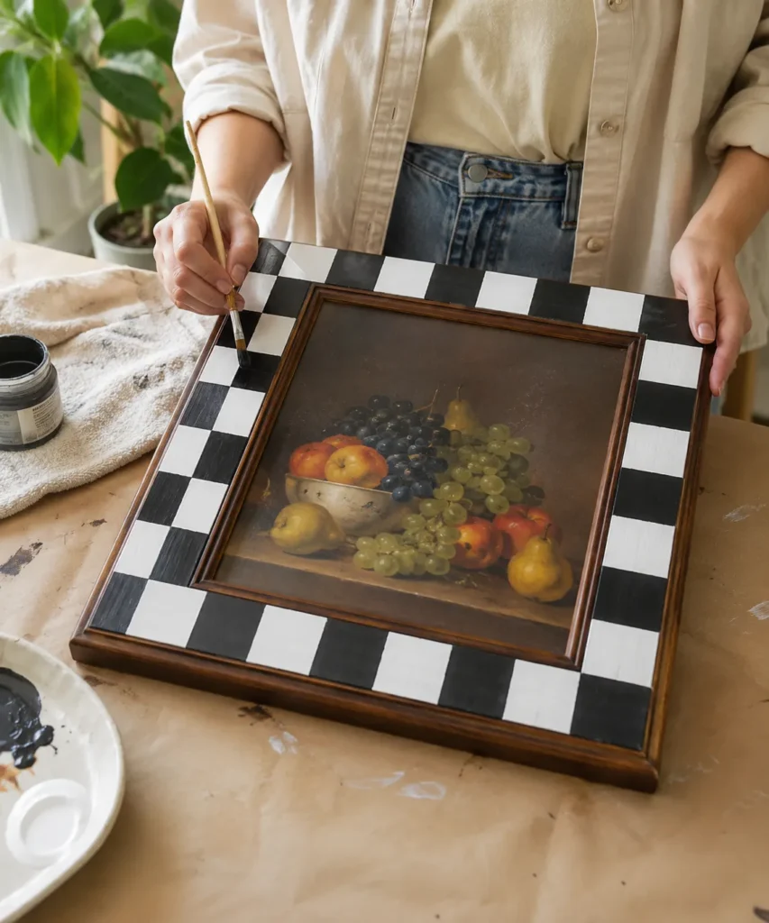
Changing the frame is a smart option when you like the thrifted picture but not the way it is presented. A dark fruit still life can suddenly feel much more current when the surrounding moulding receives a bold black-and-white checkerboard. The original painting remains readable, but the frame becomes an intentional contrast instead of a forgotten brown border.
This treatment works best on a frame with a reasonably flat band. Deeply carved frames are harder to divide into consistent squares, and paint may collect in decorative recesses. If the frame has a narrow inner lip and a wider outer area, you can keep the inner lip original and paint only the broad band.
Materials and Tools
· A framed thrift store painting
· Painter’s tape suitable for the frame surface
· Small ruler and pencil or chalk
· Black and white paint appropriate for the frame material
· Small flat brush
· Fine brush for edge correction
· Protective paper for the artwork and glass, if present
A Practical Way to Recreate the Look
1. Protect the picture before working on the frame. If removing the artwork is straightforward, separate it from the frame. Otherwise cover the picture carefully and keep paint away from glass edges, backing paper, and hanging hardware.
2. Measure the border and plan the square size. Divide each side into a repeat that looks balanced rather than forcing mathematically tiny squares. Corner transitions are the first thing people notice, so sketch the sequence around the whole frame before painting.
3. Paint one colour first. Use white or another light base for the full patterned band if the existing frame is dark. Once it is ready for the next layer, mark alternating squares and fill the darker blocks with a small flat brush, keeping paint thin near taped edges.
4. Correct the pattern by hand. Remove tape carefully and use a detail brush to straighten any rough edges. Then look at the frame with the artwork inside it. A slightly handmade line is fine; what matters is that the rhythm of the pattern feels consistent from normal viewing distance.
I know it can feel tempting to make every square absolutely identical, but a hand-painted frame does not need machine precision. If the spacing is visually even and the corners are considered, tiny variations will disappear once the piece is hanging.
Try cream and deep green, dusty blue and white, or terracotta and beige if black and white feels too strong. You can also paint a checkerboard only along the top and bottom edges for a quieter version.
Let the Frame Do the Updating
This is a particularly useful approach when the painting itself feels well executed or you are hesitant to alter it. The frame becomes the experimental area while the image stays intact. You can even test the pattern on strips of paper and tape them around the frame temporarily to see how the contrast feels. If the checkerboard looks too playful, switch to wide stripes, corner blocks, or a single coloured inner border. Small frame changes can make an old picture feel much more deliberate on a modern wall.
Turn a Dark Seascape Into a Moonlit Scene
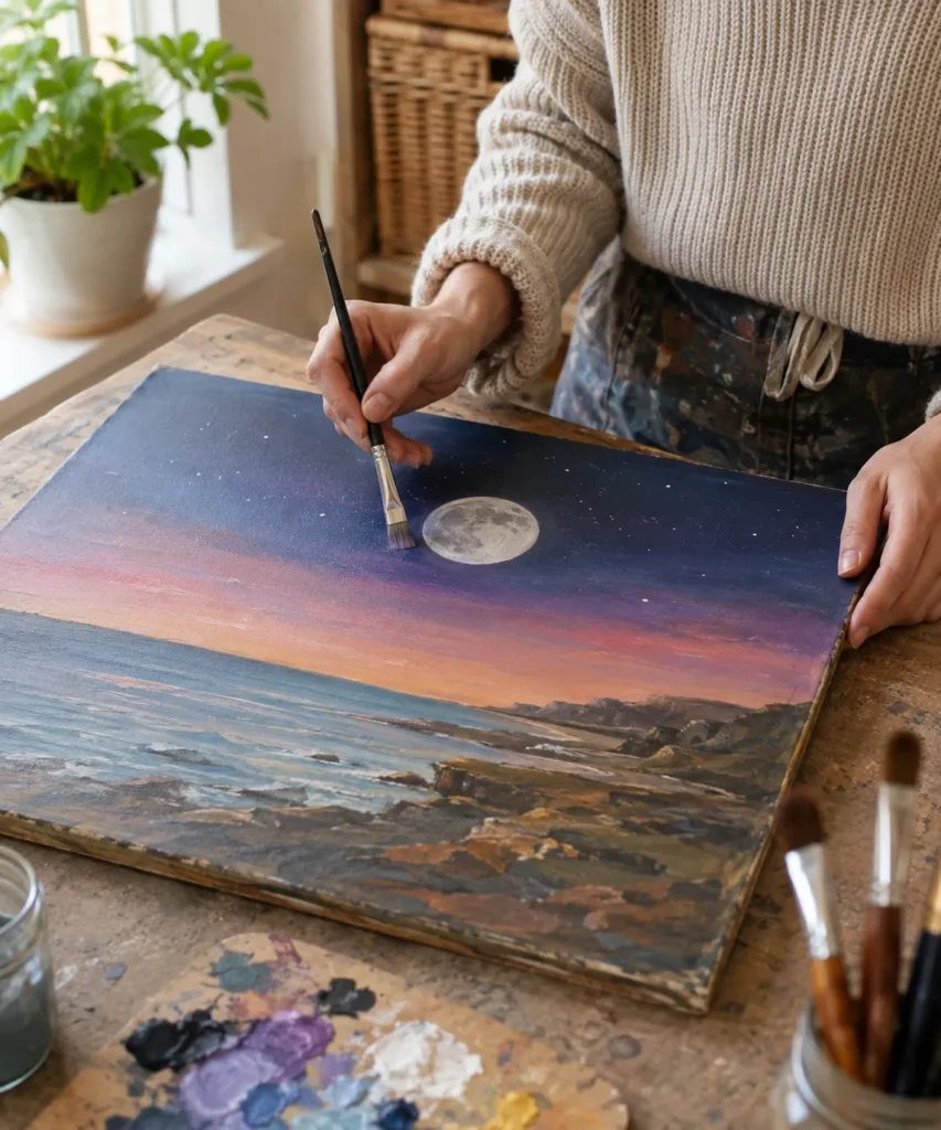
A thrifted seascape with good rocks, water, or shoreline can be changed dramatically without rebuilding the whole composition. Shifting the sky toward deep blue and violet, then adding a moon and a few restrained stars, gives the scene a different time of day while preserving the structure underneath.
This is more involved than adding a small motif because the sky may need glazing or partial repainting. The transition should still relate to the water and horizon. If the sky becomes very dark while the sea stays bright midday blue, the two halves can feel disconnected. Repeating a little of the new sky colour in the water helps join them.
Materials and Tools
· A stable thrifted seascape or coastal painting
· Acrylic paints in deep blue, violet, muted pink, warm grey, and off-white
· Medium flat brush and soft round brush
· Small detail brush
· Palette and water
· Optional sponge or soft dry brush for subtle blending
A Practical Way to Recreate the Look
1. Identify the existing horizon and light direction. Keep the original landscape structure visible. Decide where the moon will sit and how its light might influence nearby clouds, water, or rocks before changing the sky colour.
2. Darken the sky gradually. Build transparent or thin opaque layers from the top downward, preserving a softer band near the horizon. Use muted violets, blues, and warm dusk tones rather than one flat navy block. Then allow the transitions to settle before adding the moon.
3. Paint the moon with softened edges. A circle does not have to be mathematically exact, but it should feel intentional. Use off-white and pale grey rather than solid white, and add a few subtle internal variations so it belongs to the painted scene.
4. Connect the night sky to the landscape. Add a small reflection or cool highlight in the water, deepen selected shadows, and place only a few stars where they help. Too many bright dots can turn a calm seascape into a decorative pattern.
One detail I wouldn’t skip is checking the value balance. The moon should usually be one of the lightest areas, so other highlights may need softening. If everything is equally bright, the eye has nowhere to settle.
For a simpler upcycle, keep the original daytime sky and add only a small pale moon. You could also create a sunset rather than a night scene by introducing warm coral, muted orange, and lavender near the horizon while leaving much of the original water untouched.
Watch the Reflection and Horizon
Night conversions become more believable when the water responds to the sky. You do not need a perfect mirrored moon, but a few broken cool highlights can suggest reflected light. Keep them horizontal so they follow the water plane. The horizon also needs care: painting a thick dark band across it can make the sea look cut in half. Instead, soften the transition with related colours and let existing landforms interrupt the line naturally. That small attention to perspective helps the new atmosphere feel built into the old scene.
Add Tiny Mushrooms to a Woodland Landscape
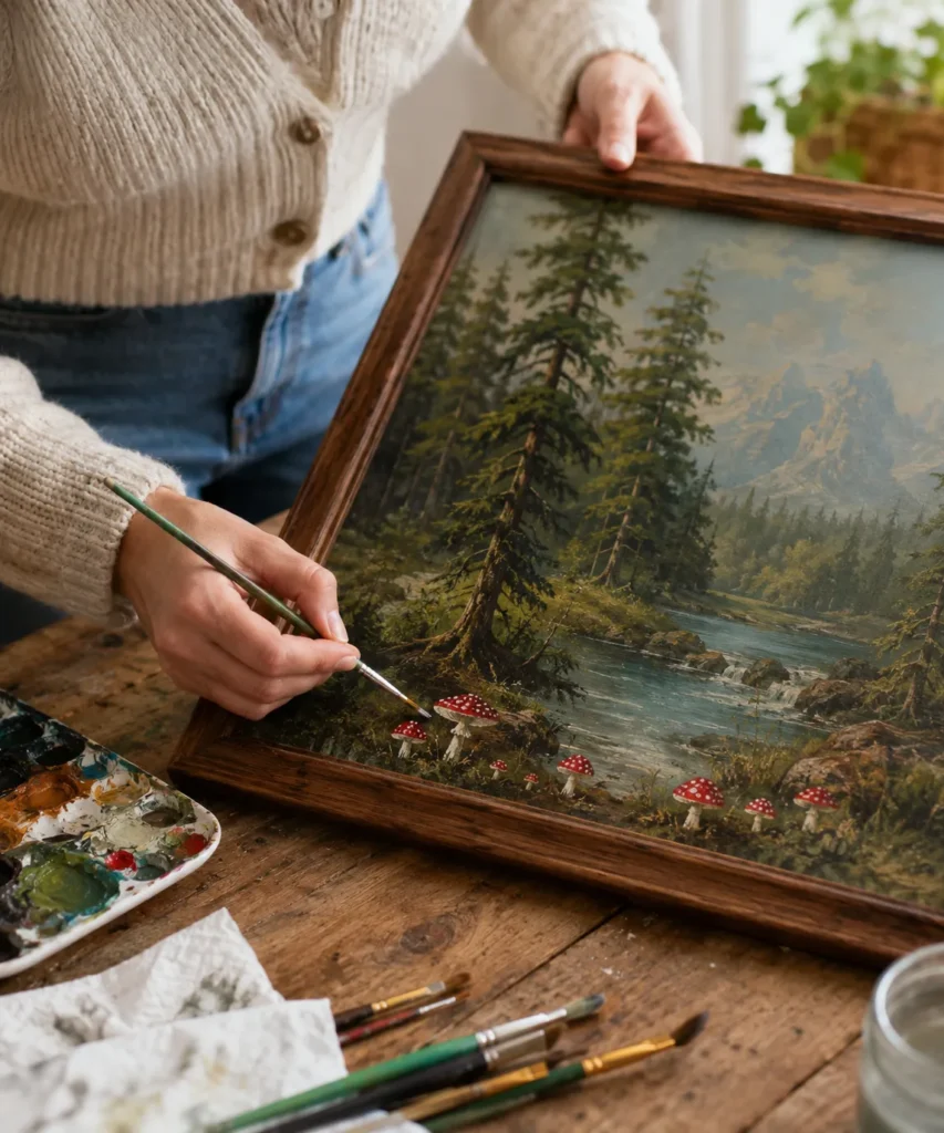
Small narrative details are useful when you want the upcycle to be visible only after someone looks twice. A traditional forest landscape already gives you the perfect setting for mushrooms, especially around tree roots, mossy banks, or dark foreground areas. Bright red caps create contrast, while the small scale keeps the idea playful rather than cartoonish.
The mushrooms should follow the ground plane. Larger ones can sit near the lower edge and smaller ones farther back. If they all float at the same height, the illusion disappears. It also helps to partly hide a stem behind grass, shadow, or a rock so the new marks feel integrated into the old landscape.
Materials and Tools
· A thrifted forest or woodland painting
· Fine detail brushes
· Red, cream, brown, green, and off-white paint
· Palette and rinse water
· Scrap card for practising mushroom shapes
· Optional magnifier if the foreground details are very small
A Practical Way to Recreate the Look
1. Choose natural resting points. Look for dark earth, tree bases, fallen logs, or mossy corners where mushrooms could plausibly appear. Plan clusters rather than spacing individual mushrooms evenly across the picture.
2. Paint stems before caps. Use muted cream or grey-brown for short stems, varying their angle and thickness. Some can lean, some can be partly hidden, and a few can be tiny enough to read only as light marks.
3. Add the caps in different sizes. Use a deep red rather than the brightest scarlet available, then place small cream spots selectively. The spots do not need to be identical, and some caps can be plain so the cluster feels more natural.
4. Tie the mushrooms into the ground. Add a little shadow, moss colour, or grass around the stems. Then step back. If the mushrooms look pasted on, softening the contrast around their bases often helps more than adding extra detail to the caps.
For me, this is a good reminder that an upcycle does not need to shout. A handful of tiny additions can make a thrifted painting feel like a personal discovery without erasing what made the landscape appealing in the first place.
You could substitute tiny flowers, a fox, fireflies, a hidden door, or one small cottage light. Beginners may find simple mushrooms easier because the shapes are forgiving and the colour contrast does most of the work.
Build a Tiny Story Without Overexplaining It
The most appealing part of a hidden-detail upcycle is that the viewer gets to discover it. One cluster near a tree can imply a whole woodland story without adding fairies, signs, doors, stars, and animals at the same time. If you want a more whimsical direction, repeat the mushroom motif in only two areas so the eye travels through the scene. Keep the new details slightly irregular in size and spacing. That way they feel found inside the landscape rather than arranged across it like stickers.
Refresh a Fruit Still Life With Brighter Lemons and Leaves
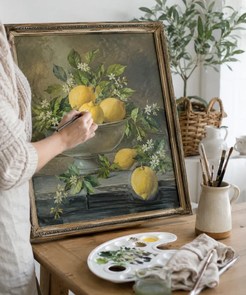
Sometimes the composition is fine but the colours have become visually heavy. A fruit still life with good drawing and a pleasant bowl can feel much fresher when selected areas are repainted with clearer colour. Lemons are especially useful because warm yellow creates an immediate focal point against deep green, brown, grey, or black backgrounds.
The trick is not to repaint every lemon with one flat bright yellow. Old still lifes usually contain soft modelling and shadow. Keep darker ochre, olive, or warm grey in the shaded areas, then add brighter yellow where the light would naturally strike. The same idea applies to leaves: a few lighter edges can wake up the foliage without turning every leaf neon green.
Materials and Tools
· A stable thrifted fruit or floral still life
· Yellow, ochre, green, cream, brown, and grey paint
· Small and medium round brushes
· Fine detail brush
· Palette and water
· Soft cloth for keeping the work area clean
A Practical Way to Recreate the Look
1. Identify the existing light source. Look for the brightest side of the fruit, cast shadows, and highlights on the bowl. Keep that logic consistent. New highlights placed randomly can flatten the original form instead of improving it.
2. Strengthen the mid-tones first. Mix a warm yellow with a little ochre or muted green and repaint only the areas that need clarification. Let some of the original colour show through so the fruit still belongs to the older painting.
3. Add brighter highlights sparingly. Use a lighter yellow or creamy yellow on the upper edges and selected textured spots. Then refresh nearby leaves with more varied greens, keeping the deepest shadows intact for contrast.
4. Unify the additions. If the new lemons look too clean compared with the old surface, soften them with a thin muted glaze or repeat a small amount of the background colour around their edges. The goal is brighter, not brand-new and disconnected.
I’d rather refresh three strong lemons than repaint every object in a crowded still life. Once one or two focal areas become clearer, the rest of the older painting often starts to look intentionally atmospheric instead of simply dull.
Oranges, pears, apples, and flowers can be treated the same way. You can also modernize the frame while leaving the painting almost untouched, which is useful if the brushwork itself is the part you like most.
Keep Some of the Old Shadow
Brightening does not mean removing every dark passage. The deeper background and shadow under the bowl are what allow yellow fruit to look luminous. If you lighten everything at the same time, the picture can lose depth. I would refresh only the edges and planes that logically face the light, then leave quiet dark areas around them. The result is usually more convincing than repainting every fruit to the same level of brightness. Contrast is doing much of the work for you, so there is no need to fight it.
Layer Simple Line Art Over a Vintage Floral Painting
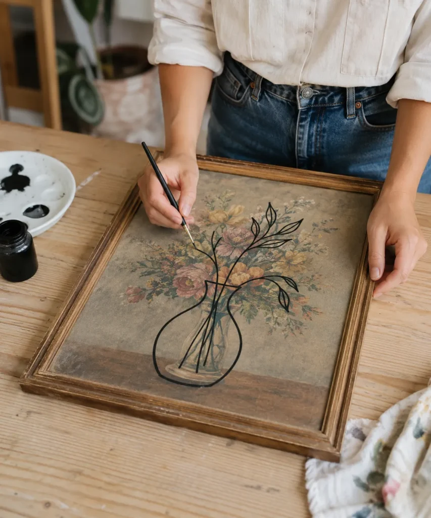
Overlaying graphic line art is one of the clearest ways to let two eras exist in the same piece. The original floral bouquet remains visible as texture and colour, while a simple black vase-and-branch drawing adds a contemporary structure on top. The contrast works because the new line is intentionally cleaner and flatter than the older painted flowers.
This technique needs confidence more than detailed painting skill. A wobbly line can still look handmade, but repeatedly correcting the same stroke may make it thick and muddy. Practise the full drawing on paper first, then simplify it. You need fewer lines than you think.
Materials and Tools
· A thrifted floral painting or print with a stable surface
· Black or very dark paint compatible with the artwork surface
· Fine round brush or paint marker suitable for the material
· Paper and pencil for practising the line drawing
· Chalk or removable transfer method if needed
· Palette and cleaning cloth
A Practical Way to Recreate the Look
1. Simplify the new drawing on paper. Use one vase shape, a few stems, and several leaves rather than a highly detailed botanical illustration. Check that the outline can still be understood when placed over the existing flowers.
2. Position the drawing over the old composition. Centre does not always mean balanced. Let the new vase overlap the main bouquet while allowing enough of the original flowers to remain visible around and inside the line structure.
3. Paint the longest lines in calm strokes. Support your painting hand if possible and work from larger curves toward smaller leaves. If a line becomes slightly uneven, resist the urge to thicken every neighbouring line to match it.
4. Decide where to stop. The point is the conversation between old and new. Once the new outline is readable, extra hatching, shading, or decorative marks may hide the vintage layer that makes the upcycle interesting.
The part I would keep simple is the colour. Black, dark green, navy, or deep brown usually gives the line enough contrast. Adding several bright outline colours can compete with the original bouquet and weaken the graphic effect.
A white line drawing can work over a very dark painting. You could also paint a face outline, hand, bird, architectural arch, or single oversized flower, provided the new shape has enough open space for the older image to show through.
Test the Drawing at Full Size
A line drawing that looks elegant in a sketchbook may feel cramped once it is enlarged across a framed painting. Tape together sheets of inexpensive paper, draw the motif at roughly the final size, and hold it over the artwork before painting. This makes it easier to judge whether a leaf crosses an important flower or whether the vase becomes too wide for the bouquet underneath. I know this extra planning can feel slow, but it is much faster than trying to erase a heavy dark line from an aged surface later.
Add Metallic Sun Rays to a Mountain Landscape
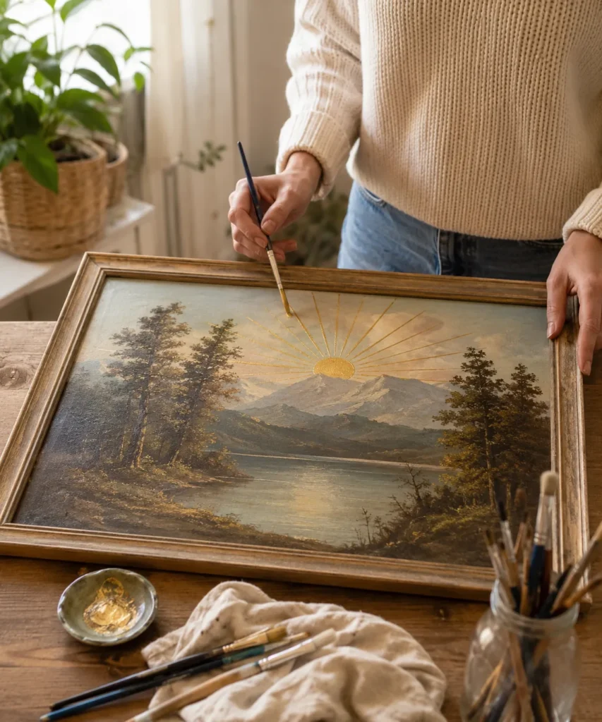
Metallic paint can change a landscape with surprisingly little coverage. A small gold sun at the horizon and thin rays stretching into the sky add a graphic layer that catches light differently from the matte older painting. The result feels decorative, but much of the original mountain, water, and trees remains untouched.
Because metallic paint reflects light, the rays need restraint. Thick opaque stripes may dominate the picture, while fine lines allow the landscape to remain primary. Positioning the sun behind or just above a mountain also helps it feel connected to the existing horizon instead of floating in empty sky.
Materials and Tools
· A thrifted landscape with clear sky and horizon space
· Metallic gold or bronze paint suitable for the surface
· Fine liner brush
· Small round brush for the sun
· Ruler or paper guide for planning ray directions
· Palette and water or appropriate cleaning medium
· Scrap card for testing metallic coverage
A Practical Way to Recreate the Look
1. Choose the sun position from the existing landscape. Look at the mountain peaks, horizon, and open sky. Place the circle where it can interact with those shapes rather than covering an important cloud or tree.
2. Plan the rays before painting. Use a paper overlay or photograph to test spacing. The rays can be regular for a graphic look or slightly varied for something softer, but they should all clearly originate from the sun.
3. Paint the sun in thin layers. Metallic colour often looks different depending on light and thickness. Build the circle gradually, then use a fine brush for the rays rather than trying to make them fully opaque in one pass.
4. Check the effect in the room where it will hang. Metallic details change as you move. If the rays become too strong in direct light, soften a few or shorten them. The landscape should still read even when the gold is not reflecting.
I especially like this treatment on paintings that already have warm brown or amber tones in the frame. The gold repeats that warmth and makes the new layer feel connected without needing to repaint the frame as well.
Silver, copper, muted ochre, or even flat cream can replace metallic gold. You can also use a simple halo, semicircle, or three broad rays rather than a full sunburst if the sky is small.
Metallic Paint Needs Its Own Restraint
Metallic paint is unusual because it changes with the angle of the room light. A ray that looks subtle while you work beside a window may flash strongly under a lamp at night. Test a few strokes on scrap card and move the card around before deciding how opaque the final lines should be. If the painting will hang opposite a sunny window, thinner rays may be enough. The changing reflection can become part of the piece, but it should support the landscape instead of overpowering every original brushstroke.
Paint Small Birds Into an Open Sky
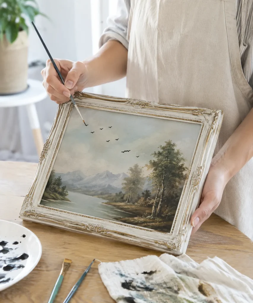
A few birds may be the simplest thrift store painting upcycle of the entire group, yet the effect can be surprisingly strong. A pale open sky often feels static. Small dark bird marks create movement, suggest distance, and give the viewer a reason to look more closely at the upper part of the picture.
The familiar shallow “M” shape works, but variation makes it more convincing. Some birds can be narrower, some wider, and a few can sit at a slight angle. Their size should also decrease as they move farther into the scene. A perfectly even line of identical marks tends to look decorative rather than atmospheric.
Materials and Tools
· A thrifted landscape with open sky
· Dark brown, charcoal, navy, or black paint
· Very fine detail brush
· Scrap paper for practising bird marks
· Palette and rinse water
· Optional removable planning dots on a photo of the artwork
A Practical Way to Recreate the Look
1. Plan the flock as one shape. Instead of deciding where each bird goes separately, look at the overall direction of the group. A loose diagonal or curve often feels more natural than a straight horizontal row.
2. Practise several bird sizes first. Use two quick strokes for each bird and change the wing angle slightly. This is worth doing on scrap paper because the final marks are small enough that heavy corrections may become obvious.
3. Paint the largest birds first. Place two or three closer birds, then add smaller marks toward the distance. Keep plenty of empty sky around them. Negative space is part of what makes the flock feel like it is moving.
4. Stop before the sky feels busy. Step back after every few birds. If the scene already has enough motion, leave it. One extra bird is easy to add later; removing a dark mark from a pale vintage sky can be much harder.
This is the project I would suggest when someone is nervous about altering a thrifted painting. The new marks are small, the materials are minimal, and the original work stays almost completely visible.
You can use warm brown instead of black for a softer result, or replace birds with tiny stars, distant kites, or small cloud accents. Keep the scale believable and let the old landscape do most of the work.
Use Empty Sky as Part of the Design
It is easy to underestimate how important blank space is in this project. A flock feels like it is travelling because there is room in front of it and behind it. If you fill the full sky with birds, that sense of direction disappears. Place the group off-centre and leave a larger open area toward the direction they appear to be flying. This is one of those cases where doing less often looks more intentional. The original clouds, haze, and distant mountains can remain quiet while the tiny marks provide just enough movement.
Painting Upcycle Mistakes That Can Make Old Art Look Forced
A thrift store painting upcycle works best when the new layer responds to the old one. The most common problems usually come from rushing past that relationship and treating the artwork like a completely blank craft surface.
Covering too much too quickly is the first mistake I would avoid. Once a portrait, landscape, or still life disappears under an opaque layer, you cannot rely on the original composition to carry the project. Take photos, test ideas digitally, and add the smallest useful change first. You can always paint more later.
Using colours that ignore the existing palette can make even a neatly painted addition look pasted on. A bright white flower, saturated green leaf, or pure black outline may need softening. Pulling one colour from the original painting into the new layer is an easy way to create visual connection.
Skipping surface checks can lead to peeling or damage. Old paintings may be varnished, dusty, glossy, brittle, or printed rather than hand painted. Test compatibility in an inconspicuous area or on a similar scrap when possible, and do not sand or scrub delicate artwork simply because that is common advice for furniture makeovers.
Overworking small details is another problem. Flowers become blobs when every petal is corrected repeatedly. Tiny birds become thick marks. Mushroom caps lose their lightness. Make a few confident strokes, let them settle, and judge them from normal viewing distance before deciding they need more.
Forgetting the frame can leave the final piece feeling unfinished. You do not always need to repaint it, but clean it, tighten loose hardware, and decide whether its colour helps the new direction. Sometimes the old wood tone is exactly what the modern addition needs.
Trying to make the upcycle look newly manufactured can remove the charm of the project. Slight frame wear, visible old brush texture, and small colour variations can stay. The purpose is not to erase every sign of age; it is to make the artwork useful and appealing again.
Frequently Asked Questions
Can beginners upcycle a thrift store painting?
Yes. Begin with a small change such as birds, flowers, a few stars, or a frame pattern rather than repainting the entire picture. Simple additions let you practise scale, colour matching, and brush control while leaving most of the original composition intact.
What paint should I use on a thrifted painting?
Acrylic paint is a common craft choice because it is widely available and can layer well on many stable surfaces, but the right paint depends on what the thrifted artwork is made from and whether it has a glossy coating or varnish. Test compatibility first and avoid assuming every old painting will accept the same material.
Do I need to sand an old painting before adding new paint?
Usually I would not sand the picture surface unless you have a specific reason and understand the material. Sanding can remove original paint, printed layers, texture, or varnish. If you are repainting a wooden frame, light preparation may be appropriate for that frame material, but protect the artwork separately.
How do I know whether a thrift store painting might be valuable?
If the piece has an original signature, gallery label, unusual age, quality frame, handwritten notes, or anything that makes you suspect it may have value, research it before altering it. A quick check is much easier than discovering after the project that you painted over something you would rather have preserved.
Can I paint over artwork that is behind glass?
You can paint the frame or, in some projects, decorate the glass itself, but painting directly onto glass creates a different effect from painting the artwork underneath. If you want to alter the picture, remove it only when the frame can be safely opened and reassembled without damaging the art or backing.
Should I seal an upcycled painting when it is finished?
Not automatically. A protective finish can change sheen, deepen colours, react with the original surface, or make future changes difficult. If you decide a coating is useful, choose one suitable for the materials involved and test it on a sample before applying it across the complete artwork.
How can I make an upcycled painting look intentional instead of random?
Repeat colours, respect the original perspective, and give the new details a clear reason to be where they are. A few connected additions usually work better than many unrelated motifs. Step back often, because the piece will be viewed on a wall rather than from ten inches away on the worktable.
Let the Old Painting Stay Part of the New One
The best thrift store painting upcycle does not necessarily hide where the piece came from. A worn landscape can keep its soft trees while gaining a field of white flowers. A formal portrait can keep its expression while receiving a floral crown. A dark old frame can become part of a bolder checkerboard border, and a quiet sky may need nothing more than five small birds.
That balance is what makes upcycling art different from simply buying a blank canvas and starting again. You are responding to something that already exists, deciding what still works, and changing only what helps the piece belong in your home.
Begin with the thrifted painting you are least afraid to experiment with. Clean it gently, photograph it, test one idea, and then make the first small change. Which part would you keep from the original, and what would you add to make it feel like yours?